Tag Archives: inequality

What are American’s view on economic inequality?

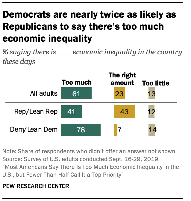
The PEW article Most Americans Say There Is Too Much Economic Inequality in the U.S., but Fewer Than Half Call it a Top Priority by Juliana Menasce Horowitz, Ruth Igielnik, and Rakesh Kochhar (1/9/2020)  is a thorough review of income and wealth inequality, as well as American’s views of inequality.  For example, the graph copied here shows the responses to if there is too much economic inequality by political affiliation.  A few highlights from the article:

From 1970 to 2018, the share of aggregate income going to middle-class households fell from 62% to 43%. Over the same period, the share held by upper-income households increased from 29% to 48%. The share flowing to lower-income households inched down from 10% in 1970 to 9% in 2018.

As of 2016, the latest year for which data are available, the typical American family had a net worth of $101,800, still less than what it held in 1998.

While a majority of Republicans overall (60%) say that people’s different choices in life contribute a great deal to economic inequality, lower-income Republicans (46%) are significantly less likely than Republicans with middle (63%) or higher (74%) incomes to say this.

There are numerous graphs in the article and a methodology section which points to the data sources.

What are EPI’s top charts of 2019?

To find the top charts of 2019 according to EPI see their Top charts of 2019 post.  The graph here is #5 on their list.

The figure shows that the real value of the federal minimum wage has dropped 17% since 2009 and 31% since 1968. A full-time worker earning the federal minimum wage today has about $6,800 less per year to spend on food, rent, and other essentials than did his or her counterpart 50 years ago.

There are 13 charts in all with data and links to the original article (for some charts you have to go to the original article to get the data).


What has improved (and not) between rich and poor countries?

The St. Louis Fed post, Healthier Countries, if Not Wealthier Countries by Guillaume Vandenbroucke (12/26/2019) notes

The income gap between rich and poor countries doesn’t seem to be closing. In fact, it seems to be getting wider. However, the gaps between these groups of countries when it comes to health may indeed be narrowing.

For example, the graph copied here provides time series of GDP of high-income countries and Sub-Saharan African countries. The gap between the two cohorts has grown. Yet,

Not surprisingly, sub-Saharan African countries exhibit a lower life expectancy at birth and a higher crude death rate than the high-income countries. What is surprising, however, is that these measures of health are converging to that of the rich countries, unlike GDP per capita.

There are two other graphs in the post. The data is from the world bank and can be found.

What progress has been made in the poorest countries?

The World Bank Blog post Chart: Two decades of progress in the world’s poorest countries by Donna Barne (12/11/2019) provides the chart copied here.

The last two decades have seen significant progress in many of the world’s poorest countries. The extreme poverty rate fell from more than 50% to about 30%. Child mortality declined from nearly 14% to 7%. Access to electricity increased by 57% and the share of people using at least basic drinking water and sanitation services increased by 22% and 41%, respectively, among other results.

Below the chart in the post is is a link to the World Bank IDA RMS Database where you can get the data for the chart and more (individual county data or different variables). Note for the chart for this data select IDA total for country.

What is the leading cause of child mortality?

The article by Our World in Data, Pneumonia – no child should die from a disease we can prevent, by Bernadeta Dadonaite (11/12/19) reports:

Every 39 seconds a child dies from pneumonia.

5.4 million children under five years old died in 2017. Pneumonia was the cause of death of one-in-seven of them. . . pneumonia is the leading cause of child mortality globally and has been the leading cause for the past three decades.

What is the distribution of deaths around the world:

As the map shows, children are most likely to die from pneumonia across Sub-Saharan Africa and South Asia. Just 5 countries — India, Nigeria, Pakistan, the Democratic Republic of Congo, and Ethiopia – accounted for more than half of all deaths from childhood pneumonia in 2017.

The disease is therefore most common in places where healthcare infrastructure is lacking and people are least able to afford treatment.

Progress but not enough:

The number of children dying from pneumonia has decreased substantially over the past three decades. In 1990, more than two million children died from pneumonia each year; by 2017 this number had fallen by almost two-thirds.

The post has three graphs with the data.

Who are the low-wage workers?

The Brookings report Meet the low-wage workforce by Martha Ross and Nicole Bateman (11/7/19) provides demographics of the low-work force by category. The nine categories they use are represented in their chart copied here.  For example, cluster 1 are ages 18-24 are not in school and don’t have a college degree. They are 13% of the low-wage workforce. The post has links to the full report where we learn that this cohort is 51% White, 16% Black, 27% Latino or Hispanic, 2% Asian American, and 4% Other. Of this group, 14% didn’t graduate from high school.

There are regional differences:

Across more than 350 metro areas, the share of workers earning low wages ranges from 30% to 62% of the overall workforce. Low-wage workers are particularly concentrated in smaller places in the southern and western parts of the United States. They make up larger shares of the workforce in places with lower employment rates and that concentrate in agriculture, real estate, and hospitality.

The full report contains a number of data tables.

How has income changed in the U.S.?

From the Census Bureau report New Data Show Income Increased in 14 State and 10 of the Largest Metros by Gloria Guzman (9/26/19)

Median household income for the United States and 14 states increased significantly in 2018 from the previous year, according to U.S. Census Bureau data released today.

But,

However, the Gini index of income inequality was significantly higher during the same period for the nation and nine states.

The report has six charts or tables. The full Household Income: 2018 report has tables of data. Historical data including household gini index (table H-4 which includes data by race) is on the Historical Income Tables: Income Inequality page.

How do food systems differ between rich and poor countries?

The World Bank post The high price of healthy food and the low price of unhealthy food by Derke Headey and Harold Alderman (7/23/19) explores the connection between food systems and wealth in a country, along with the impacts. For example, their graph here show a correlation between stunting in children and the caloric price of milk.

The metric we use to analyze the global food system from a consumer perspective is the “relative caloric price” of a given food. Take eggs, for example: how expensive is an egg calorie in Niger compared to the most important staple foods in that country? Egg calories in Niger are 23.3 times as expensive as a calorie from a staple food, such as rice or corn. In contrast, egg calories in the US are just 1.6 times as expensive as staple food calories.

The big picture:

Hence the problem in less developed countries is that poor people also live in poor food systems: nutrient-dense foods like eggs, milk, fruits and vegetables can be very expensive in these countries, making it much harder to diversify away from nutrient-sparse staple foods like rice, corn and bread. The problem in more developed countries is rather different: unhealthy calories have simply become a very affordable option. In the US, for example, calories from soft drinks are just 1.9 times as expensive as staple food calories and require no preparation time.


What 5 states had the highest mortality rates?

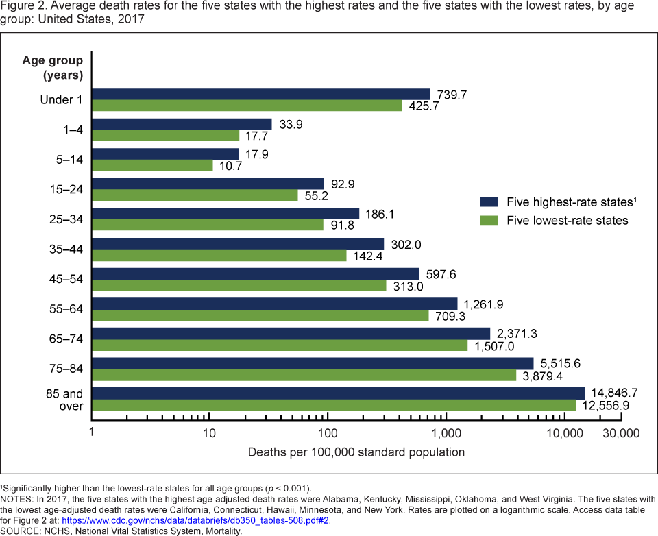
The CDC data brief, Mortality Patterns Between Five States with Highest Death Rates and Five States with Lowest Death Rates: United States, 2017 by Jiaquan Xu, M.D. (9/5/2019), provides the  graph here of death rates by age (pay attention to the log scale on the x-axis). The five states with the lowest age-adjusted death rates: California, Connecticut, Hawaii, Minnesota, and New York. The highest: Alabama, Kentucky, Mississippi, Oklahoma, and West Virginia.  By gender:

Among males, the average death rate for the states with the highest rates (1,094.3) was 48% higher than that for the states with the lowest rates (741.2).

Among females, the average death rate for the states with the highest rates (785.7) was 49% higher than that for the states with the lowest rates (526.4).

For Hispanics:

The rate for Hispanic persons was 27% lower (374.6 compared with 509.7) for the states with highest rates than for the states with the lowest rates.

There are four graph each with links to the data.

What is in the Income and Poverty 2018 report?

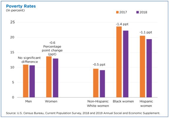
The U.S. Census Bureau report Income and Poverty in the United States: 2018 by Jessica Semega, Melissa Kollar, John Creamer, and Abinash Mohanty (9/10/19) is now available.  A few highlights can be found in the post Pay is Up. Poverty is Down. How Women are Making Strides  by Jessica Semega (9/10/19). For example, the graph copied here is poverty rates for  2917 and 2018 for men, women, and by race for women. In terms of households:

Median incomes of married-couple households and those with male householders did not change from 2017.

In 2018, the poverty rate for families with a female householder was 24.9%, higher than that for married-couple families (4.7%) and families with a male householder (12.7%).

However, the poverty rate for families with a female householder declined from the previous year, at 26.2% in 2017.

The full report contains 20 pages of charts and summaries related to income and poverty by numerous categories. The other 50 or so pages are data tables that are also available in excel files (see links on right sidebar of the report page).  There is ample data here for use in courses.