Tag Archives: inequality

Is the racial wealth gap evenly distributed by class?

The article The Racial Wealth Gap is About the Upper Classes by Matt Bruenig (6/29/2020) on the People’s Policy Project explains. First the racial wealth gap is large:

If you take the net worth of all white households and divide it by the number of white households, you get $900,600. If you do the same thing for black households, you get $140,000. The difference between these figures — $770,600 — is the best representation of the overall racial wealth gap.

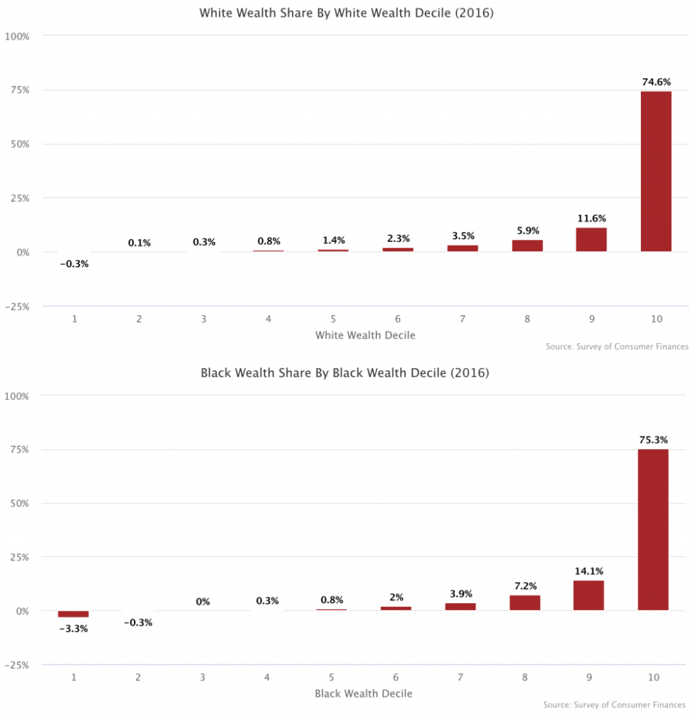
The graphs here from the article show that the wealth in both groups is largely concentrated in the top 10%.

What this means is that the overall racial wealth disparity is being driven almost entirely by the disparity between the wealthiest 10 percent of white people and the wealthiest 10 percent of black people.

Overall,

This means that even after you have completely closed the racial wealth gap between the bottom 90 percent of each race, 77.5 percent of the overall racial wealth gap still remains, which is to say that the disparity between the top deciles in each race drives over three-fourths of the racial wealth gap.

Further,

What this shows is that 97 percent of the overall racial wealth gap is driven by households above the median of each racial group.
 

What is the relationship between class, race, and police killings?

The People’s Policy Project reports on their recent research paper in the post Class and Racial Inequalities in Police Killings (6/23/2020). The full paper, Police Killings in the U.S. is by Justin Feldman, ScD. In general,

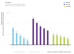
The highest-poverty areas have a police killing rate of 6.4 per million while the lowest-poverty areas have a police killing rate of 1.8 per million, a 3.5-fold difference.

The differences in killing rate have the same pattern when viewed by Black, Hispanic, and White populations. Differences by class among Hispanics is the least. Further,

He finds that class differences account for more than 100 percent of the difference between white and Latino police killing rates, meaning that, after adjusting for socioeconomic differences, Latinos have a lower police killing rate than whites. Class differences account for 28 percent of the difference between black and white police killing rates.

There are three other graphs in the post.

How has Black educational attainment changed?

The Census Bureau post Black High School Attainment Nearly on Par with National Average  by Jennifer Cheeseman Day (6/10/2020) notes:

In 1940, when the U.S. Census Bureau started asking about educational attainment, only 7% of Blacks had a high school education, compared with 24% for the nation as a whole.

In recent years, Black educational attainment has been much closer to the national average and today, 88% of Blacks or African Americans have a high school diploma, just shy of the national average, according to census data released last month from the Current Population Survey.

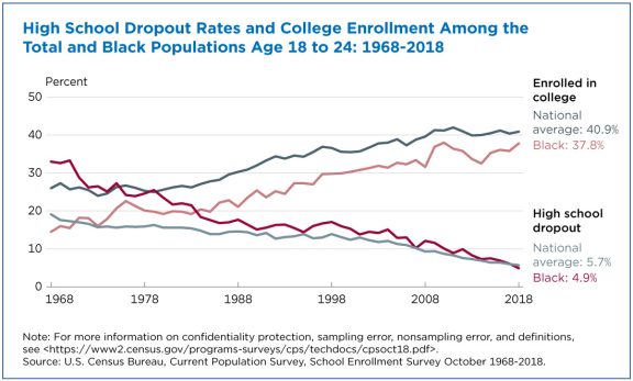
Related to the graph copied here:

The national average dropout rate declined from 19% in 1968 to about 6% in 2018. The Black dropout rate fell more steeply from 33% to 5%, bringing it in line with the national average.

Average enrollment for young adults increased from 26% to 41%. At the same time, the proportion of Black young adults in college more than doubled, rising from 15% to 38%.

The article contains five other graphs and links to the Census Bureau data sources.


What is the connection between crime and lead?

Kevin Drum asks a good question in his post How Many Cops Does New York City Need?  First note that violent crime has been dropping since around 1990 (see his graph copied here for examples). In particular for NYC:

The per capita number of police officers increased by about 10 percent through 2000 and then declined by about 20 percent through 2018. That’s nearly flat over the entire period. Violent crime, by contrast, plummeted 60 percent from its peak in 1990 through 2000 and then declined another 40 percent through 2018. That’s a total decrease of nearly 80 percent between 1990 and 2018.

Violent  crime has decreased even though the per capita number of cops has been nearly flat. So, why did crime decrease? There is overwhelming evidence that removing lead emissions from cars is the main driver of crime decline. I strongly encourage you to read Drum’s 2018 summary of the evidence.

So, why doesn’t anyone talk about lead and crime?

The second problem is among activists on both left and right who have their own pet theories. On the left, we tend to blame poverty, institutional racism, poor schooling, lousy housing, and so forth. On the right, the favorite targets are the breakdown of the family, too few cops, too few prisons, drugs, the decline of religion, and so forth. There is very little convincing evidence for any of this, while lead poisoning explains everything. But if lead poisoning is the answer, then everyone has to give up their pet theories about what happened between 1960 and 2010. That’s a tough ask.

We forget that there was a lot of violent crime in the 1980s. It had an impact on society in many ways. But, we are past that and removing lead from the environment is a permanent fix to the violent crime wave of the past. This should allow us to think differently about societal needs for policing.

The Drum post has two other graphics. The Statistics Projects page has the relevant lead and crime data.


How has Covid-19 impacted unemployment by race?

The chart here comes from using FRED (Federal Reserve Economic Data). Since at least the 1970s Hispanic or Latino (using FRED terms) unemployment was consistently between Black or African American and White and more recently slightly closer to White unemployment. For possibly the first time since the 1970s Hispanic or Latino unemployment (18.9%) exceeded Black or African American (16.7%) in April 2020. The Feb 2020 to April 2020 increase in unemployment for the four groups in the chart are (in order from smallest to largest) Black or African American (10.9%), White (11.1%), Asian* (11.8%), Hispanic or Latino (14.5%). It would seem that by both the total increase and the magnitude of unemployment that the Hispanic or Latino population was hit hardest by Covid-19. Moving to May, while Hispanic or Latino unemployment has decreased, along with White unemployment while Black or African American is stable and Asian increasing, they still exceed the other three groups.

The link here to FRED is only for the graph of Black or African American unemployment. Use the Edit Graph button (top right) and then Add Line (middle top tab). Search for the other groups and add them to the chart. The chart will provide data starting in 1972. The graph is interactive and the data is available.

*Asian Unemployment numbers are not seasonally adjusted while the other three are – FRED didn’t have seasonally adjusted for Asians or I couldn’t find it.

How have wages grown since 1979?

The EPI article State of Working America Wages 2019 by Elise Gould (2/20/2020) provides a detailed summary of wage growth. For example, copied here is the third of over 20 charts. Note that he bottom 10 percent is barely above 0 and only recently got there. A related fact from their previous  chart:

 As shown in Figure B, the top 1% of earners saw cumulative gains in annual wages of 157.8% between 1979 and 2018—far in excess of economywide productivity growth and over six times as fast as average growth for the bottom 90% (23.9%). Over the same period, top 0.1% earnings grew 340.7%.

Each chart has avaialbe data.


Who has the highest Gini of G7 countries?

The Pew article 6 facts about economic inequality in the U.S. by Katherine Schaeffer (2/7/2020) provides the chart copied here (2017 data). One of the other facts mentioned in the article:

In 1989, the richest 5% of families had 114 times as much wealth as families in the second quintile (one tier above the lowest), at the median $2.3 million compared with $20,300. By 2016, the top 5% held 248 times as much wealth at the median. (The median wealth of the poorest 20% is either zero or negative in most years we examined.)

There are 6 (surprise) charts and the data is cited. Great QL article.

How have counties grown since the great recession?

The Washington Center for Equitable Growth article New measure of county-level GDP gives insight into local-level U.S. economic growth by Raksha Kopparam (12/16/2019) provides the map copied here.

Making GDP a more useful metric may require peeling it apart and looking at the data more closely. On December 12, the U.S. Department of Commerce’s Bureau of Economic Analysis released a new measure of economic growth that does just this—Local Area Gross Domestic Product. LAGDP is an estimate of GDP at the county level between the years of 2001—2018. This measure allows policymakers and economists alike to examine local-level economic conditions and responses to economic shocks and recovery.

The new data measurement shows that private-sector industries across the nation have experienced growth since the end of the Great Recession in mid-2009, yet most of this growth is concentrated in the West Coast states and parts of the Midwest.

The article has three other maps two of which are growth based on the tech sectors and manufacturing. Each graph has a url citation for the data.


How did minimum wage increases impact wage growth?

This graph from the EPI post Low-wage workers saw the biggest wage growth in sates that increased their minimum wage between 2018 and 2019 by Elise Gould (3/4/2020) answers part of the question. It is worth noting that:

Strong wage growth at the 10th percentile is not simply due to stronger overall wage growth in those states.

Between 2018 and 2019, the median and 80th percentile wage in states with minimum wage changes increased 0.7% and 1.5%, respectively, while they increased 2.1% and 2.4%, respectively, in non-changing states.

There are three other graphs in the article and each has a link to data.

Who is in high-poverty schools?

The EPI article Schools are still segregated, and black children are paying a price by Emma García (2/12/2020) provides an overview of inequities in secondary schools. Figure B in the article is copied here and speaks clearly to issues of inequality by race. There is also a political perspective that the percentages hide. According to Table 2 on the Census Bureau page School Enrollment in the United States: October 2018 – Detailed tables, there were 1,214,00 13 and 14 year old black students and 6,058,000 white students. (Note 13 and 14 years of age is approximately 8th grade and the Census Bureau is 2018 data while the EPI graph here is 2017. ) What this means is that there are 1,214,000*0.724=878,936 black eighth graders in high-poverty schools and 6,058,000*0.313=1,896,154 white eighth graders in high-poverty schools, or over twice as many white student in high-poverty schools.

The EPI article has a total of four graphs with available data.