Tag Archives: inequality

What is the relationship between COVID-19 deaths, education, and race/ethnicity?

The working paper, from the Harvard Center for Population and Development Studies, Intersectional inequalities in COVID-19 mortality by race/ethnicity and education in the United States, Jan 1, 2020-Jan 31, 2021 by J.T. Chen, et. el. (2/23/2021) contains the graph copied here.

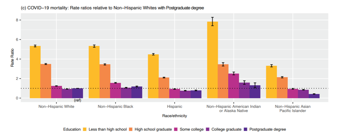
It is interesting to note that within educational categories, Hispanic mortality rates were consistently lower than rates among Non-Hispanic Whites. This suggests that the overall increased mortality rates experienced by Hispanics is driven in large part by their overrepresentation in more disadvantaged education groups. Similarly, for the non-Hispanic Black population, their equivalent mortality rates to Non-Hispanic Whites in the two lowest educational strata, and their only slightly elevated risk in the higher educational strata suggests that it is the inequities in educational distribution that drive the overall higher crude rates among the non-Hispanic Black vs non-Hispanic White populations.

This provides evidence that COVID-19 deaths are connected to education more so than race/ethnicity. This, of course, isn’t causation, as education level is likely a marker for risk factors of COVID-19 such as health habits and employment.

This paper also supplies a nice example of Simpson’s paradox. Graph 1b provides mortality rates per 100,000 by race/ethnicity (157  Non-Hispanic White, 199 Non-Hispanic-Black, 171 Hispanic). By education category the Hispanic population had lower death rates than Non-Hispanic White, but in the aggregate it is the other way around.

What is the connection between life expectancy and education?

The PNAS paper Life expectancy in adulthood is falling for those without a BA degree, but as educational gaps have widened, racial gaps have narrowed by Anne Case and Angus Deaton (3/16/2021) provides an answer. From the abstract:

We construct a time series, from 1990 to 2018, of a summary of each year’s mortality rates and expected years lived from 25 to 75 at the fixed mortality rates of that year. Our measure excludes those over 75 who have done relatively well over the last three decades and focuses on the years when deaths rose rapidly through drug overdoses, suicides, and alcoholic liver disease and when the decline in mortality from cardiovascular disease slowed and reversed. The BA/no-BA gap in our measure widened steadily from 1990 to 2018. Beyond 2010, as those with a BA continued to see increases in our period measure of expected life, those without saw declines.

By 2018, intraracial college divides were larger than interracial divides conditional on college; by our measure, those with a college diploma are more alike one another irrespective of race than they are like those of the same race who do not have a BA.

The appendix has 7 graphs including the one copied here. A few observations: Hispanics with a BA have a greater life expectancy by sex. In fact, a Hispanic female with no BA has a life expectancy similar to that of a White Male with a BA. The gap in life expectancy between Black and White by sex is about the same by BA/no BA (about 1 year in all 4 cases) but the gap between those with a BA and those without is larger.  For example, a Black male with a BA lives almost 3 years longer than a White male without a BA. This is about 2 years for women.  The no BA group has seen decreasing life expectancy, in general, since about 2010, while the BA group has continued with an increasing life expectancy.

I didn’t find the data in the appendix but there is an email to contact an author and they may provide it if you ask.

What is the distribution of global income?

The Our World in Data article How much economic growth is necessary to reduce global poverty by Max Roser (2/15/2021) includes the graph copied here. Note that all countries incomes are adjusted for price differences so it is fair comparison from county to country. It is easy to forget how much wealthier the U.S. is compared to almost all other countries.

The reason why such substantial economic growth is necessary for reducing global poverty is that the average income in many countries in the world is very low: 82% of the world population live in countries where the mean income is less than $20 per day.

There are three other graphs in the article, which is suitable for a QL based course. There isn’t data associated with these particular graphs but there are links at the top of the article with related economic data.

Why did wages grow in 2020?

The EPI article, Wages grew in 2020 because the bottom fell out of the low-wage labor market, by Elise Gould and Jori Kandra (2/24/2021) provides insights into changes in the labor market this past year. Key find:

Wages grew largely because more than 80% of the 9.6 million net jobs lost in 2020 were jobs held by wage earners in the bottom 25% of the wage distribution. The exit of 7.9 million low-wage workers from the workforce, coupled with the addition of 1.5 million jobs in the top half of the wage distribution, skewed average wages upward.

There are seven graphs or tables in the article with the associated data. The last two graphs are of the same type as the one copied here but for the 2000 and 2008 recessions, respectively.

Is this chart misleading?

The U.S. Bureau of Labor Statistics posts the chart (partially) copied here and last updated Sept 2020. An initial look at the graph and we see that the top 5 each have a median pay higher than the median pay in the U.S. (about $35k), but this is based on growth rate. On the other hand, if we look at the number of jobs the top 5 here are predicted to create, Table 1.3 from the BLS, we get 152.2 thousand jobs.  The sixth job on this list, home health and personal care aides, has a below median pay but is predicted to create 1,159.5 thousand jobs. There are 30 jobs listed in table 1.3 and home health and personal care aides represents about 45% of predicted new jobs created on this table. One can download the data in table 1.3 in an xlsx file.

How are the top 0.1% doing?

The EPI article Wages for the top1% skyrocketed 160% since 1979 while the share of wages for the bottom 90% shrunk by Lawrence Mishel and Jori Kandra (12/1/2020) reports:

As Figure A shows, the top 1.0% of earners are now paid 160.3% more than they were in 1979. Even more impressive is that those in the top 0.1% had more than double that wage growth, up 345.2% since 1979 (Table 1). In contrast, wages for the bottom 90% grew only 26.0% in that time.

The top 0.1% go off the chart. There are two other tables of data nd the data for the chart copied here is available.

How many people live in poverty?

It depends on what we mean by poverty.  The World Bank blog post A quarter of the world lives in societal poverty by Marta Schoch, Dean Mitchell Joliffe, & Christoph Lakner (12/2/2020):

Measures of absolute poverty, such as poverty at the US$1.90US$3.20 and the US$5.50 international poverty lines, have the advantage of remaining fixed (in constant dollars), allowing one to measure poverty against the same benchmark over time and across countries. However, when countries set their own national poverty lines, they typically increase the real value of these lines as their economies evolve.

The absolute poverty line  misses the fact that “the ability to participate in society is costlier in richer countries.”  So,

In 2018, the World Bank introduced a Societal Poverty Line (SPL),

The SPL is a hybrid line, combining the US$1.90-a-day absolute poverty line with a relative component that increases as median consumption or income in an economy rises.

The SPL is the max of US$1.90 and US$1+ 0.5*median, where median is the daily median income or consumption per capita in the household survey.

The is more information and other graphs in the article.

How do we compare the racial differences in home ownership?

To address this question we start with a recent post by Kevin Drum (10/23/2020): Are Black Homeowners Suffering from Slow Price Growth?

There’s no question that homes in majority-Black neighborhoods are undervalued compared to similar homes in majority-White neighborhoods, but do they also appreciate more slowly?

The article goes through four charts with the last one copied here.

However, if I were forced to choose one of these as the most telling, I’d take the Zillow chart since its data covers the entire nation and it provides a useful time series that fits what I know about the bubble-era lending industry—although I’d sure like to see it extended to the present. It shows that over a somewhat longish term, home appreciation has been lower in Black neighborhoods than in white neighborhoods, primarily because of a huge drop following the housing bubble. The culprit here, however, is not Black neighborhoods per se, but the mortgage industry, which oversold to Black borrowers during the bubble and drove prices far higher than even normal bubble standards. That wretched episode has been documented in considerable detail in a lot of places, but you can read a good outline here if you want to learn more.

One of the articles linked to is Devaluation of housing in black neighborhoods, Part 2: Appreciation by Joe Cortright (7/24/2019):

A key question the Brooking’s report leaves unanswered is whether the black/white housing differential is larger or smaller than it was 10 or 20 years ago.  If it was larger in the past and is smaller today, that implies that homes in majority black neighborhoods, although still undervalued relative to homes in predominantly white neighborhoods, have enjoyed greater relative appreciation. From the standpoint of wealth creation, the amount of appreciation since you bought your home is likely to matter more than whether the current price of your house is more or less than otherwise similar properties. Another way of expressing this is that homeowners in black neighborhoods had a lower purchase price (or basis) in their home, and even though it is still undervalued, it may have gained more value in percentage terms than homes in non-majority black neighborhoods.

Indeed, Dan Immergluck and his colleagues at the Georgia State University found that for those who bought homes in 2012, price appreciation for black homebuyers from 2012 through 2017 was higher than for white homebuyers.  Immergluck’s data show that in most markets, homes bought by black buyers appreciated more than homes bought by white homebuyers.

This article also references the Zillow study,  A House Divided – How Race Colors the Path to Homeownership by Skylar Olsen (1/15/2014), which includes a number of graphs related to homeownership by race. As Drum notes it would be nice if this study was updated.

What is the connection between poverty and extracurricular activities?

The Census Bureau post Even Short-Term Spells of Poverty Lower School-Aged Children’s Involvement in Extracurricular Activities by Brian Know (9/23/2020) quantifies the challenges of students  due to even temporary spells of poverty.

The percentage of children ages 6 to 11 taking lessons was significantly different between those who were in poverty some months in the year (22.5%) and those in poverty the entire year (16.2%).

Among children ages 12 to 17, involvement in lessons did not differ between children in poverty some months compared to all months in the year.

Similar to involvement in sports, taking lessons was more common in both age groups among children who did not experience any poverty compared to children who experienced poverty some months in the year.

There are links to data sources and two other graphs.

What is median household income by race and ethnicity?

The EPI article Racial disparities in income and poverty remain largely unchanged amid strong income growth in 2019 by Valerie Wilson (9/16/2020) reports the data from the Census Bureau on income and poverty in the graph copied here.

…real median household income increased 10.6% among Asian households (from $88,774 to $98,174), 8.5% among Black households (from $42,447 to $46,073), 7.1% among Hispanic households (from $52,382 to $56,113), and 5.7% among non-Hispanic white households (from $71,922 to $76,057), …

There is a second graph on poverty rates and data is included for both graphs, as well as a link to the original Census Bureau data.