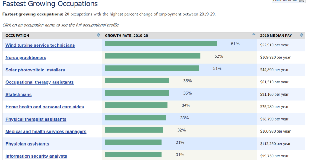
The U.S. Bureau of Labor Statistics posts the chart (partially) copied here and last updated Sept 2020. An initial look at the graph and we see that the top 5 each have a median pay higher than the median pay in the U.S. (about $35k), but this is based on growth rate. On the other hand, if we look at the number of jobs the top 5 here are predicted to create, Table 1.3 from the BLS, we get 152.2 thousand jobs. The sixth job on this list, home health and personal care aides, has a below median pay but is predicted to create 1,159.5 thousand jobs. There are 30 jobs listed in table 1.3 and home health and personal care aides represents about 45% of predicted new jobs created on this table. One can download the data in table 1.3 in an xlsx file.
Tags data source income inequality QL
Check Also
What is the male vs female grip strength difference?
Grip strength is one of the factors measured in the National Health and Nutrition Examination Survey …

