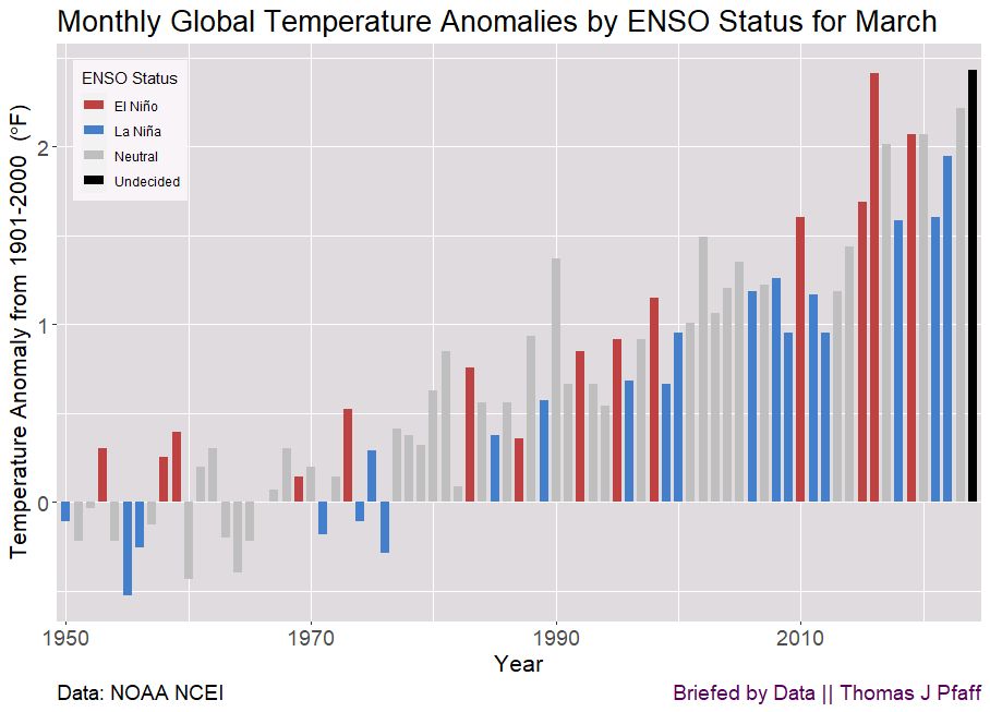
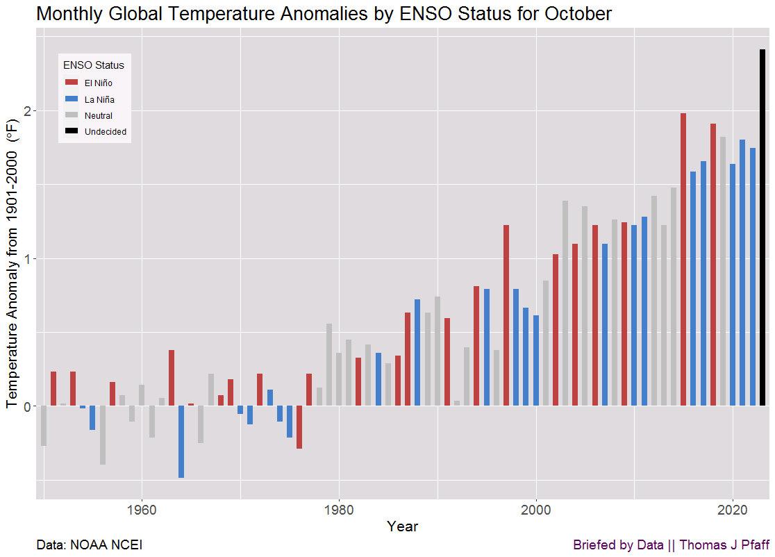
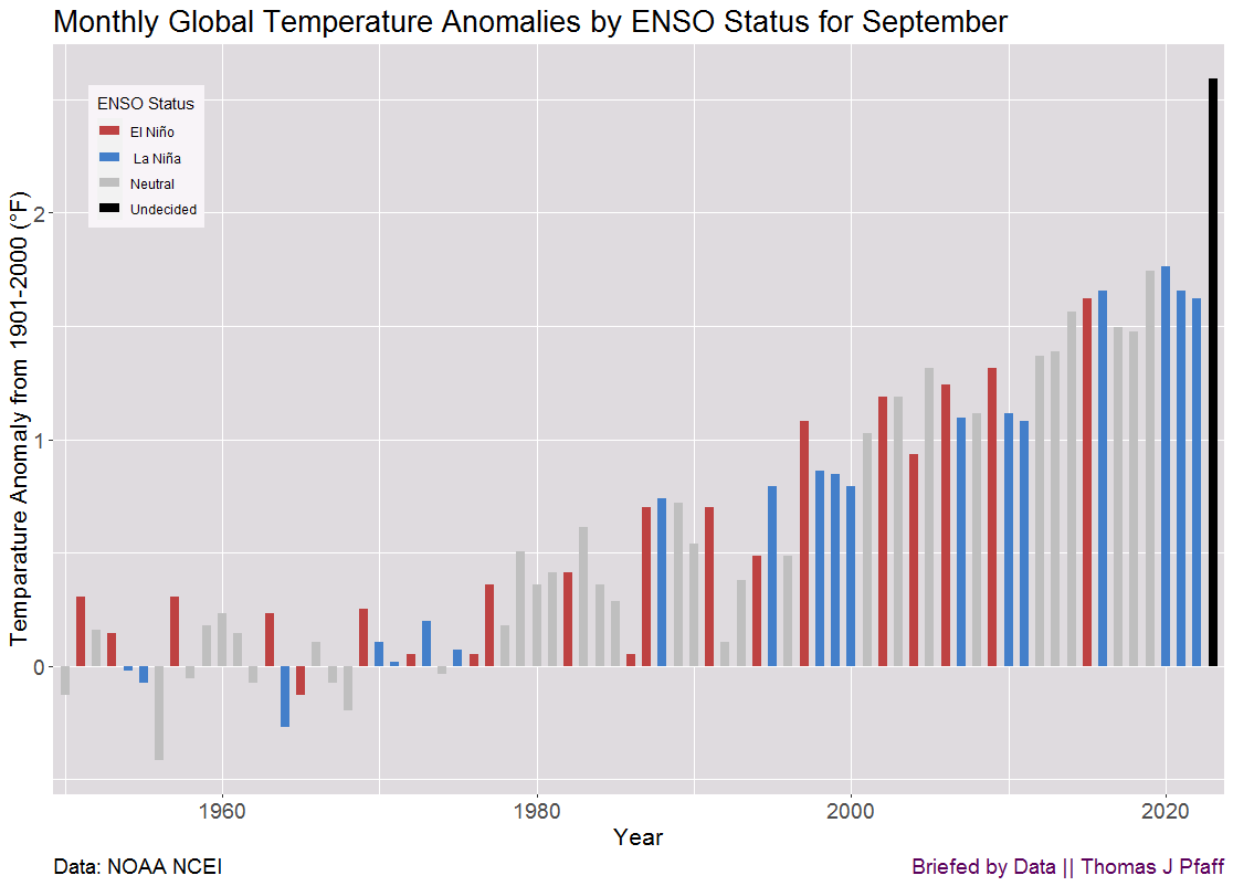
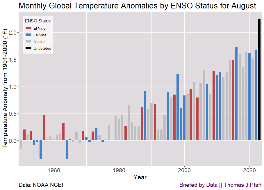
Note: Please be aware that I mostly post on my Briefed by Data substack. If you like sustainaiblitymath then you may very well like Briefed by Data. For example, this graph and one with all months can be found in this post. Please check it out.
As you can see, May 2024 was a record for May, but when we look at all months, the El Niño effect is clearly fading. In the all-month graph, the May 2024 anomaly is in line with recent neutral conditions. Here is what NOAA had to say about May 2024. It is almost as if you can predict ENSO by the monthly anomaly
May had a record-high monthly global ocean surface temperature for the 14th consecutive month. El Niño conditions that emerged in June 2023 were replaced by ENSO-neutral conditions during the past month, and according to NOAA’s Climate Prediction Center La Niña is favored to develop during July-September (65% chance) and persist into the Northern Hemisphere winter 2024-25 (85% chance during November-January).
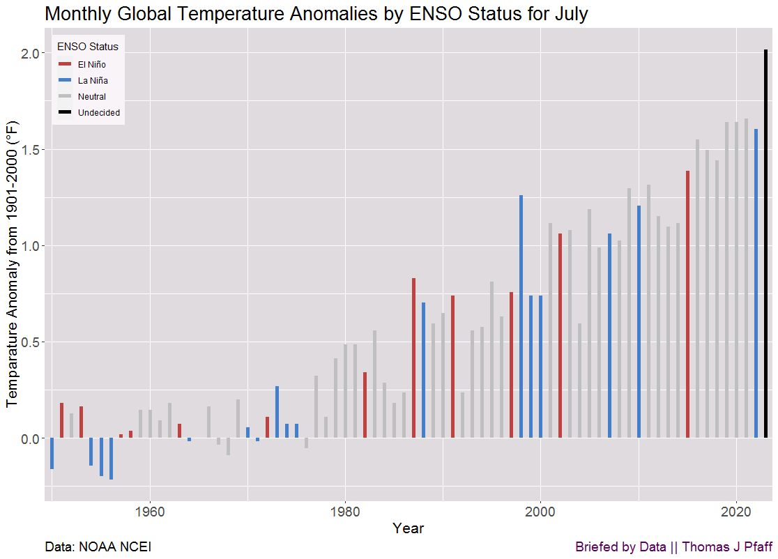
Time series data can be found at the top of the NOAA page.