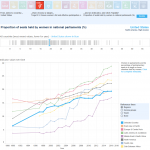
Tag Archives: data source

No El Nino, Yet 2017 on Track to be 2nd-Hottest

Climate Central reports, At Midway Point 2017 Is 2nd-Hottest Year on Record, and notes in the first line that this is a surprise given it is not an El Nino year (graph here is by and links to NASA).

“Personally, I wasn’t expecting it to be as warm as it has been,” Ahira Sanchez-Lugo, a National Oceanic and Atmospheric Administration climate scientist, said in an email. “After the decline of the strong El Niño I was expecting the values to drop a bit and rank among the top five warmest years. This year has been extremely remarkable.”

According to NOAA we just had the second hottest June with the hottest three Junes occurring in the last three years. You can get the data for June since 1880 from NOAA here and details about June  from their Global Climate Report  – June 2017.

Life Expectancy by Health Expenditure with Comments on Differences by Race

Our World in Data has an interactive graph of life expectancy by health expenditure for a number of countries, with downloadable data. The U.S. spends more money per person on health care, by far, than the other countries represented, without corresponding gains in life expectancy. At the same time, there are large differences in life expectancy by race in the U.S.  For example, the 2013 CDC National Vital Statistics Report life tables has life expectancy at birth for Non-Hispanic Black males of 71.9 years, which would be at the bottom of the chart.  Hispanic females are at the top in the U.S. with a life expectancy at birth of 84.2 years; a 12.3 year difference (data on page 3 here).  At the same time, the money spent on health care is also not likely to be equally distributed. The CDC is a source of life expectancy data and if you ask them they might have excel files. For an example of using life expectancy data, here is a 2012 paper Period Life Tables: A Resource for Quantitative Literacy published in Numeracy and freely available.

Where Do Carbon Emissions Go?

Where do carbon emissions go seems like an obvious question. Into the air of course. If so, then one would expect a near perfect linear relationship between emissions and atmospheric CO2.  The graph here has yearly carbon emissions in million tonnes per year (as reported by the Global Carbon Project)  vs atmospheric CO2 in ppm from Mauna Loa (see data in the calculus project page).  The graph may not be as linear as expected and, while maybe some of it is explained by issues of mixing in the atmosphere or the need for a lag, part of the answer is based on where the carbon goes after it has been emitted.  A recent NYT article, Carbon in the Atmosphere is Rising – Even as Emissions Stabilize, sheds some light on the issue:

Scientists have spent decades measuring what was happening to all of the carbon dioxide that was produced when people burned coal, oil and natural gas. They established that less than half of the gas was remaining in the atmosphere and warming the planet. The rest was being absorbed by the ocean and the land surface, in roughly equal amounts.

In essence, these natural sponges were doing humanity a huge service by disposing of much of its gaseous waste. But as emissions have risen higher and higher, it has been unclear how much longer the natural sponges will be able to keep up.

In fact, much of the carbon is absorbed in the ocean and land surface, and that will add variability to the relationship. The Global Carbon Project has this data available and it can be used by teachers. Go to their page and click on the global budget link for the data, which includes ocean and land sinks of carbon.  If you want the data that created the graph on this page go here.

Life Expectancy vs Income Per Person

With health care in the news, let’s take a look at the knowledge that can be gained by using Gapminder. For example, the graph here is life expectancy vs income per person for 2015, with the bubbles representing population size of the country. Can you guess the bubble for the U.S.? Go to the graph on Gapminder to find out.  As a bonus their is a play button so that the graph will scroll from 1800 to 2015. You will also find a number of tools to change the graph and create others. All the data used by the Gapminder graphs is located on their data page.

Employment Report for the Class of 2017

EPI released a must read report early this month titled the Class of 2017. This is a long report with 17 graphs of historical trends, with data, related to employment of recent college grads. For example, figure F provides unemployment rates for young college graduates by race and ethnicity (Black, Hispanic, and White). The graph provides historical trends and notes that young graduates of color have higher unemployment rates. Other highlights from the report:

The overall unemployment rates and idling rates of young graduates mask substantial racial and ethnic disparities in these measures.

Young graduates are burdened by substantial student loan balances.

The wage gap between male and female young high school graduates has narrowed since 2000, while the wage gap between male and female young college graduates has widened.

Wages have stagnated—or fallen—for most young graduates since 2000.

There is an abundance of information and data in this report that can be used in math or QL based courses.

Data Spotlight: Employment and Wages by Race and Gender

The Economic Policy Institute has a State of Working America Data Library. Here you will find downloadable excel files on employment and wages by race and gender.  For example, you might be interested in the median hourly wages for men and women over time (see the graph – you can guess which is women and men). Not only is the data suitable for regression, but also for rich discussion on equality and policy.  This data set will get added to the statistics material pages.

Energy Data

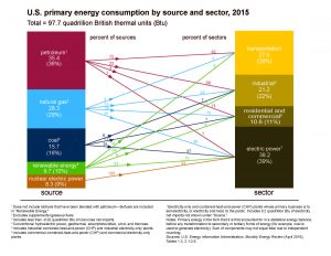
If you are looking for U.S. energy data then visit the EIA’s Monthly Energy Review.  If you are interested in coal or renewable energy, nuclear or natural gas, or consumption by sector, the data is there. You can choose from pdf files or excel files and each data set has an interactive graph link.  All data sets are historical providing an abundance of time series. On the right sidebar are interesting graphs like the one here that are archived dating back to 1996. Enjoy.

World Development Indicators: Proportion of seats held by women in national parliaments

If you are looking for graphs and data on a variety of sustainability issues you should look at the World Bank’s Sustainable Development Goals – World Development Indicators 2017. The site contains interactive related to 17 development goals. For example, the chart here (downloaded from the site) is the proportion of seats held by women in national parliaments. The U.S. is the bold light blue line. You can also download the data to be analyzed.