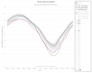
Tag Archives: data source

How well is the world achieving its Sustainable Development Goals – gender equity edition?

You can find out with Our World in Data’s Sustainable Development Goals tracker.

In 2015 the world set a new sustainable development agenda, pledging within the United Nations (UN) to achieve 17 development goals by 2030: The Sustainable Development Goals (also known as The Global Goals). Ranging from eradicating poverty, to ensuring clean energy for all, to reaching sustainable levels of consumption, the array of targets across these goals were selected to drive our efforts in the 15 years up to 2030.

Our World in Data has data for all 17 goals on their SDG page.  For example, their Goal 5: Achieve gender equality and empower all women and girls page has 24 charts including the one posted here on unmet need for contraception. As is always the case with Our World in Data, each chart has easy access to the data and you can download their graphs.

What is the state of Arctic Sea Ice?

We are within about a month of the peak of Arctic sea ice in its yearly cycle of freezing and thawing. At the moment, sea ice is at a record low (see chart) tracking close to 2017 and 2016, where as 2012 holds the record for the lowest extent of ice. NSID has an interactive real time chart (the last data point here is Feb 25) where you can select any and all years from 1979 to the present and download the graph. The data can be downloaded in an Excel spreadsheet from their Sea Ice Data and Analysis Tools page where they also have links to animations.  There are materials in both the Calculus Projects and Statistics Projects pages using this data.

How does income inequality differ by country over time?

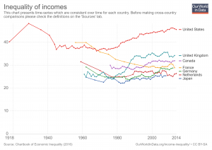
Our World in Data has an interactive chart that compares income inequality with gini coefficients. For example the chart here has the United States, United Kingdom, France, Germany, Netherlands, and Japan (you can select other countries too). Of these six countries the U.S. has greater income inequality than the other five.  It has also grown considerably since the mid 1970s.  As always with Our World in Data, you can download the data set so it can be used in statistics courses. You can also download graphs, such as the one here.

What is the history of manufacturing employment in the U.S.?

We can answer this question by using FRED. The accompanying graph was created with FRED’s graphing tool (see below for a quick tutorial on creating this graph), which creates an interactive graph that can be downloaded along with the data. The blue line represents total manufacturing jobs, which consistently decreases during a recession (gray bands). Manufacturing jobs peaked in 1979 at just below 20 million and now stand at about 12.5 million. The red line provides another perspective and represents the percent of manufacturing jobs relative to all employment.  In the 1940s manufacturing represented almost 40% of all employment. It has been decreasing ever since and today it is down to around 8.5%.

How to create the graph: Start by searching FRED for manufacturing employment. You should get this.  On the upper right click edit graph and then add line (second button on top). Search employment and click on All Employees: Total Nonfarm Payrolls.  Add the data series. Go to format (third button across the top)  and click right under y-axis position for LINE 2.  Now go to edit line 2 (first button across the top). Under customize data search manufacturing. Click All Employees: Manufacturing. In formula type b/a. Now click add next to All Employees: Manufacturing.  This does it. FRED offers a powerful tool.

What do you know about historical unemployment by race?

The data, from the U.S. Bureau of Labor Statistics, and a graph by FRED can enlighten you. FRED has Black, Hispanic, and White unemployment data since 1973.  Here we downloaded the graph since the end of the 2008 recession. At its peak (about March 2010) Black unemployment (16.8%) was about twice that of White (8.9%), while Hispanic unemployment was about 50% greater at 12.9%.  Currently, Dec 1017, the spread isn’t as bad but the relationships still exists with unemployment rates at 6.8% (Black), 4.9% (Hispanic), and 3.7% (White). The FRED graph is interactive and you can download the data.

How has the black/white earnings gap changed over time?

Kevin Drum has the answer with his post Black Incomes Have Fallen Further Behind Whites for the Entire 21st Century.

Black men have made essentially no progress in the past four decades, while black women have fallen considerably further behind. Since 2000, both both men and women have fallen further behind their white counterparts.

There are two other graphs and he notes:

Black households made income and wealth gains up through about 2000, but since then have gone backwards. Any way you look at this, the gap between blacks and whites has gotten worse throughout the entire 21st century. Anyone who doesn’t understand why the African-American community has seemingly become more despairing of racial progress lately should take a look at this.

The data for the graph here comes from FRED. If you haven’t used FRED it is an excellent resource.  To get you started with FRED by comparing black vs white earnings (not separated by gender)  go here and then click on edit graph. Add the series LEU0252883700Q under customize data. Then under formula type a/b.  You should get the graph below. You can then download the data and graph.

How hot was the U.S. in 2017?

According to NOAA’s article, Assessing the U.S. Climate in 2017, it was the third hottest year on record for the U.S. It also wasn’t an El Nino year. In summary,

This was the third warmest year since record keeping began in 1895, behind 2012 (55.3°F) and 2016 (54.9°F), and the 21st consecutive warmer-than-average year for the U.S. (1997 through 2017). The five warmest years on record for the contiguous U.S. have all occurred since 2006.

For the third consecutive year, every state across the contiguous U.S. and Alaska had an above-average annual temperature. Despite cold seasons in various regions throughout the year, above-average temperatures, often record breaking, during other parts of the year more than offset any seasonal cool conditions.

The article has other useful graphs and information, including a summary for December.  Related data is linked to their Climatological Rankings page.

What would minimum wage be if it grew with productivity?

According to the 3rd chart of EPI’s Top Charts of 2017, U.S. minimum wage would be $19.33 per hour if it grew at the same rate as productivity.  If it simply grew at the rate of average workers it would be $11.62 per hour.

The expectation that the minimum wage rise in step with broader trends in the economy would not have been unreasonable for previous generations—that was the trend throughout the 1950s and 1960s. Today’s minimum wage workers have been harmed both by the failure to raise the minimum wage in step with pay for typical workers and by the huge and growing gap between these nonsupervisory wages and economy-wide productivity. The Raise the Wage Act of 2017 would raise the federal minimum wage to $15 by 2024. Such a raise would certainly bring the pay of minimum wage workers closer to providing a decent quality of life, even though it would still fall short of what the economy could have delivered for low-wage workers over the past 50 years.

All twelve of EPI’s Top Charts of 2017 include data and you can download the chart.

Is there a wealth gap due to discrimination?

The EPI provides evidence for yes in the 6th of their top charts of 2017, The racial wealth gap is the clearest legacy of past discrimination in housing markets. Their chart shows the differences for mean and median household wealth for black and white households. They key is housing:

Besides facing discrimination in employment and wages, black families historically have been shut out of the most important wealth-building market: housing. Overall, home equity makes up about two-thirds of all wealth for the typical household. In short, for median families, the racial wealth gap is overwhelmingly a housing wealth gap. And this housing wealth gap is no accident; it is the outcome of intentional policies at all levels of government, in particular housing policies that prevented blacks from acquiring land, created redlining and restrictive covenants, and encouraged lending discrimination. These policies created and reinforced the racial wealth gap we are still struggling to address.

You can download the data and graph for all of EPI’s top charts of 2017.

In which city has winter warmed the most?

Find out by going to Climate Central’s post, See How Much Winters Have Been Warming in Your City.  The winner is Burlington, Vermont, with about 7 degrees F of warming since 1970 (graph here from the post). There is a drop down menu where you can select from most major cities in the U.S. They don’t provide the data, unfortunately, but they do provide a clear methodology so that you can create the data set for your city. You can get weather data from NOAA Climate Data Online. There is great potential here for student projects in statistics courses.