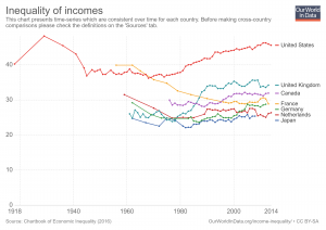
 Our World in Data has an interactive chart that compares income inequality with gini coefficients. For example the chart here has the United States, United Kingdom, France, Germany, Netherlands, and Japan (you can select other countries too). Of these six countries the U.S. has greater income inequality than the other five. It has also grown considerably since the mid 1970s. As always with Our World in Data, you can download the data set so it can be used in statistics courses. You can also download graphs, such as the one here.
Tags data source income inequality social justice
About Thomas J. Pfaff
Check Also
The End is Near
I expect to shut down this site by the end of the summer (2026). I …