Our World in Data has the answer in their post, 50% of the world’s habitable land is used for agriculture. If we all ate like New Zealanders we would need 200% of habitable land, which is supplied in the chart. Simply put, the world all can’t eat like the U.S. The world can’t eat like the countries colored in orange but can with those colored in green. Why?
Livestock takes up nearly 80% of global agricultural land, yet produces less than 20% of the world’s supply of calories. This means that what we eat is more important than how much we eat in determining the amount of land required to produce our food.
There is an association between wealth and diet as can be seen in the chart below, but there are variations.
Nonetheless, there are still large differences in dietary land requirements between countries of a similar income-level. Why, for example, is the requirement for a New Zealander more than double that of a UK citizen, despite them having similar levels of prosperity?
 As always Our World in Data includes the data for each of their charts and there are more than the two here. They also allow you to download the graphics which was done for this post.


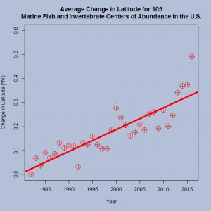
 NOAA’s
  Our World in Data’s article