Tag Archives: data source

How has forest area changed around the world?

Our World in Data answers the question with an interactive chart of forest area by country and regions from 1990 to 2015.  In that time period the world has lost 1.29 million square km of forest area (41.28 to 39.99). On the other hand, the U.S. and China both increased forest area by 0.08 (3.02 to 3.1) and 0.51 (1.57 to 2.08 – a 32% increase) msk respectively, while Brazil lost 0.53 msk (5.47 to 4.94).  As always with Our World in Data, you can download charts (as we did here with our selected countries and regions) and the data.

Why are forest important?  The USDA Forest Service Ecosystem Services page is a starting point to learn more.

Healthy forest ecosystems are ecological life-support systems. Forests provide a full suite of goods and services that are vital to human health and livelihood, natural assets we call ecosystem services.

Many of these goods and services are traditionally viewed as free benefits to society, or “public goods” – wildlife habitat and diversity, watershed services, carbon storage, and scenic landscapes, for example. Lacking a formal market, these natural assets are traditionally absent from society’s balance sheet; their critical contributions are often overlooked in public, corporate, and individual decision-making.

In particular, forests play a role in climate change. Learn more and some basic science from the FAO Forests and climate change Carbon and the greenhouse effect

Is math involved in modeling forest? Yes, The Smithsonian’s National Zoo & Conservation Biology Institute article Using Mathematical Models to Save Forests (3/27/2018) provides one example:

In collaboration with partners from universities in the western U.S., South America and New Zealand, Smithsonian scientists have developed a mathematical model to help understand why certain landscapes are especially vulnerable to losing their forests and the species that rely on them, while others are more resilient.

What economic impacts does some college education have on men?

The article in the Conversation 22 percent of men without college don’t have jobs. Here’s why they’re being left behind. by Erin Wolcott (6/7/2018) makes two points:

But the unemployment rate doesn’t tell the full story because it only includes people actively looking for work. People who report not having looked for work in the previous four weeks are completely left out of this number. The employment rate, which is the share who are actually employed, captures the full picture.

And the numbers are stark. Back in the 1950s, there was no education-based gap in employment. About 90 percent of men aged 25-54 – regardless of whether they went to college – were employed.

The Great Recession was particularly painful for men without any college. By 2010, only 74 percent had a job, compared with 87 percent of those with a year or more of college.

By 2016, from the graph here copied from the article, the gap was 90% vs 78%. For the second point:

The gap extends to the wages of those who actually had jobs as well. As recently as 1980, real hourly wages for the two groups were nearly identical at about US$13. In 2015, men with at least a little college saw their wages soar 65 percent to over $22 an hour. Meanwhile, pay for those who never attended plunged by almost half to less than $8.

The article has another graph for wages. Both graphs are interactive and contain links to download the data. Read the article.

How fast is Antarctica melting (and a quick calculus project)?

A recent NYT article, Antarctica Is Melting Three Times as Fast as a Decade Ago by Kendra Pierre-Louis (6/13/2018), states clearly that Antarctica is melting, well, three times faster than a decade ago, which is a rate of change statement. Rapid melting should cause some concern since:

Between 60 and 90 percent of the world’s fresh water is frozen in the ice sheets of Antarctica, a continent roughly the size of the United States and Mexico combined. If all that ice melted, it would be enough to raise the world’s sea levels by roughly 200 feet.

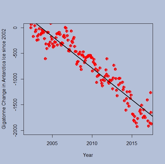
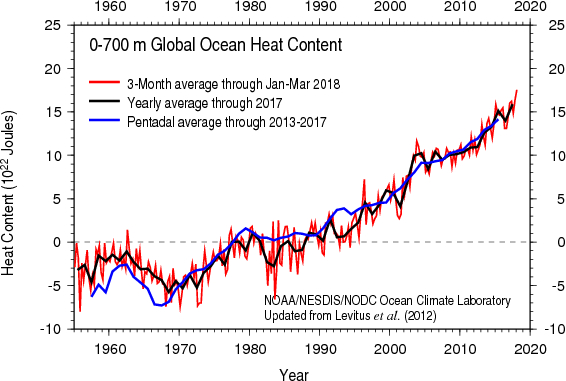
Any calculus student can roughly check the melting statement.  Antarctica ice data is available at NASA’s Vital Signs of the Planet Ice Sheets page. There you can download change in Antarctica ice sheet data since 2002. (Note: The NYT article has a graph going back to 1992, but ends in 2017 as does the NASA data.) A quick scatter plot and a regression line shows that the change is not linear and the data set is concave down. (The graph here is the NASA data and produces in R – the Calculus Projects page now has some R scripts for those interested.)  Now, a quadratic fit to the data followed by a derivative yields that in 2007 the Antarctica was losing 95 gigatonnes of ice per year and in 2017 it was 195.6 gigatonnes per year. Even with this quick simple method melting has more than doubled from 2007 to 2017. The NYT article states:

While that won’t happen overnight, Antarctica is indeed melting, and a study published Wednesday in the journal Nature shows that the melting is speeding up.

This is an excellent sentence to analyze from a calculus perspective. Given that the current trend in the data is not linear and at least about quadratic, then melting is going to increase each year.  On the other hand, maybe they are trying to suggest that melting is increasing more than expected under past trends, for example the fit to the data is more cubic than quadratic. In other words, is the derivative of ice loss linear or something else? If everyone knew calculus the changes in the rate of ice loss could be stated precisely.
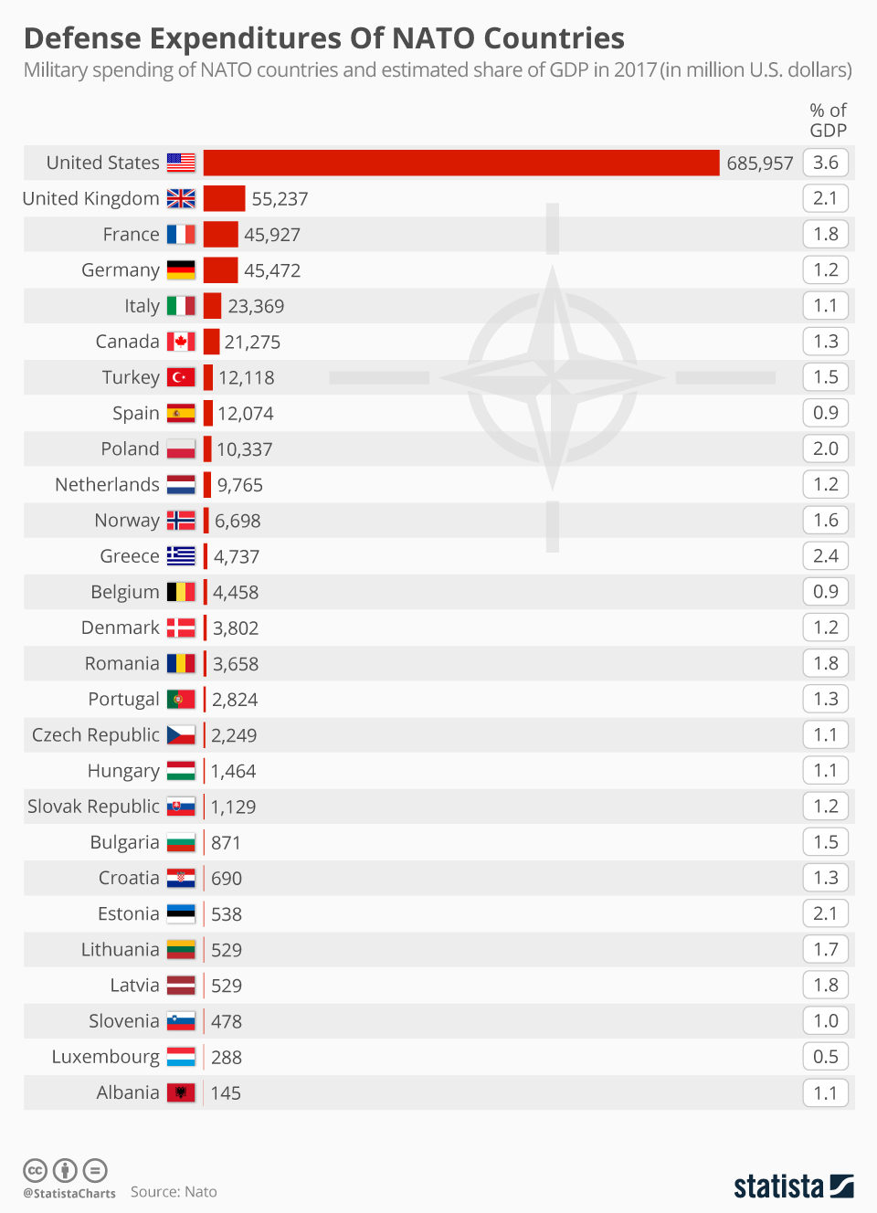
How much are the oceans warming?

A year ago Climate Central posted the article Oceans Are Heating Up with a graph of sea surface temperature anomalies while providing context on issues of ocean warming:

 93 percent of the excess heat absorbed by the climate system goes into our oceans, creating major consequences. While more extreme storms and rising sea levels are some of the impacts of warmer oceans, rising CO2 levels and the resulting warmer oceans are impacting ocean health itself. The most well­ known effects are coral bleaching and ocean acidification, but an emerging issue is the decreasing oxygen levels in the warming waters.

The graph here is from NOAA’s Global Ocean Heat and Salt Content page. There you will find numerous updated graphs related to ocean heat content.  For related data go to NOAA’s Basin time series of heat content page to find about 50 time series on ocean heat.

For context on units, a person at rest typically generates about 60 joules of heat per minute while the graph here has y-axis units of 10^22 Joules.

What are the symptoms of inequality?

The Guardian article, Trump’s ‘cruel’ measures pushing US inequality to dangerous level – UN warns by Ed Pilkington (6/1/18) lists some symptoms two of which are:

Americans now live shorter and sicker lives than citizens of other rich democracies;

The US incarceration rate remains the highest in the world;

The article lacks some data, which we provide here. It is true that incarceration rates in the U.S. are shockingly the highest in the world, see the chart here from the Prison Policy Initiative’s States of Incarceration: The Global Context 2018. But, this isn’t much different than in 2016 as compared to Prison Policy Initiative’s States of Incarceration: The Global Context 2016 report. Both PPI pages have links to the data sets at the bottom as well as other graphs.

As for U.S. life expectancy Our World in Data has an interactive life expectancy graph.  The last year for this graph is 2015, but by that time the U.S. already had a lower life expectancy than other wealthy countries. This graph allows us to choose other countries, has a map version, and a link to download the data.

In short, the symptoms of inequality stated in the Guardian article are not new (at least the two we focused on here), although they may be getting worse. The article is worth wording as well as the PPI report. Also explore the Our World in Data life expectancy graph. There is data and context to connect all this to stats or QL courses.


What is the state of the Rio Grande?

The NYT article, In a Warming West – the Rio Grande Is Drying Up by Henry Fountain (5/24/2018) answers the question.

Even in a good year, much of the Rio Grande is diverted for irrigation. But it’s only May, and the river is already turning to sand.

“The effect of long-term warming is to make it harder to count on snowmelt runoff in wet times,” said David S. Gutzler, a climate scientist at the University of New Mexico. “And it makes the dry times much harder than they used to be.”

With spring runoff about one-sixth of average and more than 90 percent of New Mexico in severe to exceptional drought, conditions here are extreme. Even in wetter years long stretches of the riverbed eventually dry as water is diverted to farmers, but this year the drying began a couple of months earlier than usual. Some people are concerned that it may dry as far as Albuquerque, 75 miles north.

What the article is missing is data. For example, we have here a graph of daily discharge in cubic feet per second at the Albuquerque station (directions below on how to obtain this graph and associated data.).  Note, that the graph is on a log scale and so is there is downward trend in this data?  Since 1991, the Rio Grande hasn’t stopped flowing in Albuquerque, although is came close around 2014.  Other stations farther south have periods of zero discharge. Use the directions below to explore water flow of the Rio Grande at several locations.  The data is naturally collected as a rate and so it is interesting for calculus classes as well as statistics classes.

To obtain water flow data at any USGS station around the country start at the National Water Information System: Mapper (Note: Different sites around the country will have different dates and type of data available.) Click on any of the sites to get a window with a link to access the data.  The graph here comes from selecting the USGS 08330000 RIO GRANDE AT ALBUQUERQUE, NM station. On that page under Available data for this site  select Time series: Current/Historical observations. For this specific graph we selected a time frame for the whole data set and selected Graph.  You can also select tab-separated file, as well as a few other options.  Further historical data for the Rio Grande can be found at the Rio Grande Historical Mean Daily Discharge Data page.

What is the CEO to worker pay gap?

U.S. Publicly held companies now have to report CEO and median worker salaries (this was part of the Dodd-Frank Wall Street Reform and Consumer Protection Act of 2010) and Bloomberg has an article, Alphabet CEO Page Makes a Tiny Fraction
Compared to Its Median Employee by Alicia Ritcey and Jenn Zhao (5/15/18), with an interactive graph (see image).   Mattel “wins” with a CEO to median worker pay ratio of 4,987-1. Walmart “wins” in the consumer staple category with 1,188-1 ratio.  In the interactive graph there is a button on the top right that hides outliers. This is useful, but be conscious of whether it is on or off.

The Guardian article ‘CEOs don’t want this released’: US study lays bare extreme pay-ratio problem by Edward Helmore (5/16/18)  provides some context and a summary.  The Bloomberg graph is being updated daily.  Rep. Keith Elliston’s staff prepared the report Rewarding or Hoarding? An Examination of Pay Ratios Revealed by Dodd-Frank, which has the data of the first 225 Fortune 500 companies to report and and details on the data collection. The data in the report can be used in statistics courses to test differences by sector.  At some point maybe Bloomberg will post a spreadsheet of the data (one can also ask for it too).

How does the U.S. government spend tax dollars?

Federal government spending is reported on the usgovernmentspending.com website. On the main page you will find this pie chart of fiscal year 2018 (Oct 2017 through Sept 2018). The two biggest categories are health care 22% and pensions including social security 19%, with interest at 6%. For some context you can read  What does the federal government spend your tax dollars on? Social insurance programs, mostly by  D. Desilver (4/4/17).

In fiscal year 2016, which ended this past Sept. 30, the federal government spent just under $4 trillion, and about $2.7 trillion – more than two-thirds of the total – went for various kinds of social insurance (Social Security, Medicaid and Medicare, unemployment compensation, veterans benefits and the like). Another $604 billion, or 15.3% of total spending, went for national defense; net interest payments on government debt was about $240 billion, or 6.1%. Education aid and related social services were about $114 billion, or less than 3% of all federal spending. Everything else – crop subsidies, space travel, highway repairs, national parks, foreign aid and much, much more – accounted for the remaining 6%.

The usgovernmentspending.com page is a maze of information, but you can find plenty of data and charts if interested. For example, you can find total government spending (fed, state, local) data  and charts by categories. There are certainly projects for many courses, including stats, waiting to be created from these pages.

How does air pollution compare by country?

The State of Global Air 2018 has an interactive air pollution graph to compare countries and regions.  Graph and data are both available. For example, the graph here is Average Seasonal Population-Weighted Ozone (ppb) for Canada, Mexico, and the U.S. (in yellow), as well as the global average (in black).   We can select ambient particulate matter pollution and household air pollution from solid fuels, along with most countries or regions. There is also a tab for health impact as the number of deaths (this is not a rate so larger countries will likely have more deaths) related to  the particular air pollution for the selected country. The State of Global Air 2018 explains their methods, has a full report, and maps.

Where does the U.S. rank on the world press freedom index?

According to the Reporters Without Borders index, the U.S. ranks 45 (out of 180) in 2018, just behind Romania and South Korea. Here is what they have to say about the U.S.

US press freedom, enshrined in the First Amendment to the 1787 constitution, has been under increasing attack over the past few years, and the first year of President Donald J. Trump’s presidency has fostered further decline in journalists’ right to report. He has declared the press an “enemy of the American people” in a series of verbal attacks toward journalists, attempted to block White House access to multiple media outlets, and routinely uses the term “fake news” in retaliation for critical reporting. He has even called for revoking certain media outlets’ broadcasting licenses. The violent anti-press rhetoric from the highest level of the US government has been coupled with an increase in the number of press freedom violations at the local level as journalists run the risk of arrest for covering protests or simply attempting to ask public officials questions. Reporters have even been subject to physical assault while on the job. It appears the Trump effect has only amplified the disappointing press freedom climate that predated his presidency. Whistleblowers face prosecution under the Espionage Act if they leak information of public interest to the press, while there is still no federal “shield law” guaranteeing reporters’ right to protect their sources. Journalists and their devices continue to be searched at the US border, while some foreign journalists are still denied entry into the US after covering sensitive topics like Colombia’s FARC or Kurdistan.

You can download their data and since the rankings stared in 2002 you might be able to get  access to past data (some of it is available in their archives). Their methodology is explained and they have an interactive map.