Tag Archives: data source

What do we know about nighttime minimum temperatures?

The recent article on Climate.gov Extreme overnight heat in California and the Great Basin in July 2018 by Rebecca Lindsey (8/8/18) provides an overview in context.

As the NCEI’s Deke Arndt has blogged about before, nighttime low temperatures are increasing faster than daytime high temperatures across most of the contiguous United States. For much of the West and Southwest, July’s record-breaking nighttime heat is a new highpoint in a long-term trend—one that has rapidly accelerated in recent decades. In California, average overnight low temperature in July rose by 0.3°F per decade over the historical record (1895-2018), but since 2000, the pace of warming has accelerated to 1.3°F per decade.

Here is an example of why this matters:

According to Tim Brown, director of NOAA’s Western Region Climate Center (WRCC), it’s a pattern that has serious consequences for wildfires and those who combat them. When temperatures cool off overnight, it’s not just a physical relief for firefighters who may be working in conditions that push the limits of human endurance; fire behavior itself relaxes as temperatures drop, winds grow calmer, and relative humidity rises.

The graph here for California July minimum temperature is from the article. A stats course can have students create a similar graph for their hometown. Go to  NOAA’s Local Climatological Data Map. Click on the wrench under Layers. Use the rectangle tool to select your local weather station. Check off the station and Add to Cart. Follow the direction from their being sure to select csv file. You will get an email link for the data within a day.  Note: You are limited in the size of the data to ten year periods. You will need to do this more than once to get the full data set available for your station.

The map here  shows statewide minimum temperature ranks for July 2018.  It is from NOAA’s National Temperature and Precipitation Maps page.  Under products select Statewide Minimum Temperature Ranks and choose the desired time period.  A map similar to the one in the article can be generated by selecting CONUS Gridded Minimum Temperature Ranks.

How much vacation time do workers get?

Statista put together a chart (copied here) of vacation time for 12 countries selected from OECD data  (see table PF2.3.A) of 42 countries in the post Vacation: Americans Get A Raw Deal by Niall McCarthy (8/8/18). Of the 42 countries listed the U.S. is the only one with a statutory minimum days of paid leave of 0. In fact, only 9 countries have a statutory minimum below 20 days.  The medium number of public holidays is 11, while the U.S. has 10. Four countries tie with the maximum of 15 public holidays.  The statista article notes:

The U.S. remains the only advanced economy that doesn’t guarantee paid vacation. Even though some companies are generous and provide their employees with up to 15 days of paid leave annually, almost one in four private sector workers does not receive any paid vacation, according to the Center for Economic and Policy Research.

What are the recent Mauna Loa CO2 measurements?

NOAA: https://tinyurl.com/y9opmjxg

The  NOAA article Another Climate Milestone on Mauna Loa (6/7/18) provides an overview of CO2 measurement at the Mauna Loa site.  In particular,

Carbon dioxide levels measured at NOAA’s Mauna Loa Atmospheric Baseline Observatory averaged more than 410 parts per million in April and May, the highest monthly averages ever recorded, scientists from NOAA and Scripps Institution of Oceanography at the University of California San Diego announced today.

There is also this point:

From 2016 to 2017, the global COaverage increased by 2.3 ppm – the sixth consecutive year-over-year increase greater than 2 ppm. Prior to 2012, back-to-back increases of 2 ppm or greater had occurred only twice.

Why Mauna Loa?

The Mauna Loa observatory is ideally located for monitoring CO2 and other greenhouse gases in the atmosphere. Situated at more than 11,000 feet above sea level in the middle of the Pacific Ocean, the site gives researchers the opportunity to sample air that has been well-mixed during its passage across the Pacific and, thanks to its altitude, is minimally influenced by local vegetation or local pollution sources.

The article links directly to CO2 data sets and other resources.  The Calculus Projects page here has a Mauna Loa CO2 project and the Misc Materials page has the CO2 movie.

How many people are there and how many can the earth support?

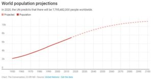
The article in The Conversation 7.5 billion and counting: How many humans can the Earth support? by Andrew D. Hwang (7/9/18) provides some details.  The graph here, copied from the article provides population number and future estimates. 

For real populations, doubling time is not constant. Humans reached 1 billion around 1800, a doubling time of about 300 years; 2 billion in 1927, a doubling time of 127 years; and 4 billion in 1974, a doubling time of 47 years.

On the other hand, world numbers are projected to reach 8 billion around 2023, a doubling time of 49 years, and barring the unforeseen, expected to level off around 10 to 12 billion by 2100.

The article provides a link to download the data and discusses key points related to inequality. For example,

Wealthy countries consume out of proportion to their populations. As a fiscal analogy, we live as if our savings account balance were steady income.

According to the Worldwatch Institute, an environmental think tank, the Earth has 1.9 hectares of land per person for growing food and textiles for clothing, supplying wood and absorbing waste. The average American uses about 9.7 hectares.

These data alone suggest the Earth can support at most one-fifth of the present population, 1.5 billion people, at an American standard of living.

This article is useful for QL and Stats classes, as well as anyone that would like to use population data and/or discuss carrying capacity.

What are the prospects for high school grads?

The EPI article Class of 2018 High school edition by Elise Gould, Zane Mokhiber, & Julia Wolfe (6/14/18) provides a thorough review.  Figure I from the report, copied here, shows 2000 and 2018 wages for high school grads not enrolled in further schooling by race and gender.

In 2018, young workers with a high school diploma have an average hourly wage of $11.85, which translates to annual earnings of around $24,600 for a full-time, full-year worker. This overall average masks important differences in wages by gender and race.

The report has 11 graphs each with data that can be downloaded along with the graph.  A few points from the article:

  • Only 32% of 18-64 have a four year degree or more while 10.5% haven’t graduated high school. (see figure A)
  • The percent of high school grads (18-21) that are employed and not enrolled has increased from 26% in 2010 to 31% in 2018. (see figure c)
  • Over much of the last three decades, wage growth for young high school graduates has been essentially flat. (see figure H)

The first paragraph of their conclusion:

While there may be many reasons someone might choose to enter the labor force after high school rather than attend college, college should at least be a viable option; a person’s economic resources should not be the determining factor in whether they get to go to college. But, as things stand, the prospect of staggering debt may discourage students from less wealthy families from enrolling in further education or prevent them from completing a degree.

Which river basins have the most surface area covered by streams and rivers?

Also, why would we want to know this?  NASA’s Vital Signs of the Planet feature How wide are the world’s rivers?  by Adam Voiland (7/18/18) answers the questions.

Most scientists who study rivers rely on measures of discharge, the volume of water transported through a given cross-section of a river. Much less studied, though critically important, is a river’s total surface area, particularly for scientists trying to understand how carbon dioxide moves between rivers and the atmosphere.

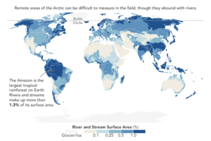
The work has resulted in a  global database of river widths.  The map here, copied from the post, answers the main question:

The map below shows which river basins have the most surface area covered by streams and rivers. The Brahmaputra River in India and Bangladesh, the Amazon in Brazil, and the Lena in Russia are among the widest rivers—and the river networks with the largest surface areas.

Along with the river widths database the article also links to global network of stream gauges for river discharge data.


What is the poverty rate in OECD countries?

The OECD (Organisation for Economic Co-operation and Development) defines poverty as an income below half the median household income. The chart here was created using the most recent year of data from the OECD poverty rate page .  The U.S. leads the pack with a rate of 17.8%, with Israel right behind at 17.7%. At the bottom are Denmark and Finland with rates of 5.5% and 5.8% respectively.  It is important to note, as the OECD does,

However, two countries with the same poverty rates may differ in terms of the relative income-level of the poor.

The data is available for more than OECD countries on their page and there is an interactive graph, but the graph can’t be dowloaded. The data and R script that created the graph here are available: csv file, R script.

Citation for data:OECD (2018), Poverty rate (indicator). doi: 10.1787/0fe1315d-en (Accessed on 11 July 2018)

How much does the U.S. spend on defense compared to NATO countries?

Statista has the answer with their post Defense Expenditures Of NATO Countries by Niall McCarthy (7/11/18). They created the infographic copied here.

The following infographic shows how much money NATO members spend on defense as well as its estimated share of GDP. While Germany spent over $45 billion on its military equating to 1.2 percent of GDP in 2017, the U.S. spend $686 billion – 3.6 percent of GDP.

The U.S. spends more than twice as much on defense as all other NATO countries combined. As a percent of GDP, the U.S. spends twice as much or more than all other countries other than the U.K. The link in the quote goes directly to a pdf file from NATO with data on defense spending by country from 2010 to 2017.

What is the story of suicides in the U.S.?

The article in the Conversation, Why is suicide on the rise in the US – but falling in most of Europe? by Steven Stack (6/28/18), tries to get at the story. The first chart (copied here), clearly shows that the suicide rate rose from 199-2015 overall and considerably more for the 45-54 age group (stats regression problem here).  There is a second chart showing changes in suicide rates in Western European countries:

However, suicide rates in other developed nations have generally fallen. According to the World Health Organization, suicide rates fell in 12 of 13 Western European between 2000 and 2012. Generally, this drop was 20 percent or more. For example, in Austria the suicide rate dropped from 16.4 to 11.5, or a decline of 29.7 percent.

The obvious question is why?

There has been little systematic research explaining the rise in American suicide compared to declining European rates. In my view as a researcher who studies the social risk of suicide, two social factors have contributed: the weakening of the social safety net and increasing income inequality.

The article has two more charts showing that the U.S. is low on Social Welfare Expenditures as a percent of GDP and is high on inequality. In all instances the data is available for download and there are links to the original sources.

How has forest area changed around the world?

Our World in Data answers the question with an interactive chart of forest area by country and regions from 1990 to 2015.  In that time period the world has lost 1.29 million square km of forest area (41.28 to 39.99). On the other hand, the U.S. and China both increased forest area by 0.08 (3.02 to 3.1) and 0.51 (1.57 to 2.08 – a 32% increase) msk respectively, while Brazil lost 0.53 msk (5.47 to 4.94).  As always with Our World in Data, you can download charts (as we did here with our selected countries and regions) and the data.

Why are forest important?  The USDA Forest Service Ecosystem Services page is a starting point to learn more.

Healthy forest ecosystems are ecological life-support systems. Forests provide a full suite of goods and services that are vital to human health and livelihood, natural assets we call ecosystem services.

Many of these goods and services are traditionally viewed as free benefits to society, or “public goods” – wildlife habitat and diversity, watershed services, carbon storage, and scenic landscapes, for example. Lacking a formal market, these natural assets are traditionally absent from society’s balance sheet; their critical contributions are often overlooked in public, corporate, and individual decision-making.

In particular, forests play a role in climate change. Learn more and some basic science from the FAO Forests and climate change Carbon and the greenhouse effect

Is math involved in modeling forest? Yes, The Smithsonian’s National Zoo & Conservation Biology Institute article Using Mathematical Models to Save Forests (3/27/2018) provides one example:

In collaboration with partners from universities in the western U.S., South America and New Zealand, Smithsonian scientists have developed a mathematical model to help understand why certain landscapes are especially vulnerable to losing their forests and the species that rely on them, while others are more resilient.