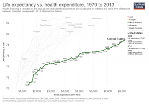
Our World in Data has an interactive graph of life expectancy by health expenditure for a number of countries, with downloadable data. The U.S. spends more money per person on health care, by far, than the other countries represented, without corresponding gains in life expectancy. At the same time, there are large differences in life expectancy by race in the U.S. For example, the 2013 CDC National Vital Statistics Report life tables has life expectancy at birth for Non-Hispanic Black males of 71.9 years, which would be at the bottom of the chart. Hispanic females are at the top in the U.S. with a life expectancy at birth of 84.2 years; a 12.3 year difference (data on page 3 here). At the same time, the money spent on health care is also not likely to be equally distributed. The CDC is a source of life expectancy data and if you ask them they might have excel files. For an example of using life expectancy data, here is a 2012 paper Period Life Tables: A Resource for Quantitative Literacy published in Numeracy and freely available.
Tags data source QL social justice statistics
Check Also
A pause in posting
At the moment, I don’t plan on posting here anymore. The content I used to …
