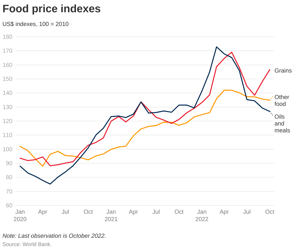
 In a follow up to the last post, How much has sea level risen locally? (12/1/2022), we have the IPCC Sea Level Projection Tool. The NOAA sea level trends tool looks at the historic data and adds linear regression lines. The IPCC tool has projections based on the different IPCC scenarios. For example, when you first land on the page you will see blue dots on a map. A dot with a number means there are a cluster of dots nearby so zoom in. I went to the Miami beach dot. Click on the dot and then click full projections. This will bring you to a page with two interactive maps. The first is a curve of seal level change (relative to the 1995-2014 baseline) projected out to 2150. You can select one of the six IPCC scenarios.
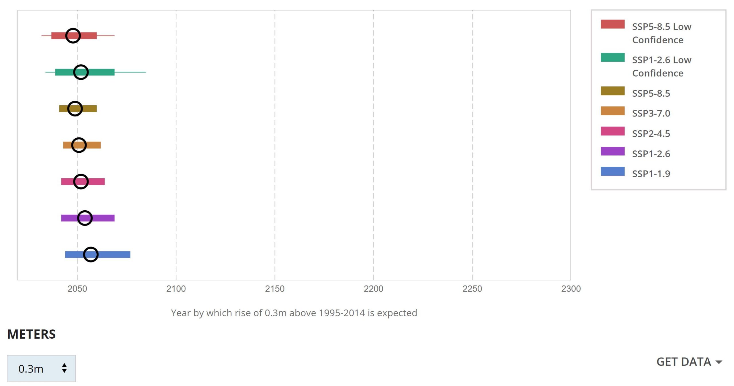
The other graph, seen here, allows you to select an increase in sea level and provides estimates for when that will occur, with the black circle being the median year. The graph here is the data at which we see about one foot of sea level rise in Miami. In both graphs there is a link to download the data.
A related article from NASA, NASA Study: Rising Sea Level Could Exceed Estimates for U.S. Coasts by Sally Younger (11/15/2022) provides some interesting context such as:
The hazards of rising sea level are amplified by natural variabilities on Earth.
For instance, by the mid-2030s, every U.S. coast will experience more intense high-tide floods due to a wobble in the Moon’s orbit that occurs every 18.6 years. Hamlington said that this lunar cycle, in combination with rising sea level, is projected to worsen the impacts of high-tide flooding during the 2030s and 2040s.