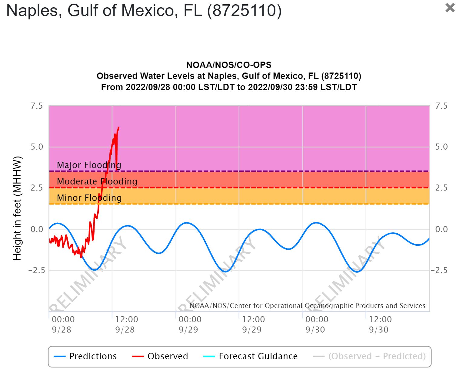
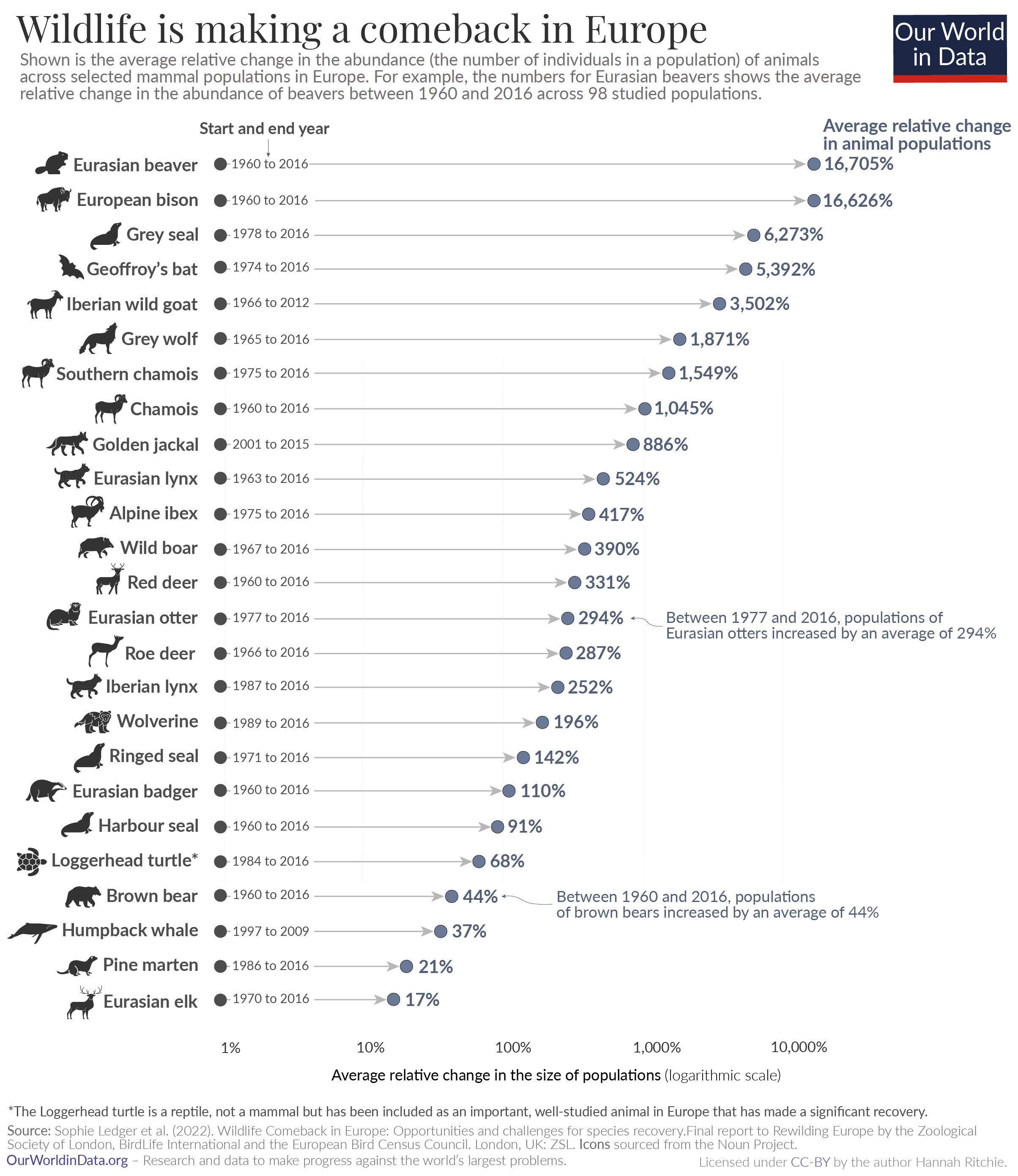
Tag Archives: data source

How much nuclear power does California use?

From the eia article Nuclear power provided about 10% of California’s total electricity supply (9/19/2022) by Slade Johnson and Katherine Antonio:

In 2021, three nuclear power plants supplied about 10% of California’s electricity. Diablo Canyon, located in San Luis Obispo County, is California’s last operating nuclear power plant, and it supplied over 8% of California’s electricity in 2021.

The graph provided is a little misleading because it is in-state generation but

California has the largest state economy in the United States and is the fourth-largest electricity producer in the nation, accounting for about 5% of U.S. utility-scale electricity generation in 2021. Because more electricity is consumed in California than is produced there, about 30% of its electricity supply is imported, and 36% of its nuclear electricity supply is imported,

In a state that an only generate about 60% of its electricity needs, one nuclear plant generates 8% of its needs. The article has links to the data.

How hot was Aug 2022?

From NOAA’s August 20022 Global Climate Report:

The August 2022 global surface temperature departure was the sixth highest for August in the 143-year record at 0.90°C (1.62°F) above the 20th century average of 15.6°C (60.1°F). The ten warmest Augusts on record have all occurred since 2009. August 2022 also marked the 46th consecutive August and the 452nd consecutive month with temperatures, at least nominally, above the 20th century average.

Highlights:

The contiguous U.S. had its eighth-warmest August on record. For the second month in a row, the contiguous U.S. monthly average minimum temperature was record warm.

Spain had its second-warmest August on record after August 2003.

The Royal Meteorological Institute confirmed that Belgium had its warmest August since records began in 1833.

Time series data is available at the top of the page.

What are the economic freedom rankings?

The Fraser Institute does an annual economic freedom report (9/8/2022), which ranks countries and interesting also states in the U.S. The main page includes an explanation of what goes in the economic freedom score. The most recent data, 2020, and the sub scores are available to download. The U.S. ranks as #7 overall, but as you can see by the map here there is considerable variable by state. They have put together an excellent interactive page, which is where the map here comes from, to explore the results in a number of formats. Great Stats/QL information here.

How much corn?

The image (2020), which I find fascinating, is from the NASA earth observatory article Falling for Corn:

The natural-color image above was acquired by the Moderate Resolution Imaging Spectroradiometer (MODIS) on Terra. The map below shows lands that were planted with corn in 2020 (marked in yellow). The map was built from the Cropland Data Layer product provided by the National Agricultural Statistics Service, which includes data from the USGS National Land Cover Database and from satellites such as Landsat 8, ResourceSat-2, and Sentinel-2.

That’s a lot of corn.

In its October 2021 report, USDA noted that corn production was up 3 percent this year, with an estimated 15 billion bushels of corn harvested from 93.3 million planted acres. Record-high yields were reported in ten states, including Illinois, Indiana, Kentucky, Michigan, and Ohio (all shown above).

More than one-third of the world’s corn is grown in the United States, and the largest share of it comes from a swath of land across the Midwest.

Together Iowa and Illinois grow and harvest about one-third of the entire U.S. crop, and each state alone produces more corn than many countries.

If you are looking for data check out the National Agricultural Statistics Service linked in the first quote. If you use GIS the National Land Cover Database is also a good data site. For a QL project, how do we understand 93.3 million acres?

How are teens using social media?

The Pew article Teens, Social Media and Technology 2022 by Emily A. Vogels, Risa Gelles-Watnick, and Navid Massarat (8/10/2022) is filled with data on teen social media use. I was a little surprised by the graph copied here and less surprised by this:

In addition, the share of teens who say they use the internet almost constantly has gone up: 46% of teens say they use the internet almost constantly, up from only about a quarter (24%) of teenagers who said the same in 2014-15.

I found this concerning:

In addition, the share of teens who say they use the internet almost constantly has gone up: 46% of teens say they use the internet almost constantly, up from only about a quarter (24%) of teenagers who said the same in 2014-15.

There are numerous charts and a methodology section. This article seems great for a stats or QL based course.

Where is the CO2 data?

Back to more serious data stuff today. Now, you may have been wondering where to get a visualization and the data for CO2 measurements collected on Mahe Island, Seychelles. All you have to do is start on NOAA’s Global Monitoring Laboratory where you will find a map with a bunch of dots around the world. Each dot represents a monitoring station. When you run the cursor over the data it tells you what data is collected at that location. Click the dot and then select what you’d like on the right sidebar. A new page will open for a few more choices. In the end you can get a graph, such as the one here, and a link to the data. Enjoy.

How hot was July 2022?

From NOAA’s July 2022 Global Climate Report:

The July 2022 global surface temperature departure was the sixth highest for July in the 143-year record at 0.87°C (1.57°F) above the 20th century average of 15.8°C (60.4°F). The five warmest Julys on record have all occurred since 2016. July 2022 also marked the 46th consecutive July and the 451st consecutive month with temperatures, at least nominally, above the 20th century average.

A few highlights:

Most of the contiguous U.S. had warmer-than-average temperatures in July, with several areas experiencing record-warm temperatures this month. July 2022 was the third-warmest July on record for the U.S.

Portugal had its warmest July on record, according to the Portuguese weather service. A station in Pinhão recorded a temperature of 47.0°C (116.6°F) on July 14, setting a new record for the warmest day in July for the country.

Spain had its warmest July on record, as well as its warmest month on record since at least 1961. 29 major weather stations had an average July temperature that was the highest of any month since the beginning of the record in 1961.

Time series data is available at a link near the top of the page.


How much has Western US snowpack changed?

The Bloomberg article The End of Snow Threatens to Upend 76 Million American Lives by Baker et. el. (8/3/2022) has some excellent graphs, such as the one copied here, and overview of the water issues in the west.

The West’s mountain snowpacks have shrunk, on average, 23% between 1955 and 2022. By the end of the 21st century, California could lose as much as 79% of its peak snowpack by water volume.

This impacts all of the US:

The California Rice Commission says only about half of the 500,000 acres of rice typically planted in the state will be grown this year.

California alone accounts for a third of all vegetables grown in the US and two-thirds of the nation’s fruits and nuts.

The article includes a map of CA with charts of current reservoir levels as well as a couple of then and now photos. The data seems to come from the California Data Exchange Center.

Is the U.S. the number 1 carbon emitter per person?

To answer the question Berkeley Earth has an interactive, What is your country’s carbon trend?, where you select a country and you get a table of information and a graph, such as the one copied here. The table of information provides such facts as the U.S. emits 14.2 tonnes per person per year, is the 14th highest, and is 3.2x the world average.  On the other hand, the U.S. cumulative emissions (1850-2020) is 416,723 million tonnes and is the 1st highest.  The  nice part about the interactive is there is a link to the data on the graph.

The link is the same as the post from last Thursday, How much has your country warmed?, and this interactive is just a bit further down the page.

How much has your country warmed?

The Berkeley Earth page Actionable Climate Science for Policymakers has a Country-Level Warming Projections interactive graphic. Select a country and a graph, such as the one here for the U.S. appears. Click on the button below the graph,  View More Details, and you will get extra text information and links to download the graph and the data.

As for the U.S. Berkeley Earth tells us the country has already warmed 1.7 deg C and headed for around 4.3 deg C by 2100,