You may be seeing articles about the Great Salt Lake in the news and how it drying up is an environmental problem. NASA Earth Observatory had a great article last summer, The Great Shrinking Lake, with maps and data about the loss of water.
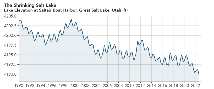
Though water levels in the Great Salt Lake can fluctuate by year, they have generally been declining for decades. At the lake’s highest recorded level in 1986, mean water elevation reached as high as 4,211.6 feet (1,283.7 meters). Since 1986, the lake has dropped about 22 feet, hitting a new record low on July 3, 2022. By August 10, 2022, water levels had dropped slightly more—to 4,189.6 feet (1,276.9 meters).
Now 20 feet may not seem like a lot, but click the NASA link and take a look at the then and now map with the slider. The surface area of the lake had decreased dramatically. The NASA post also has a well-done animated graph. If you want data about the Great Salt Like go to Hydroshare page Collection of Great Salt Lake Data. Daily updated lake elevation and drought maps can be found at the Great Salt Lake Water Level page.