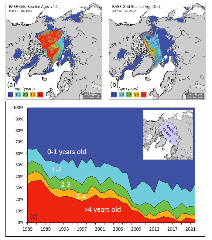
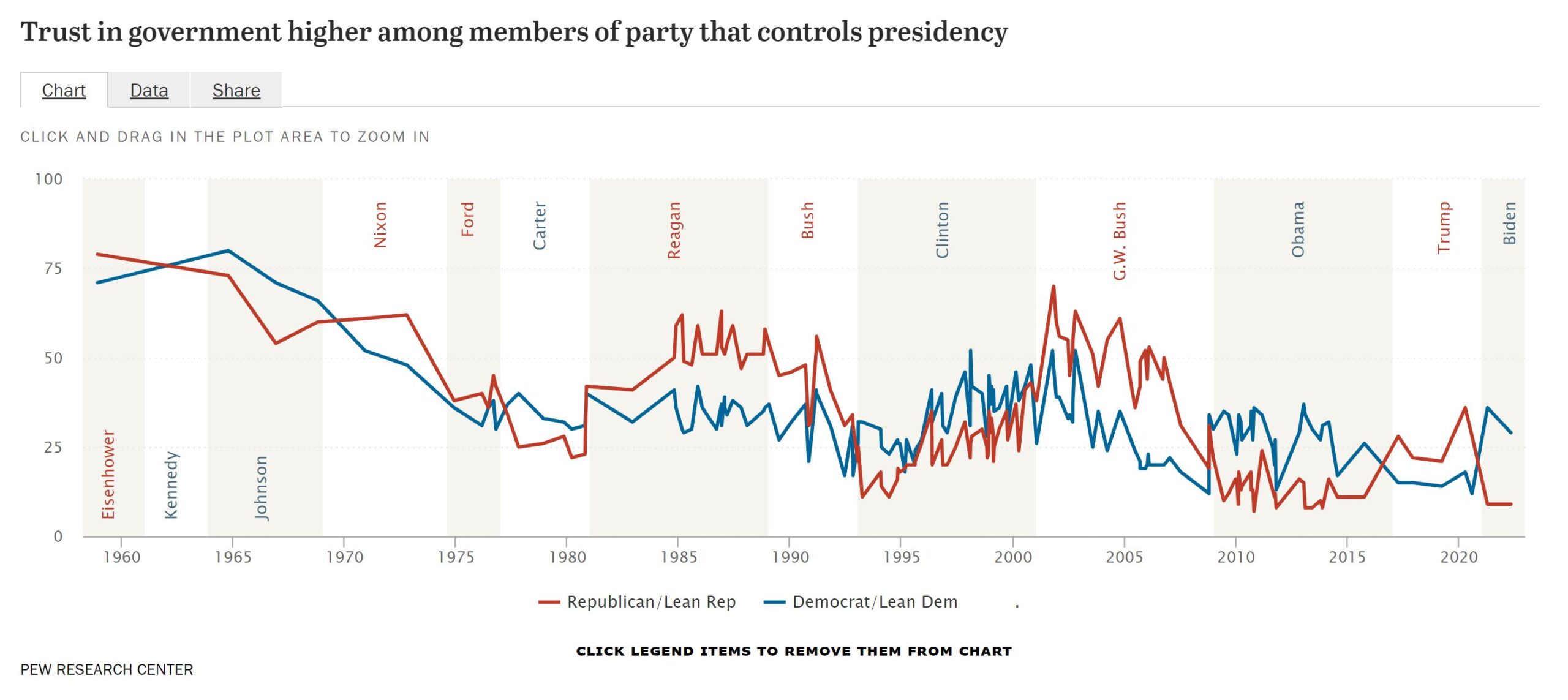
Tag Archives: data source

Is there a relationship between homicide and race?

One more post from the Manhattan Institute’s* Breaking Down the 2020 Homicide Spike by Christos A. Makridis and Robert VerBruggen (5/18/2022). We first note:

Homicides went up throughout the country, and for every major demographic group, in 2020, but they did not rise for everyone equally, as is clear when we break down the numbers by race, age, sex, urbanicity, and region of the country.

Related to figure 3 (copied here) we have this, which is excellent  QL material:

The racial and ethnic breakdown is perhaps most striking in this regard. Proportionally, homicide rates rose by about 34% for black Americans and about 19% percent for non-Hispanic whites: a notable, but not extreme, gap (Figure 3). But since the black homicide rate was already many times higher than the white one, this translated into 8 additional black deaths for every 100,000 population—an increase similar to the total homicide rate for the country as a whole—while the death rate for whites rose by only 0.5 per 100,000. (Recall that these numbers pertain to the homicide victims, not the killers, though American homicide is overwhelmingly intraracial.)

There is a lot to discuss in this article as well as ample quantitative literacy material. There is a discussion of methods and the CDC data they use is easy enough to locate.

* (This is the same note from Monday’s Post) Yes, MI has a clear political leaning but that doesn’t make their work incorrect. Their data and methods are sound here and this should be engaged not ignored. If someone thinks something is incorrect then let me know.


Is there a correlation between Homicide rate and voting?

The Manhattan Institute* has a lengthy report on the increasing homicide rate, Breaking Down the 2020 Homicide Spike by Christos A. Makridis and Robert VerBruggen (5/18/2022), with numerous interesting charts. From the report (figure 7 copied here):

Next, we explore the correlation between two geographic factors—population and GOP vote share—and the growth rate in the homicide rate per capita between 2019 and 2020. Each observation is a county whose size is determined by its population, giving larger counties greater weight. Counties with a higher share of GOP voters not only have lower homicide rates but also a lower growth in homicide rates between 2019 and 2020 (Figures 6 and 7).

There is a positive correlation between population in a county and the growth in the homicide rate, but the correlation between population and just the homicide rate is slightly negative (Figure 8). In this sense, even though there are slightly higher rates of homicide deaths per capita in smaller counties, some of those differences could be driven by spurious factors that are correlated with population.

There is a lot to discuss in this article as well as ample quantitative literacy material. There is a discussion of methods and the CDC data they use is easy enough to locate.

* Yes, MI has a clear political leaning but that doesn’t make their work incorrect. Their data and methods are sound here and this should be engaged not ignored. If someone thinks something is incorrect then let me know.


How hot was April 2022?

From NOAA’s April 2022 Global Climate Report:

The April 2022 global surface temperature was 0.85°C (1.53°F) above the 20th century average and tied with 2010 as the fifth highest for April in the 143-year record. The 10 warmest April months have occurred since 2010, with the years 2014–2022 all ranking among the 10 warmest Aprils on record. This marked the 46th consecutive April and the 448th consecutive month with temperatures, at least nominally, above the 20th century average.

Time series data available at a link at the top of the page.

How much do corporation pay in local taxes?

We tend to think of corporate taxes as a federal issues and less a local issue, but the article Reclaiming corporate tax revenues by Josh Bivens (4/14/2022) in EPI has some key takeaways:

Depending on how it is measured, the effective state and local tax rate on corporate profits shrunk by between a third and a half between 1989 and 2017.

The resulting revenue shortfall is estimated to be at least $43 billion and possibly as high as $57 billion.

The erosion of state corporate income tax revenue has nothing to do with corporations’ ability to pay. Indeed, corporate profits have risen even as corporate tax revenues have declined.

This has real consequences for state and local spending—constraining these governments’ ability to provide basic services to their residents.

State and local (S&L) public investment is more than the Fed:

For most years since 1979—and for all years since 1988—the S&L sector has directed more public investment than the federal government. By 2019 this gap was quite large, with public investment from the S&L sector equaling 2.0% of GDP while investment from the federal government totaled just 0.8% of GDP. In dollar terms, that’s a gap of roughly $220 billion annually.

The article is detailed with numerous charts (and data). Worth reading.


How old is Arctic sea ice?

The NSIDC page Springtime in the Artic (5/3/2022) has a section on sea ice age.

At the end of last summer, the extent of the oldest ice (greater than 4 years old) tied with 2012 for the lowest in the satellite record. This spring, we continue to see a dominance of first-year ice (Figure 4). The percentage of the greater than 4-year-old ice, which once comprised over 30 percent of the Arctic Ocean, now makes up only 3.1 percent of the ice cover.

The page has other graphs and maps related to ice. There is a link in the citations for data related to the graph copied here.


Where do I get a wind rose?

The first question is probably what is a wind rose? Take a look at the graph to see an example of a wind rose. Now you probably want one for your location.  Start at the Iowa State University IEM Site Information page. Select a network based on your state. Click switch network to change the map. You can then select a station by double clicking a dot or using the drop down menu. Once you click select a station you get a new page.  Click the Wind Roses tab to get a selection of wind roses. You’ll get a total data one and ones for each month of the year.  Each wind rose graph has a link to view the raw data, which can be downloaded. You can also generate a custom wind rose by clicking the Custom Wind Roses tab. Climate.gov has some information about the wind roses at Wind Roses from airports around the world – Graphics or Raw Data Tables.

What should get you into college?

The Pew article, U.S. public continues to view grades, test scores as top factors in college admissions by Vianney Gómez (4/26/2022), provides the result of a survey about college admissions:

More than nine-in-ten Americans (93%) say high school grades should be at least a minor factor in admissions decisions, including 61% who say they should be a major factor. Grades are, by far, the criteria the public says should most factor into admissions decisions. This is followed by standardized test scores (39% major factor, 46% minor factor) and community service involvement (19% major, 48% minor), according to a Pew Research Center survey conducted March 7-13, 2022.

By comparison, nearly three-quarters of Americans or more say gender, race or ethnicity, or whether a relative attended the school should not factor into admissions decisions.

There are three graphs in the article, such as the one copied here, and a methodology section.


What is the status of Lake Mead?

Most of the western half of the U.S. continues to have various levels of drought (see U.S. Drought Monitor) and Lake Mead has reached a new low. The graph here is from the data on the Lake Mead at Hoover Dam, End of Month Elevation (feet) page by the Bureau of Reclamation. How low can Lake Mead go before it gets serious?

The Sept Lake Mead post and the July Lake Mead post, which has a link to the R code for the graph.

What are the most important community issues for Black Americans?

The Pew article Race is Central to Identity for Black American and Affects How They Connect With Each Other by Kiana Cox and Christine Tamir (4/14/2022) is report on an extensive survey with about 37 charts and tables such as the one copied here.

When asked in an open-ended question to identify the most important issue in the community they live in, the top issue was violence or crime (17%). This includes Black Americans who listed specific issues such as drug activity, shootings, or theft; but also those who simply listed “violence” or “crime” as the most pressing issues in their communities. Another 11% of Black adults said economic issues such homelessness, poverty and taxes were most important.

How does this compare to the general public?

The Black population’s rating of the most important issue facing the community they live in is only slightly different from that of the general public. Americans overall name economic issues (15%), violence or crime (12%), and COVID-19 and public health (7%) as the most important issues in their community.

As usual, there is a detailed methodology section.


What about methane?

The focus on greenhouse gasses is typically on CO2, but we shouldn’t forget about methane. From the NOAA article Increase in atmospheric methane set another record in 2021 – Carbon dioxide levels also record a big jump (4/7/2022):

For the second year in a row, NOAA scientists observed a record annual increase in atmospheric levels of methane, a powerful, heat-trapping greenhouse gas that’s the second biggest contributor to human-caused global warming after carbon dioxide.

NOAA’s preliminary analysis showed the annual increase in atmospheric methane during 2021 was 17 parts per billion (ppb), the largest annual increase recorded since systematic measurements began in 1983. The increase during 2020 was 15.3 ppb. Atmospheric methane levels averaged 1,895.7 ppb during 2021, or around 162% greater than pre-industrial levels. From NOAA’s observations, scientists estimate global methane emissions in 2021 are 15% higher than the 1984-2006 period.

Methane data links are at the bottom of this Global Monitoring Laboratory page. There is also a methane project on the Calculus Projects page.