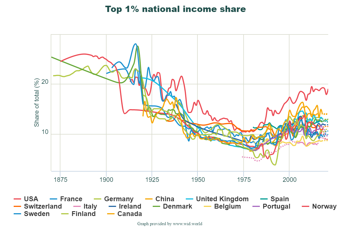
 How we answer this questions depends on what we mean by best and the comparison group. For today we’ll look at the share of income by the top 1% and compare mostly western Europe countries. The graph here is from the world income database. It is good to be in the top 1% in the U.S. where they take home home 19% of the countries income in 2021. China is next at 14%. Note that this is a statement of the share of income and not what the income is.
The link will take you to the page where the graph is from. There is also a map colored by ranges of income by the top 1% and if you click on the country in the map it is added to the time series. The U.S. just missed the top color of 19-31% (I’m assuming it starts at greater than 19). Try to guess the countries in the top category and which one is tops at 31%. There is also a link to download the data, as well as other indicators to choose from.