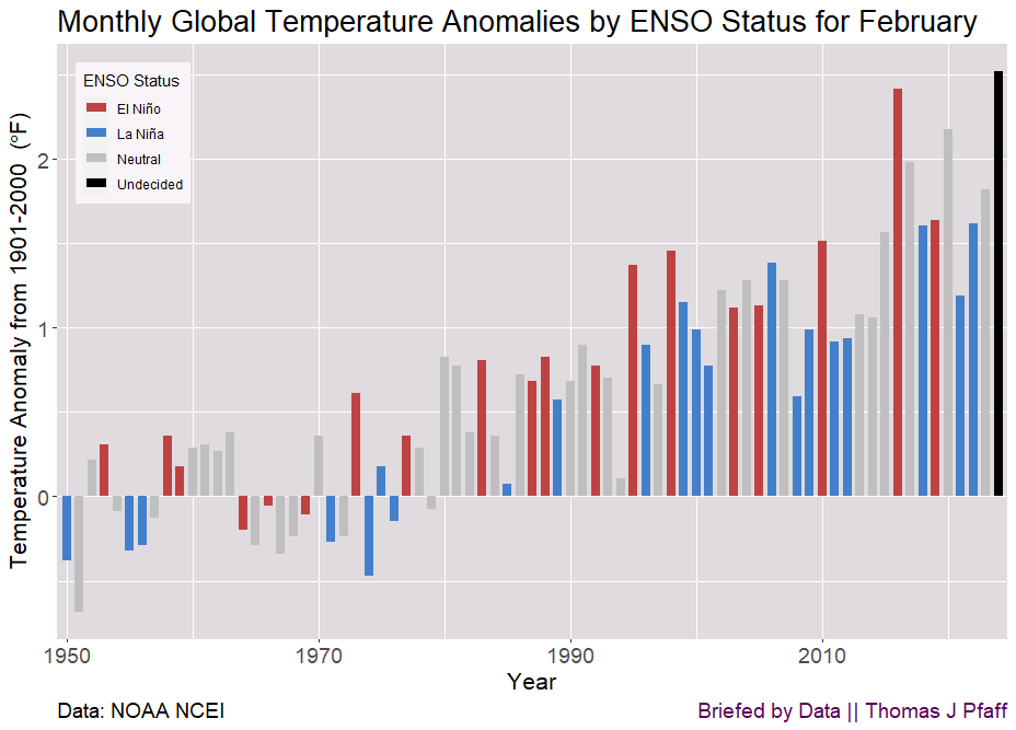
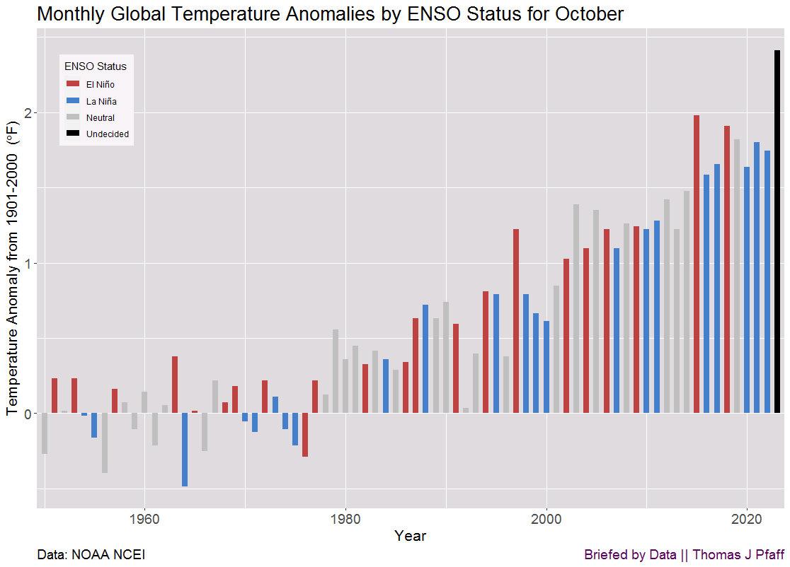
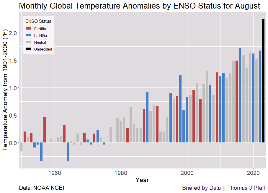
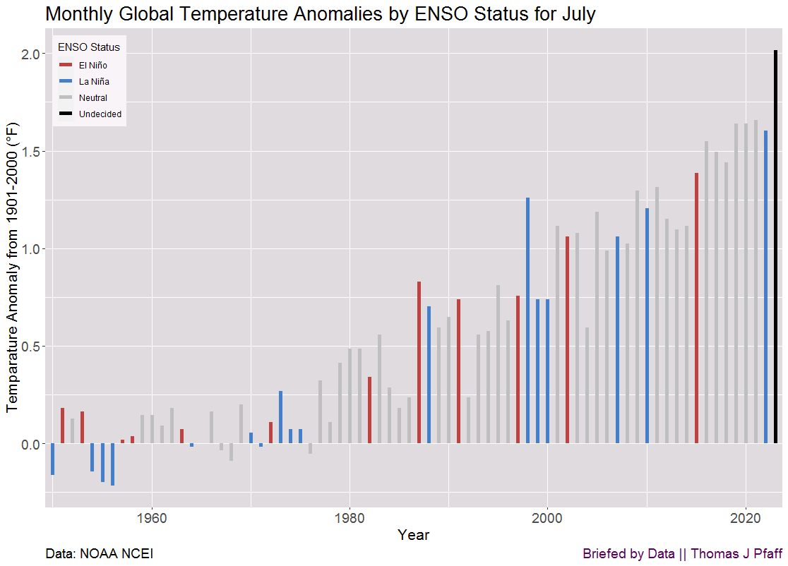
Tag Archives: charts and graphs

Where can you find applied math for the classroom?

On my Briefed by Data site, I’ve started doing a monthly post called Classroom Connections. The idea is to list a number of articles where the math could possibly be used in the classroom. The level ranges from engaging graphs and basic math to modeling and data science. For example (related to the graph here),

This paper, Electric and gasoline vehicle total cost of ownership across US cities (1/3/2024), goes through the calculations to estimate the return on investment of an electric vehicle. The math is just arithmetic, but a lot can be done with just arithmetic. Great for a project of some sort, and more can be done. For example, if the payoff for the care is 10 years, but you only plan to keep it for 5 years, is it worth it? Can it be resold to make up for the initial investment? What economic level does one need to be at to be able to make the investment in an EV as opposed to an ICE?

Find more examples at Classroom connections for February 3, 2024.

How hot was Oct 2023?

The October temperature anomaly was a top-5 anomaly overall and a record for October, but this shouldn’t be surprising. If one follows the red bars and El Niño months, the 2023 anomaly follows that trend, and the expectation is that October 2023 will officially be an El Niño month. Expect more record monthly anomalies because (from NOAA)

El Niño conditions that emerged in June continued into October, and according to NOAA’s Climate Prediction Center there is an 80% chance that El Niño will continue through the Northern Hemisphere spring (March–May 2024).

NOAA has the time series data. More on this and other notes can be found in my Briefed by Data Quick Takes post.

Is global warming speeding up?

My question here is largely rhetorical. Global warming trends have been roughly quadratic for decades and that means the rate of increase is increasing. Still, the NTY thinks this is something new to write about in their article I Study Climate Change. The Data Is Telling Us Something New (10/13/2023) with this first sentence:

Staggering. Unnerving. Mind-boggling. Absolutely gobsmackingly bananas.

I provide a response to this article in my Briefed by Data post A Response to a NYT Climate Article, suggesting that this first sentence is just alarmism. The article includes an animation illustrating that quadratic functions have increasing slopes and so the NYT image here is not surprising. Also, one should ask why the lines on this graph are over different periods.

Please check it out the Briefed by Data article. The basic conclusion is that yes, warming is speeding up, which is bad, but at the same time nothing we are seeing now is all that surprising or unpredictable.

Which energy source uses the most minerals?

Here is an excerpt from my Briefed by Data post Minerals for renewables:

A few things stand out. The first is the amount of minerals utilized for offshore wind, which is 50% more than for the next category, onshore wind. The second factor is the importance of copper in all energy sources. Figure 2 shows the copper price from FRED. Prior to 2004, the price remained below 3,000 per metric ton, and it has climbed around four to five times since then.

The post includes links to the IEA data plus other graphs. If you aren’t getting the Briefed by Data newsletter in your inbox then consider subscribing when you read the post.

How hot was August 2023?

From my post of the same name on Briefed by Data. Figure 1 shows that the August 2023 anomaly was a record for August by a half degree Fahrenheit, or about a 30% increase over the previous record in 2016. Here is what NOAA has to say about August 2023:

The August global surface temperature was 1.25°C (2.25°F) above the 20th-century average of 15.6°C (60.1°F), making it the warmest August on record. This marked the first time an August temperature exceeded 1.0°C (1.8°F) above the long-term average. August 2023 was 0.29°C (0.52°F) warmer than the previous August record from 2016, but the anomaly was 0.10°C (0.18°F) lower than the all-time highest monthly temperature anomaly on record (March 2016). However, the August 2023 temperature anomaly was the third-highest anomaly of any month on record.

Links to the data are in the post, plus two other graphs.

How hot was July 2023?

I did a full summary of July on Briefed by Data and here is a  highlights from the post.

First, Figure 1 represents the July historical temperature anomaly. It was certainly a record-setting year for July, on the order of 0.75 °F above the previous record anomaly. It should be noted that ENSO status will not be formally determined for some months. How does this compare to all months?

July’s anomaly was not even a top 10 for a month (see Figure 2 in the post) but it was a warmest month on record, but this is an artifact of July being the warmest month of the year in general. Read more here which includes links to the data.

What is the male vs female grip strength difference?

Grip strength is one of the factors measured in the National Health and Nutrition Examination Survey (NHANES). Grip strength, which is formally tested by gripping a dynamometer, is also a proxy measurement for upper body and total strength. The median summed (right plus left hand) female grip strength is 64% of the median summed male grip strength. Measures of central tendency do not tell the whole story, and we can see from the distribution that relatively few females exceed the male median. In fact, just 17 of the 2,515 females, or less than 0.1%, have a summed grip strength greater than the median summed grip strength of males. Read more about this on my substack Briefed by Data,
Female vs Male Grip Strength, where I include links to the data and two other graphs.

See Briefed by Data for other articles.

How hot was June 2023?

From NOAA’s June 2023 Global Climate Report:

June 2023 set a record as the warmest June for the globe in NOAA’s 174-year record. The June global surface temperature was 1.05°C (1.89°F) above the 20th-century average of 15.5°C (59.9°F). This marked the first time a June temperature exceeded 1°C above the long-term average.

By definition we don’t officially know if June 2023 was an El Niño month (hence the black bar in the graph) but it was emerging and likely will be one. More about June 2023 on my Briefed by Data site.

How much does seasonal solar generation vary?

This is from my Briefed by Data post Seasonal Solar Electricity Generation. It looks like the difference between the maximum month and minimum months of solar electricity generation are growing. In fact, it is fairly consistent in terms of a percentage drop.

In Figure 2, we can see that the annual seasonal drop has averaged 56%, but it’s possible that this number is inflated because 2011 and 2012 had higher values. Since 2018, the drop has been extremely stable, staying between 50% and 55% of the previous level.

There is another graph and a reference to the data. Click the article link or visit the main page of Briefed  by Data. Also on twitter @BriefedByData.