 The article in the Conversation, Why is suicide on the rise in the US – but falling in most of Europe? by
However, suicide rates in other developed nations have generally fallen. According to the World Health Organization, suicide rates fell in 12 of 13 Western European between 2000 and 2012. Generally, this drop was 20 percent or more. For example, in Austria the suicide rate dropped from 16.4 to 11.5, or a decline of 29.7 percent.
The obvious question is why?
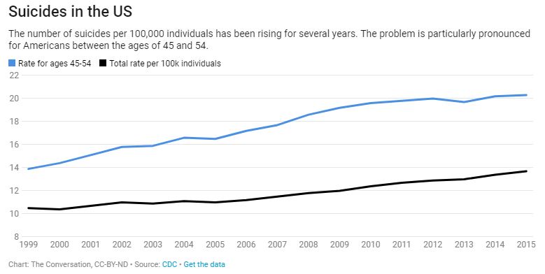
There has been little systematic research explaining the rise in American suicide compared to declining European rates. In my view as a researcher who studies the social risk of suicide, two social factors have contributed: the weakening of the social safety net and increasing income inequality.
The article has two more charts showing that the U.S. is low on Social Welfare Expenditures as a percent of GDP and is high on inequality. In all instances the data is available for download and there are links to the original sources.