 The climate.gov article 2020 Arctic sea ice minimum second lowest on record by Michon Scott (9/21/2020) reports:
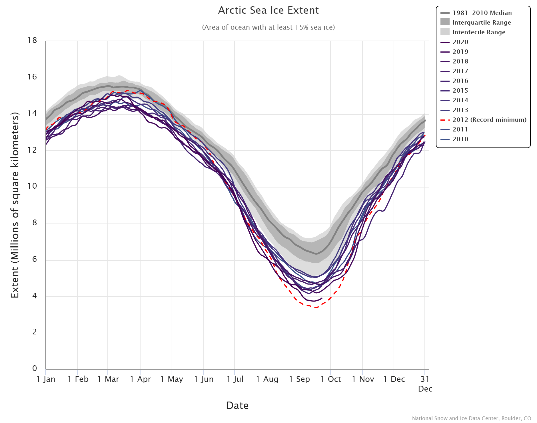
On September 15, 2020, the National Snow and Ice Data Center (NSIDC) announced, Arctic sea ice appeared to have reached its annual minimum extent. At 1.44 million square miles (3.74 million square kilometers), this minimum was second only to the record-low extent observed on September 17, 2012. The 2020 figure—preliminary because a late-season surge of summer warmth could still drop the extent further—continued an observed trend of long-term Arctic sea ice decline.
The graph here is from the National Snow and Ice Data Center’s Chartic Interactive Sea Ice Graph (a really great visual). I selected 2010-2020. The year 2012, still the current record, was an impressive minimum and this year is the first in the last 8 to come close.
From the article:
Among long-time observers of Arctic sea ice, the 2020 value was significant in that it not only punctuated a long-term decline, but also because it fell below the 4-million-kilometer (1.5-million-mile) threshold for only the second time in the satellite record—after 2012, when the minimum extent dipped to 1.31 million square miles (3.39 million square kilometers). Ted Scambos, senior research scientist at the Earth Science Observation Center at the University of Colorado-Boulder, says, “This threshold means the Arctic is more ocean than ice, a blue highway that’s been open since mid-July and won’t close until well into October, and a huge fetch for wave action along an 8,000-mile open coast of Siberia and Alaska.” The combination of sea ice decline and permafrost thaw can lead to coastal erosion as more abundant waves wear away newly softened coastlines.