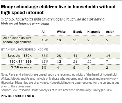
Tag Archives: charts and graphs

How much have fall temperatures risen?

According to the Climate Central post, Fall Warming Trends Across the U.S. (9/5/18), the average fall temperature for the U.S. has risen nearly 3°F since 1970 (see their graph copied here).  Why does this matter:

Insects linger longer into the fall when the first freeze of the season comes later in the year. A new study from the Universities of Washington and Colorado indicates that for every degree (Celsius) of warming, global yields of corn, rice, and wheat would decline 10 to 25 percent from the increase in insects. Those losses are expected to be worst in North America and Europe.

The article has a drop down menu to select cities across the U.S. to see a graph similar to the one copied here for the selected city.  They don’t post the data that was used to create the graphs but they do explain their data sources under methodology.

A statistics project could have students create this graph for their hometown.  One way to obtain the data was noted in our post, What do we know about nighttime minimum temperatures?: Go to  NOAA’s Local Climatological Data Map. Click on the wrench under Layers. Use the rectangle tool to select your local weather station. Check off the station and Add to Cart. Follow the direction from their being sure to select csv file. You will get an email link for the data within a day.  Note: You are limited in the size of the data to ten year periods. You will need to do this more than once to get the full data set available for your station.


What do we know about plastics?

The Our World in Data article Plastic Pollution by Hannah Ritchie and Max Roser (Sept 2018) is a detailed summary of plastics with 20 charts.  For example, one of the charts is a time series of plastic production (downloaded and posted here) showing that, in 2015, the world produced 381 million tons of plastic. In the same year, only 20% of the plastic was recycled (second chart in the article).  There is information on plastic waste generation.

Packaging, for example, has a very short ‘in-use’ lifetime (typically around 6 months or less). This is in contrast to building and construction, where plastic use has a mean lifetime of 35 years.7 Packaging is therefore the dominant generator of plastic waste, responsible for almost half of the global total.

Who produces the most plastic waste?

… we see the per capita rate of plastic waste generation, measured in kilograms per person per day. Here we see differences of around an order of magnitude: daily per capita plastic waste across the highest countries – Kuwait, Guyana, Germany, Netherlands, Ireland, the United States – is more than ten times higher than across many countries such as India, Tanzania, Mozambique and Bangladesh.

As always with Our World in Data, the data associated with each graph is downloadable.

How many 90+ degree days will your hometown have in the future?

The New York Times interactive article How Much Hotter Is Your Hometown Than When You Were Born? By Nadja Popovich, Blacki Migliozzi, Rumsey Taylor, Josh Williams and Derek Watkins, allows the reader to input a birth year and hometown and provides a graph with historical 90+ degree days and predictions for the future. For example a person born in 1970 in NYC would get the graph copied here.  In 1970 the expectation was six 90+ degree days, today it is 11, and by 2050 it will be 24 with a likely range of 15 to 30.

THE NEW YORK AREA is likely to feel this extra heat even if countries take action to lower their emissions by the end of the century, according to an analysis conducted for The New York Times by the Climate Impact Lab, a group of climate scientists, economists and data analysts from the Rhodium Group, the University of Chicago, Rutgers University and the University of California, Berkeley. If countries continue emitting at historically high rates, the future could look even hotter.

The future projection shown here assumes countries will curb greenhouse gas emissions roughly in line with the world’s original Paris Agreement pledges (although most countries do not appear on track to meet those pledges).

There are related human health impacts:

Worldwide, high temperatures have been found to increase the risk of illness and death, especially among older people, infants and people with chronic medical conditions. Lower-income populations, which more often lack access to air conditioning and other adaptive technologies, are also more likely to suffer the impacts of extreme heat. In America, so are people of color.

The article has other graphs and quantitative information which can be used in  QL based course.

How distracting are cell phones?

The extensive article by Pew Research, How Teens and Parents Navigate Screen Time and Device Distractions by Jingjing Jiang (8/22/18), presents detailed data on cell phone use.  For example,

And 51% of teens say they often or sometimes find their parent or caregiver to be distracted by their own cellphone when they are trying to have a conversation with them.

As they look at their own lives and those of their peers, most teens see things that worry them. Roughly nine-in-ten teens view spending too much time online as a problem facing people their age, including 60% who say it is a major problem.

The article has eight charts, one of which is reposted here.  There is a complete methodology section, which is perfect for a stats class, with enough information to use the data for statistical tests.

Where are women less likely than men (ages 30-70) to die of a major disease?

The Our World in Data post, Why do women live longer than men?  by Esteban Ortiz-Ospina and Diana Beltekian (8/14/18) answers the question with the graph copied here.

As the next chart shows, in most countries for all the primary causes of death the mortality rates are higher for men. More detailed data shows that this is true at all ages; yet paradoxically, while women have lower mortality rates throughout their life, they also often have higher rates of physical illness, more disability days, more doctor visits, and hospital stays than men do. It seems women do not live longer than men only because they age more slowly, but also because they are more robust when they get sick at any age. This is an interesting point that still needs more research.

Interestingly, it seems that  except for Bhutan it is only countries in Africa where women are more likely to die of a major disease.  The article is an excellent example of telling a story with data while also posing questions.

The evidence shows that differences in chromosomes and hormones between men and women affect longevity. For example, males tend to have more fat surrounding the organs (they have more ‘visceral fat’) whereas women tend to have more fat sitting directly under the skin (‘subcutaneous fat’). This difference is determined both by estrogen and the presence of the second X chromosome in females; and it matters for longevity because fat surrounding the organs predicts cardiovascular disease.

But biological differences can only be part of the story – otherwise we’d not see such large differences across countries and over time. What else could be going on?

The article has three other graphs beyond this one. One compares life expectancy by country for women and men, one for life expectancy for men and women in the U.S. (and three other countries that can be selected) since 1790, and one for the difference in life expectancy at age 45 since 1790 for selected countries.  All graph can be downloaded  and the data is available for each.

How does the U.S. use its land?

Bloomberg: https://tinyurl.com/yaq3mp7m

The Bloomberg article Here’s How America Uses Its Land by Dave Merrill and Lauren Leatherby (7/31/2018). The article arrives at the graph copied here and it is worth scrolling through the article to see the graphs along the way with associated facts.

More than one-third of U.S. land is used for pasture—by far the largest land-use type in the contiguous 48 states. And nearly 25 percent of that land is administered by the federal government, with most occurring in the West. That land is open to grazing for a fee.

In exploring the graph it is interesting to note that maple syrup, highways, and golf courses, are categories big enough to be represented. Also note how much space is for cows. The article has potential to be used in a QL based course.

What are the prospects for high school grads?

The EPI article Class of 2018 High school edition by Elise Gould, Zane Mokhiber, & Julia Wolfe (6/14/18) provides a thorough review.  Figure I from the report, copied here, shows 2000 and 2018 wages for high school grads not enrolled in further schooling by race and gender.

In 2018, young workers with a high school diploma have an average hourly wage of $11.85, which translates to annual earnings of around $24,600 for a full-time, full-year worker. This overall average masks important differences in wages by gender and race.

The report has 11 graphs each with data that can be downloaded along with the graph.  A few points from the article:

  • Only 32% of 18-64 have a four year degree or more while 10.5% haven’t graduated high school. (see figure A)
  • The percent of high school grads (18-21) that are employed and not enrolled has increased from 26% in 2010 to 31% in 2018. (see figure c)
  • Over much of the last three decades, wage growth for young high school graduates has been essentially flat. (see figure H)

The first paragraph of their conclusion:

While there may be many reasons someone might choose to enter the labor force after high school rather than attend college, college should at least be a viable option; a person’s economic resources should not be the determining factor in whether they get to go to college. But, as things stand, the prospect of staggering debt may discourage students from less wealthy families from enrolling in further education or prevent them from completing a degree.

What is the story of suicides in the U.S.?

The article in the Conversation, Why is suicide on the rise in the US – but falling in most of Europe? by Steven Stack (6/28/18), tries to get at the story. The first chart (copied here), clearly shows that the suicide rate rose from 199-2015 overall and considerably more for the 45-54 age group (stats regression problem here).  There is a second chart showing changes in suicide rates in Western European countries:

However, suicide rates in other developed nations have generally fallen. According to the World Health Organization, suicide rates fell in 12 of 13 Western European between 2000 and 2012. Generally, this drop was 20 percent or more. For example, in Austria the suicide rate dropped from 16.4 to 11.5, or a decline of 29.7 percent.

The obvious question is why?

There has been little systematic research explaining the rise in American suicide compared to declining European rates. In my view as a researcher who studies the social risk of suicide, two social factors have contributed: the weakening of the social safety net and increasing income inequality.

The article has two more charts showing that the U.S. is low on Social Welfare Expenditures as a percent of GDP and is high on inequality. In all instances the data is available for download and there are links to the original sources.

Do we disagree with factual statements that we think are opinions?

The Pew Research Center’s article Distinguishing Between Factual and Opinion Statements in the News by Amy Mitchell, Jeffrey Gottfried, Michael Barthel, and Nami Sumida (6/18/18) addresses this question and more.

A new Pew Research Center survey of 5,035 U.S. adults examines a basic step in that process: whether members of the public can recognize news as factual – something that’s capable of being proved or disproved by objective evidence – or as an opinion that reflects the beliefs and values of whoever expressed it.

We will focus on section 4 Americans overwhelmingly see statements they think are factual as accurate, mostly disagree with factual statements they incorrectly label as opinions. Odds are that a person who identifies a factual statement as opinion will also disagree with the statement (see table copied here).  For example,  41% of those surveyed said that Spending on Social Security, Medicare, and Medicaid make up the largest portion of the U.S. federal budget was an opinion and of those 82% disagreed with the statement.

This is an excellent article for a QL or Stats course as it is rich with data, graphs, and charts. You can also discuss why 41% of those surveyed thought a statement that is measurable (How much of the Federal budget goes to social security, medicare, and medicaid?) was an opinion.  The article also includes detailed information on their methodology and detailed tables of data.


How much are 30 year temperature averages increasing?

Changes in 30 year temperature averages depend on where you live, but Climate Central’s New Normal: Temperatures Are Trending Up Across U.S.  (3/16/18) has graphs for major cities across the U.S. The one here is for the U.S.

Normal temperatures, generally defined to be the 30-year average at a location, are trending up across most of the U.S. Since 1980, the average continental U.S. temperature has risen 1.4°F.

This is a change in the 30 year average so that the value for 2017 is the average from 1988-2017. In other words, the climate is changing.  A nice primer on the difference between weather and climate can be found at the NSIDC Climate vs Weather page:

Weather is the day-to-day state of the atmosphere, and its short-term variation in minutes to weeks. People generally think of weather as the combination of temperature, humidity, precipitation, cloudiness, visibility, and wind. We talk about changes in weather in terms of the near future: “How hot is it right now?” “What will it be like today?” and “Will we get a snowstorm this week?”

Climate is the weather of a place averaged over a period of time, often 30 years. Climate information includes the statistical weather information that tells us about the normal weather, as well as the range of weather extremes for a location.

The Climate Central post has a drop down menu and you can choose the graph for the city closest to you to see how much your climate has changed.  They don’t post the data that was used to create the graphs, but you can find the data for a location near you. Try starting with this NOAA map (look for a future post on using this portal for local data). This could be a great stats project for students.