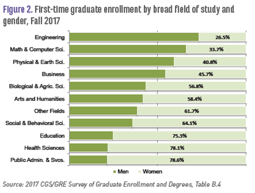
Tag Archives: charts and graphs

Why should we care about insects?

The Guardian article, Plummeting insect numbers ‘threaten collapse of nature’ by Damian Carrington (2/10/19) reports on the recent Biological Conservation paper Worldwide decline of the entomofauna: A review of its drivers by Francisco Sánchez-Bayo and Kris A.G.Wyckhuys (1/20/19).

More than 40% of insect species are declining and a third are endangered, the analysis found. The rate of extinction is eight times faster than that of mammals, birds and reptiles. The total mass of insects is falling by a precipitous 2.5% a year, according to the best data available, suggesting they could vanish within a century.

(Note percentage rate of change in the quote.) Why?

The analysis, published in the journal Biological Conservation, says intensive agriculture is the main driver of the declines, particularly the heavy use of pesticides. Urbanization and climate change are also significant factors.

So what?

One of the biggest impacts of insect loss is on the many birds, reptiles, amphibians and fish that eat insects. “If this food source is taken away, all these animals starve to death,” he said. Such cascading effects have already been seen in Puerto Rico, where a recent study revealed a 98% fall in ground insects over 35 years.

and

“If insect species losses cannot be halted, this will have catastrophic consequences for both the planet’s ecosystems and for the survival of mankind,” said Francisco Sánchez-Bayo

The Guardian article is a good QL resource. The paper has nice graphs and data but is behind a paywall.

How warm was 2018?

A number of agencies have reported that 2018 was the fourth hottest year on record. The report from NASA GIS, 2018 Fourth Warmest Year in Continued Warming Trend, According to NASA, NOAA (2/6/19) includes a short video showing the warming of the planet while including other facts. The report also includes the animated graph, copied here, with temperature trends from five different agencies.

Global temperatures in 2018 were 1.5 degrees Fahrenheit (0.83 degrees Celsius) warmer than the 1951 to 1980 mean, according to scientists at NASA’s Goddard Institute for Space Studies (GISS) in New York. Globally, 2018’s temperatures rank behind those of 2016, 2017 and 2015. The past five years are, collectively, the warmest years in the modern record.

The post includes a link to data.

Did a wall impact violent crime in El Paso?

Kevin Drum has an excellent post, Here’s a Closer Look at President Trump’s Big Lie About El Paso, addressing El Paso crime as an example of deceiving with charts. He first quotes the state of the union:

The border city of El Paso, Texas, used to have extremely high rates of violent crime — one of the highest in the country, and considered one of our Nation’s most dangerous cities. Now, with a powerful barrier in place, El Paso is one of our safest cities.

He then provides three charts.  The first is El Paso violent crime rate, as reported by the El Paso Police Department, from 2006 through 2013 with a line noting the wall completion in 2009. The second, copied here, is the El Paso crime rate from 1993 to 2013.  By the first graph it appears the wall had an impact by picking the low point in 2006 as the starting point, but based on the graph here it doesn’t appear the wall had much of an impact. The final graph is a selection of mid-size cities which shows El Paso has historically had a low crime rate. The post is worth reading to see all three graphs.

The FBI post crime data and a place to start is their Crime Data Explorer.  The Crime in the U.S. page is also useful.

How has growth is emigration by region changed?

The Pew Research Center article Latin America, Caribbean no longer world’s fastest growing source of international migrants by  Luis Noe-Bustamante and Mark Hugo Lopez (1/25/19) provides an overview emigration changes by region. The graph copied here shows how the growth in emigration from Latin America and the Caribbean has drooped from 58% from 1990-2000 to 7% for 2010-2017, which is slower than thew worldwide growth rate of 17%. On the other hand, 

Even though the percentage growth of the emigrant population from Latin American-Caribbean nations has slowed, the region is still a large source of emigrants. About 37 million people from the region lived outside their country of birth in 2017, up from 35 million in 2010 and accounting for nearly 15% of the world’s more than 250 million international migrants in 2017. The Asia-Pacific region is the source of the world’s largest emigrant population (85 million), as well as the largest share of the global total (33%).

The article includes three other charts, a table of data, and a methodology section with sources.

Where will our electricity come from in next two years?

The EIA Today in Energy report, EIA forecasts renewables will be fastest growing source of electricity generation (1/18/19), provides projections for electricity generation.

EIA expects non-hydroelectric renewable energy resources such as solar and wind will be the fastest growing source of U.S. electricity generation for at least the next two years. EIA’s January 2019 Short-Term Energy Outlook (STEO) forecasts that electricity generation from utility-scale solar generating units will grow by 10% in 2019 and by 17% in 2020. According to the January STEO, wind generation will grow by 12% and 14% during the next two years. EIA forecasts total U.S. electricity generation across all fuels will fall by 2% this year and then show very little growth in 2020.

The good news is more renewables, but “fastest growing” can be misleading. According to the chart (copied from the article) nonhydro renewables are projected to go from 10% in 2018 to 13% in 2020, and so their share of electricity generation is still small.  This is good good discussion for a calculus class or any QL based course.  The article includes two other charts and one is a complex bar chart that could be the focus of a class period.

How many people in the world don’t have electricity?

Our World in Data’s latest visualization is a bar chart from 1990 to 2016 of the number of people with and without electricity.  In 2016, out of about 7.5 billion people nearly 1 billion lived without electricity or about 12%. In 1990, 1.5 billion people were without electricity, a decrease of 1/2 a billion, but also a decrease from 35% to 2016’s 12%. Their graph is interactive and users can choose individual countries, download the graph, and download the data.

Related Post (12/14/17): How many people don’t have access to electricity?

How much money do parents spend on children?

Parental Financial Investments in Children per Quarter by Household Income Percentile Rank (2014 dollars).


The graph here from the American Sociological Review paper Income inequality and Class Divides in Parental Investments by Schneider, Hastigs, and LaBriola (5/21/18) summarizes changes in spending on children by income.

The past 40 years have witnessed historic increases in income inequality in the United States (Piketty and Saez 2003). Over the same period, existing class divides—by household income and by parents’ educational attainment—in how much money parents spend on children and how much time parents spend in childcare have widened considerably (Altintas 2016Kornrich and Furstenberg 2013Ramey and Ramey 2010). These increasingly evident class divides in parental investments of time and money spark concern, because parental investment is an important factor in the intergenerational perpetuation of advantage (Downey, von Hippel, and Broh 2004Potter and Roksa 2013Waldfogel and Washbrook 2011). If affluent families are increasingly able to transmit their advantages to children, that bodes poorly for an open opportunity structure.

Of course,

We would expect rising income inequality to increase class gaps in parental financial investments in children mechanically if rising income inequality simply means the affluent have more to spend. But, rising income inequality might also widen class gaps in investments in children if it reshapes parents’ preferences for these practices differentially by class.

It is also possible that income inequality is not related to class gaps in parental investment. Indeed, recent work suggests a narrowing of gaps in early achievement by family income, and a narrowing or arrested divergence in some gaps in parenting practices, even as income inequality has continued to rise, raising questions about this often assumed empirical relationship (Kalil et al. 2016Reardon 2011Reardon and Portilla 2016).

We empirically investigate these questions.

The paper has interesting charts and data, and worth reading for their conclusions. Also, the supplemental materials include some mathematical modeling.

How quickly is Antarctica losing ice?

Time series of cumulative anomalies in SMB (blue), ice discharge (D, red), and total mass (M, purple) with error bars in billions of tons for (A) West Antarctica, (B) East Antarctica; (C) Antarctic Peninsula), and (D) Antarctica, with mean mass loss in billions of tons per year and an acceleration in billions of tons per year per decade for the time period 1979 to 2017.


The new paper, Four decades of Antarctic Ice Sheet mass balance from 1979–2017, by Eric Rignot, et. el (PNAS 1/14/19) states

The total mass loss from Antarctica increased from 40 ± 9 Gt/y in the 11-y time period 1979–1990 to 50 ± 14 Gt/y in 1989–2000, 166 ± 18 Gt/y in 1999–2009, and 252 ± 26 Gt/y in 2009–2017, that is, by a factor 6.

An interesting fact from the paper:

Antarctica contains an ice volume that translates into a sea-level equivalent (SLE) of 57.2 m.

Note: 52.2m is about 188 feet. The graph with caption here is from the paper. The Washington Post has a summary of the paper in the article Ice loss from Antarctica has sextupled since the 1970s, new research finds by Chris Mooney and Brady Dennis (1/14/19) and notes

It takes about 360 billion tons of ice to produce one millimeter of global sea-level rise.

Based on the last two quotes, How much ice is there on Antarctica?  NASA’s Vital Signs of the Planet has Antarctica Ice data on their Ice sheets page.

Related Post: How well do we understand rising sea levels?

What’s new at sustainabilitymath.org?

The first two interactive graph have been posted at sustainabilitymath.org.  They can be found at the new Interactive Graphs page. The two graph represent mean and median wages by race and gender with regression lines from 1973 to 2017 (data from EPI).  Check them out because they are interesting and both could be used in a QL or stats course.

What have we done to the broiler chicken?

The Royal Society research article, The broiler chicken as a signal of human reconfigured biosphere by Carys E. Bennett et. el. (12/12/18) , provides the evidence of how human intervention has changed a species.

Breeding by natural selection has been modified by human-directed selection. While the size of the domesticated chicken in historical times was little different to the red jungle fowl (figure 3), domestic chicken bone morphology shows that selective breeding practices took place as early as the sixteenth century [53,54]. Chickens from the late twentieth century are markedly different in terms of size (figures 3 and 4), growth rate (figure 5) and body shape. The change in body mass and body shape has been visually documented by photographs of broiler breeds throughout ontogeny from 1957, 1978 and 2005 [14]. Broilers from a 1957 breed are between one-fourth and one-fifth of the body weight of broilers from a twenty-first century breed [13,14]. The modern broiler is a distinctive new morphotype with a relatively wide body shape, a low centre of gravity [13] and multiple osteo-pathologies. If left to live to maturity, broilers are unlikely to survive. In one study, increasing their slaughter age from five weeks to nine weeks resulted in a sevenfold increase in mortality rate [55]: the rapid growth of leg and breast muscle tissue leads to a relative decrease in the size of other organs such as the heart and lungs, which restricts their function and thus longevity [56]. Changes in the centre of gravity of the body, reduced pelvic limb muscle mass and increased pectoral muscle mass cause poor locomotion and frequent lameness [15]. Unlike most other neobiota, this new broiler morphotype is shaped by, and unable to live without, intensive human intervention.

The article includes a number of interesting charts including the one copied here and in reference to the figure they refer to a derivative:

Chicken-meat consumption is growing faster than any other meat type and is soon to outpace pork

Data used in the paper is available under Supplemental Material (left side bar).