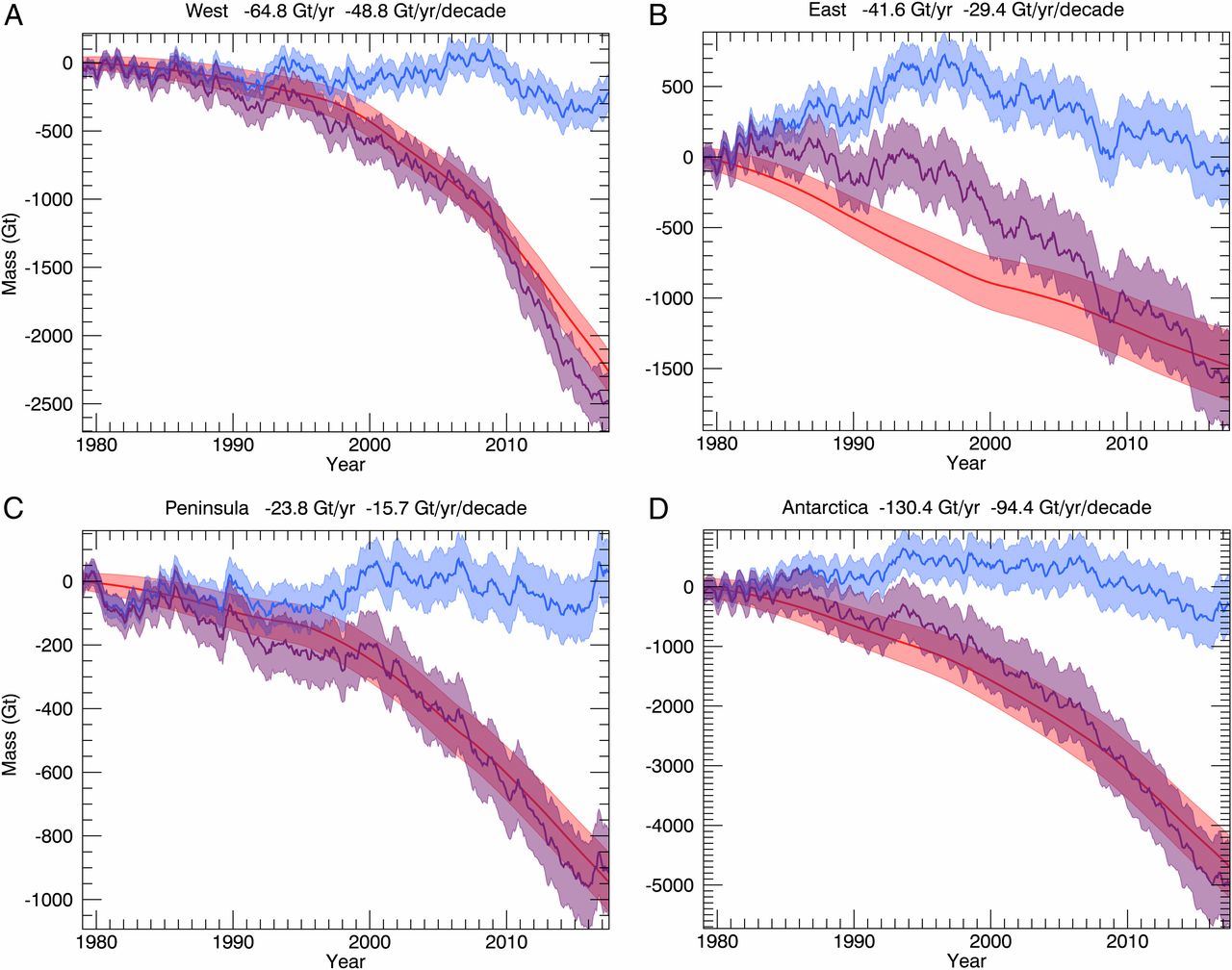
Tag Archives: charts and graphs

How many women have been in congress?

The Pew article, A record number of women will be serving in the new Congress by Drew Desliver (12/18/18) provides an historical overview and the chart copied here of women in congress.

When the 116th Congress convenes next month, women will make up nearly a quarter of its voting membership – the highest percentage in U.S. history, and a considerable increase from where things stood not too long ago.

A record 102 women will serve in the incoming House of Representatives, comprising 23.4% of the chamber’s voting members. More than a third of those women (35) won their seats for the first time in last month’s midterms.

The differences by party are notable. For instance, the most Republican women in the House of Representative was 25 in 2017-2019 and down to  13 this year.  On the other hand, there have been more than 25  Democrat women in the House since the 1993-1995 congress. As a percentage of each party’s delegation, women have never exceeded more than 10% of Republican House members. From 109th through 112th congress (2005-2013) women made up 9.9% of Republican House members. This is down to 6.5% (13 women) this year. On the other hand, women have been generally increasing as a percentage of Democrat House members since the 101st congress (1989-1991) and stand at 38% (89 women) this year.  Wikipedia posts this data in a table, which comes from a Congressional Research Service report.

Related post: World Development Indicators: Proportion of seats held by women in national parliaments (3/2/17)

Follow Up: How old is Arctic Ice?

In a follow up to our May 28, 2018 post, How old is Arctic Ice?, the Washington Post has an article, The Arctic Ocean has lost 95 percent of its oldest ice — a startling sign of what’s to come by  Chris Mooney (12/11/18). It notes:

In 1985, the new NOAA report found, 16 percent of the Arctic was covered by the very oldest ice, more than four years old, at the height of winter. But by March, that number had dropped to under 1 percent. That’s a 95 percent decline.

At the same time, the youngest, first-year ice has gone from 55 percent of the pack in the 1980s to 77 percent, the report finds. (The remainder is ice that is two to three years old.)

The loss of sea ice creates a feedback loop:

There is a well-known feedback loop in the Arctic, caused by the reflectivity of ice and the darkness of the ocean. When the Arctic Ocean is covered by lighter, white ice, it reflects more sunlight back to space. But when there is less ice, more heat gets absorbed by the darker ocean — warming the planet further. That warmer ocean then inhibits the growth of future ice, which is why the process feeds upon itself.

and

Because of this, Arctic sea ice loss has already increased the warming of the planet as a whole. Ramanathan said the impact is equivalent to the warming effect of 250 billion tons of carbon dioxide emissions, or about six years of global emissions.

Ramanathan fears that entirely ice-free summers, if they began to occur regularly, could add another half- degree Celsius (0.9 degrees Fahrenheit) of warming on top of whatever else the planet has experienced by that time.

The Washington Post article has a few nice animated graphics. The graph and map here is from the sea ice sections of the Arctic Report Card: Update for 2018 – Effects of persistent Arctic warming continue to mount from NOAA. The Arctic Report card contains a half dozen charts and graphs including one that compares March and September sea ice extent. A data and project for this is in our Statistics Project page.

Which country emits the most CO2?

The country that emits the most CO2 depends on how it is measured. Our World in Data has a graph of annual share of CO2 emissions by country. By this measurement, a graph with the top 5 countries (China, U.S., India, Russia, & Germany) in 2016 was downloaded from Our World in Data.  In this case, China has been the largest contributor of CO2 since 2005.  In fact, in 2016 China emitted 10,295 million metric tons of CO2 compared to 5,240 million metric tons by the U.S.  On the other hand, from EIA data, in 2016 each person in China emitted 7.3 tons of CO2 compared to a person in the U.S. at 16.2 tons.  The EIA data dates back to 1980, and from 1980 to 2106 China emitted 177,547 million metric tones of CO2 compared to 197,176 for the U.S.  Which is more important, per person, current, or total historical emissions?  How does this create challenges in climate talks? Further analysis with other countries can be done with EIA data. Data can also be downloaded from the Our World in Data post.  The Calculus Projects page has an example of using this data in a calculus class.

What are the demographics of 6- 21 year olds?

The Pew article Early Benchmarks Show ‘Post-Millennials’ on Track to Be Most Diverse, Best-Educated Generation Yet – A demographic portrait of today’s 6- to 21-year-olds by Richard Fry and Kim Parker (11/15/18)  provides demographic information comparing early boomers, gen xers, millennials, and post millennials.  For example, the graph copied here shows the changes in racial groups across the four generations. The trend toward cities contiues:

The geography and mobility of post-Millennials differ from earlier generations. Reflecting broader national trends, post-Millennials overwhelmingly reside in metropolitan as opposed to rural areas. Only 13% of post-Millennials are in rural areas, compared with 18% of Millennials in 2002. By comparison, 23% of Gen Xers lived in rural areas when they were ages 6 to 21, as did 36% of early Boomers.

The distribution of racial groups by region differs (also see the second graph):

In the West, post-Millennials are just as likely to be Hispanic as non-Hispanic white (both 40%). This stands in contrast to older generations. Among those residing in the West, 45% of Millennials, 50% of Gen Xers and 64% of Boomers are non-Hispanic white. Minority representation among post-Millennials is lowest in the Midwest, where roughly a third (32%) of 6- to 21-year-olds are racial or ethnic minorities.

The Pew report includes 12 charts and a methods section with links to the data.

How effective is gerrymandering?

The article in Isthmus No contest – Dems sweep statewide offices in midterms but remain underrepresented in Assembly by Dylan Brogan (11/15/18) presents the graphic copied here. In short the dems won all races in terms of the popular vote but control only 36 of the 99 seats in the assembly.

“The biggest obstacle remains gerrymandering. There are only a handful of districts that are remotely competitive. That’s why a district court ruled the [legislative] maps unconstitutional and why we still have a case before that court,” says Hintz, referring to Gill v. Whitford which the U.S. Supreme Court sent back to the lower federal court for reargument. “Gerrymandering doesn’t just have an impact on the outcome. It has an impact on being able to recruit candidates. There aren’t a lot of people willing to run when they know they don’t have a shot.”

Three sources to learn more about the mathematics of gerrymandering: The Math Behind Gerrymandering and Wasted Votes by Patrick Honner (10/12/17), Countermanding Gerrymandering with a short podcast with Moon Duchin, and Detecting Gerrymandering with Mathematics by Lakshmi Chandrasekaran (8/2/18) .

Our recent post How do you tell a story with data and maps – Beto vs Cruz? (11/15/18) notes how to obtain election data. The chart made here for WI can be done for other states as a stats project.

What are the predictions for antimicrobial resistance?

The OECD has resources related to antimicrobial resistance (AMR). A summary can be read in the article Stopping antimicrobial resistance would cost just USD 2 per person a year (7/11/18), which included the chart copied here.  The article is rich with quantitative information.

While resistance proportions for eight high-priority antibiotic-bacterium combinations increased from 14% in 2005 to 17% in 2015 across OECD countries, there were pronounced differences between countries. The average resistance proportions in Turkey, Korea and Greece (about 35%) were seven times higher than in Iceland, Netherlands and Norway, the countries with the lowest proportions (about 5%).

Resistance is already high and projected to grow even more rapidly in low and middle-income countries. In Brazil, Indonesia and Russia, for example, between 40% and 60% of infections are already resistant, compared to an average of 17% in OECD countries. In these countries, growth of AMR rates is forecast to be 4 to 7 times higher than in OECD countries between now and 2050.

The full report is available: Stemming the Superbug Tide Just A Few Dollars More. Two other pages have graphs. The Nov 11 post under the same title, Stemming the Superbug Tide Just A Few Dollars More, includes a map and two sets of graph with AMR trends by countries.  On another page, Trends in AMR prevalence rates 2005-2030, users can select up to eight specific bacteria resistance rates, such as Penicillin-resistant S. Pneumoniae prevalence rates, along with any country to create interactive charts of present and projected rates.  The data does not appear to be accessible, but the first article contains contact information at the bottom that might help in getting the data in these reports.

How do you tell a story with data and maps – Beto vs Cruz?

FiveThirtyEight has an excellent article on the 2018 senate race and the possible implications for future elections. The article, What Really Happened In Texas by Kirk Goldsberry (11/14/18) analyzes voting patterns by county and compares 2014 to 2018.  Their graph copied here is the fourth in a series of maps and mostly summarizes the previous maps.

Cruz won by 220,000 votes last week. But in Harris County alone, 500,000 more people voted in the 2018 midterms than had voted in 2014. In Dallas County, 300,000 more people voted than in the last midterms, and in Travis, Bexar and Tarrant counties, 200,000 more people voted.

Indeed, aside from some noteworthy increase in voter numbers in suburban Dallas, the biggest white circles on the map above tend to hover over Beto country. Meanwhile, the darkest red counties — the places that carried Cruz back to Washington — have exhibited very little, if any, change in the number of votes cast compared to 2014. Those areas may be staunchly red, but they’re also staunchly stagnant too. O’Rourke almost won in 2018 by taking roughly 60 percent of the vote in the big five counties. This map suggests that if Democrats can repeat that feat as these places continue to grow, that may be all they need to turn Texas blue.

The data for their analysis comes from the Texas Secretary of State election results.  The 2014 data is available by following the Historical Election Results (1992-current) link. The 2018 data is available through a link along the top. This is a stats project in the making (do this for you home state). The article can also  be used in a QL course.

How does the digital divide impact secondary education for different groups?

The Pew Research Center article Nearly one-in-five teens can’t always finish their homework because of the digital divide by Monica Anderson and Andrew Perrin (10/26/18) provides insights on how lacking access to the internet impacts the ability to complete homework.  Their chart (copied here) gives the percent of school-age children by race and income without high-speed internet.  A second chart provides the results of survey about how this impacts homework. In particular,

One-quarter of black teens say they are at least sometimes unable to complete their homework due to a lack of digital access, including 13% who say this happens to them often. Just 4% of white teens and 6% of Hispanic teens say this often happens to them. (There were not enough Asian respondents in this survey sample to be broken out into a separate analysis.)

The article includes a link at the bottom for results and methodology. This includes sample sizes making this article particularly useful for statistics courses.

What is the relationship between rates of suspension by race and free and reduced lunch?

Propublica’s article, Miseducation – Is There Racial Inequality at Your School? by  Lena V. Groeger, Annie Waldman and David Eads, (10/16/18), provides data by state on the percent of nonwhite students, the percent of students who get free/reduced-price lunch, high school graduation rate, the number of times White students are likely to be in an AP class as compared to Black students, and the number of times Black students are likely to be suspended as compared to White students. The comparison is also available for Hispanic students.

The graph here was created with their data and compares the percent of students on free and reduced lunch with the number of times Black students are likely to be suspended  compared to White students (state data isn’t available for HI, ID, MT, NH, NM, OR, UT, or WY).  The red lines uses all the data where as the blue line removes the outliers of DC and ND. The blue regression line has a p-value of 0.012 and R-squared of 0.15.  This suggests that wealthier states, as measured by free and reduced lunch programs, have a greater disparity is suspensions between black and white students. The impact of outliers is instructive here and there are other scatter plots worth graphing from the article. There are also statistics projects waiting to be created with this data.

The article also has an interactive map or racial disparities by districts, but the map can be misleading based on missing data from districts. Can you see how?  This makes the map itself useful for QL courses.  R Script that created this graph. Companion csv file.

How much have child and adolescent mortality rates changed?

The World Bank report, New child and adolescent mortality estimates show remarkable progress, but 17,000 children under 15 still died every day in 2017, by Emi Suzuki and co-author Haruna Kashiwase ( 9/18/18) provides a summary, as well as a number of charts. The good news:

There has been remarkable progress in reducing mortality among children and young adolescents in the past several decades. Between 1990 and 2017, the global under-five mortality rate dropped by 58 percent from 93 deaths per 1,000 live births to 39 deaths per 1,000 live births. During the last 17 years, the reduction in under-five mortality rates accelerated to an average 4% annual reduction, compared to an average 1.9% annual reduction between 1990 and 2000. For children aged 5-14, mortality dropped by 53 percent, from 15 deaths to 7 deaths per 1,000 children.

At the same time there is work to be done:

However, while a substantial reduction from the 14.3 million in 1990, an estimated 6.3 million children under age 15 still died in 2017, mostly from preventable causes.

The charts on the page are interactive but can’t be downloaded. On the other hand, the data is easily available and charts can be made for download. The chart here was made at the World Bank’s DataBank.  Note that the European Union has a lower under 5 mortality rate than the U.S. There are numerous variables to choose. Data can be downloaded and charts for download can be highly customized.