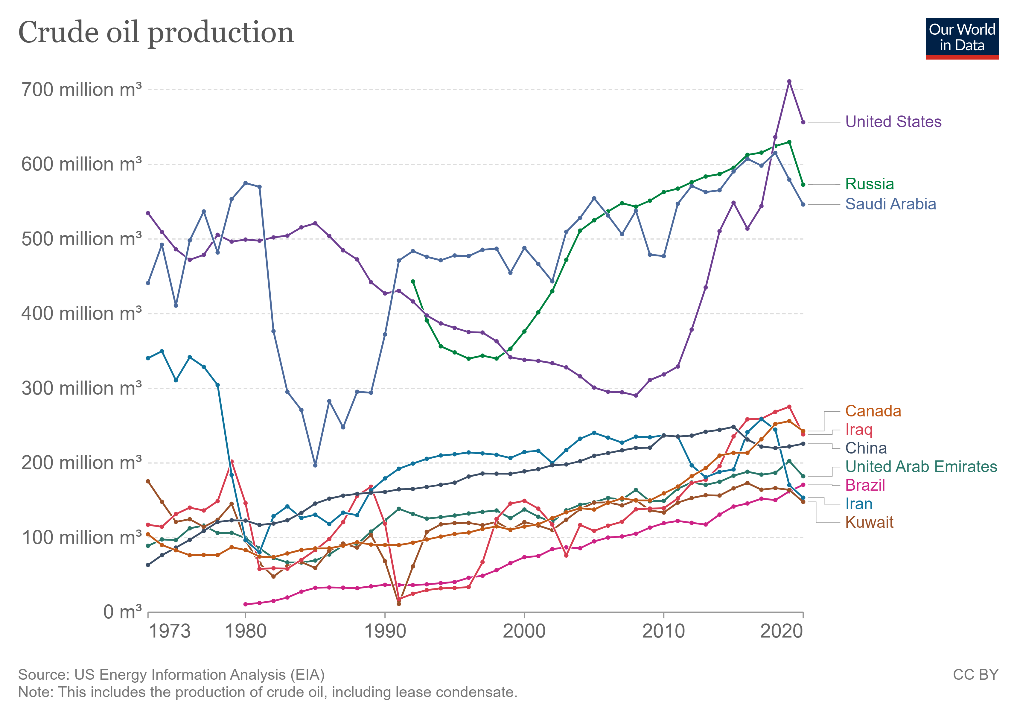
 Our World in Data now has a Fossil Fuels Data Explorer. You can create a time series of the top ten oil producers, download the image, and post it on your favorite blog, which I did. Each of the top three more than doubles any producer in the 4-10 spot. Plenty to talk about in how this relates to global politics. The data is available as well as information for coal and natural gas.
When is your last freeze date?
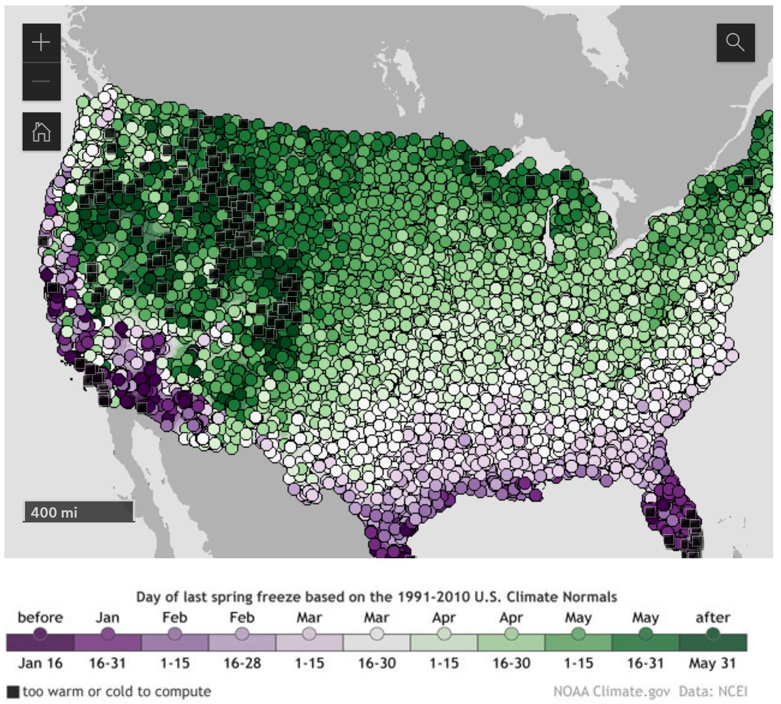 Climate.gov has an interactive map in their article Interactive map: average date of last spring freeze across the United States by Rebecca Lindsey (3/21/2022). A picture of the map is posted here. You can zoom in on a location and click a dot to get and exact data for the day the chance of freeze drops below 50%.
Places where this milestone is reached before the first day of spring in mid-March appear in shades of purple, while places where it comes after that are colored in shades of green. Clearly, from the amount of green, the odds of freezing air temperature remain above 50 percent until after the solar start of spring in most of the Lower 48. As you’d expect, the farther north or higher in elevation you go, the later in the season (darker greens) this day generally arrives.
At the bottom of there is a link to Annual/Seasonal Normals and how to get data for this graph and for other cutoff percentages.
What is the connection between flu and humidity?
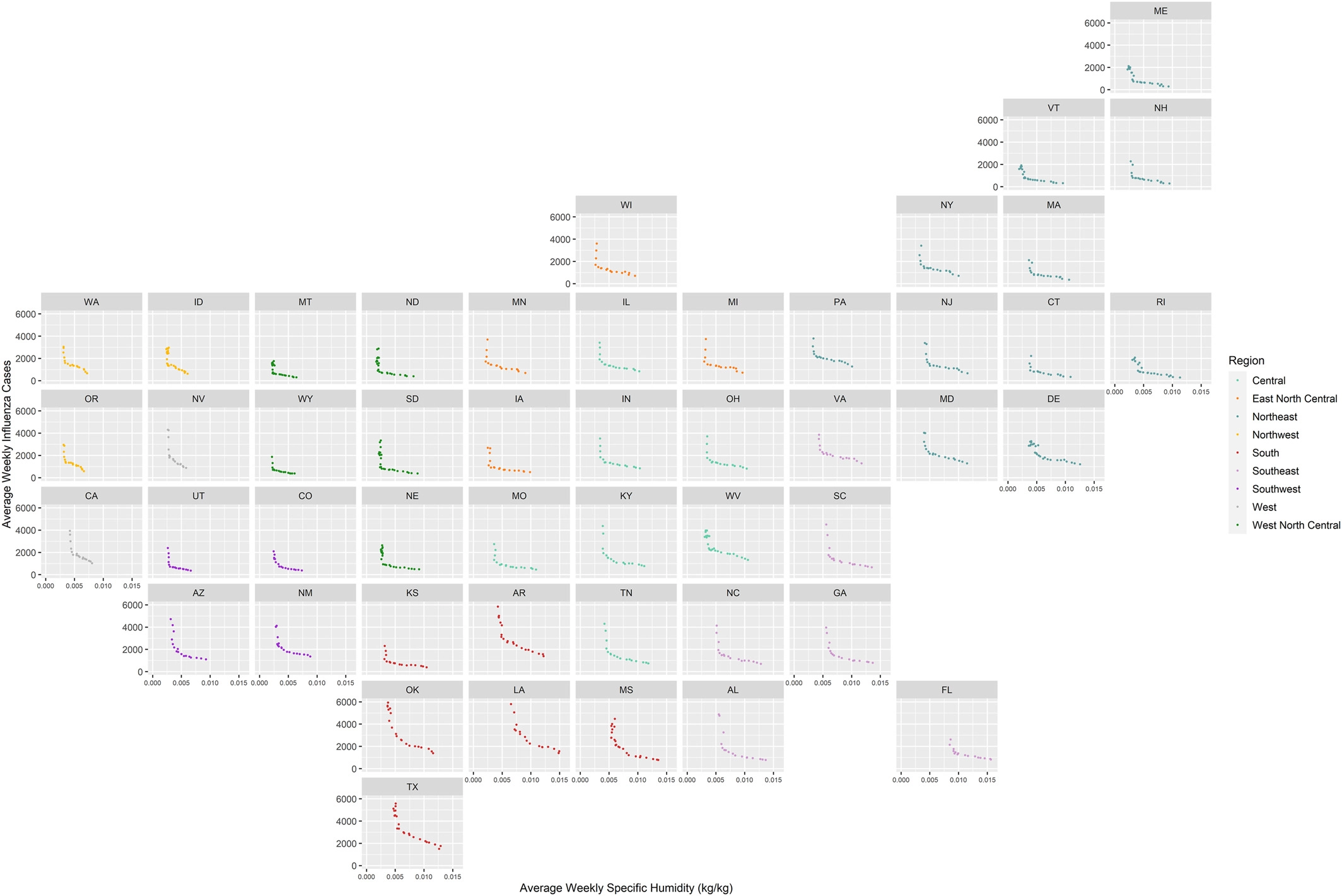
The NASA post NASA Finds Each State Has Its Climatic Threshold for Flu Outbreaks (3/4/2022) summarizes the recent paper Spatial Variation in Humidity and the Onset of Seasonal Influenza Across the Contiguous United States by E. Sherman, et. el (12/13/2021). From the NASA Post:
Researchers at NASA’s Jet Propulsion Laboratory in Southern California and the University of Southern California correlated AIRS measurements of water vapor in the lower atmosphere with flu case estimates for each week from 2003 to 2015. The researchers found that in each state, there is a specific level of low humidity that may signal a flu outbreak is imminent. When this threshold is crossed each year, a large increase in flu cases follows within two or three weeks, on average.
The graph here is from the paper. The x-axis is the humidity level and the y-axis is the number of flu cases. One interesting feature is that all states have this clear ben in the scatter plot. The paper could be interesting for a stats course or maybe an independent project for students. Data availability is at the bottom of the paper.
How big is the Dem/Rep perception gap?
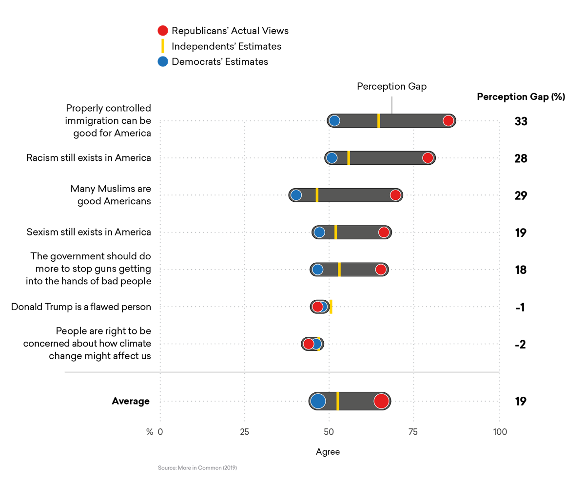 More in Common did a perception gap study in 2018 and while it is a few years old it is worth reading. The graph copied here is the Democrats’ Perception Gap and the page has a similar one for Republicans. One interesting paragraph:
Education is intended to make us better informed about the world, so we’d expect that the more educated you become, the more you understand what other Americans think. In fact, the more educated a person is, the worse their Perception Gap – with one critical exception. This trend only holds true for Democrats, not Republicans. In other words, while Republicans’ misperceptions of Democrats do not improve with higher levels of education, Democrats’ understanding of Republicans actually gets worse with every additional degree they earn. This effect is so strong that Democrats without a high school diploma are three times more accurate than those with a postgraduate degree.
The page has 11 graphs and would make a great QL source for discussion in a class. One key question to ask is if the gap has gotten better or worse over the last few years.
What are the sources of methane emissions in the U.S.?
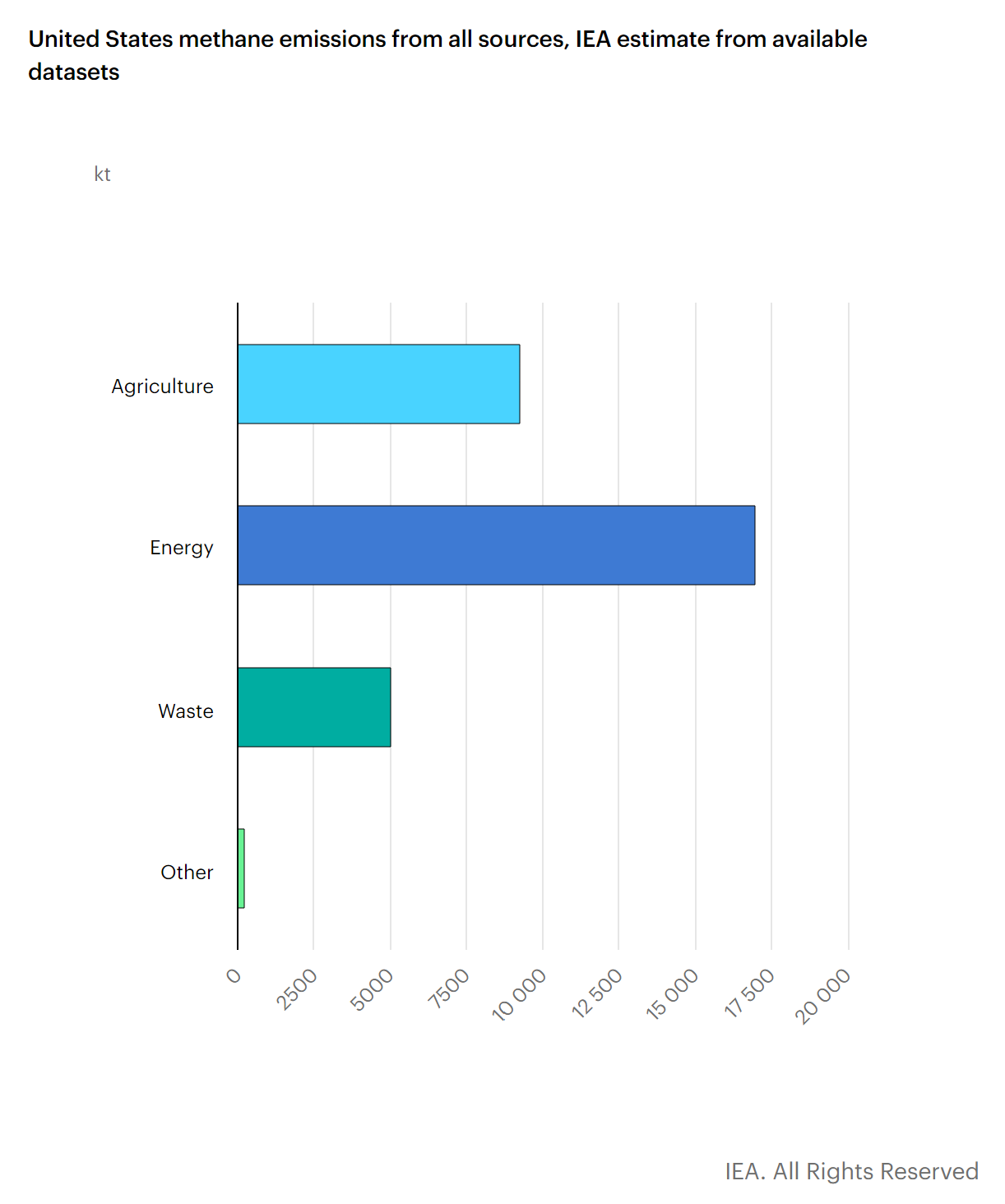 The iea has a Methane Tracker Data Explorer which has information of methane emissions by country or for the world. In 2021 the U.S. emitted 31,460 kt of methane which is 8.8% of the global emissions. There are various graphs, such as the one copied here, and links to download the data.
What is the connection between attending college and parental income?
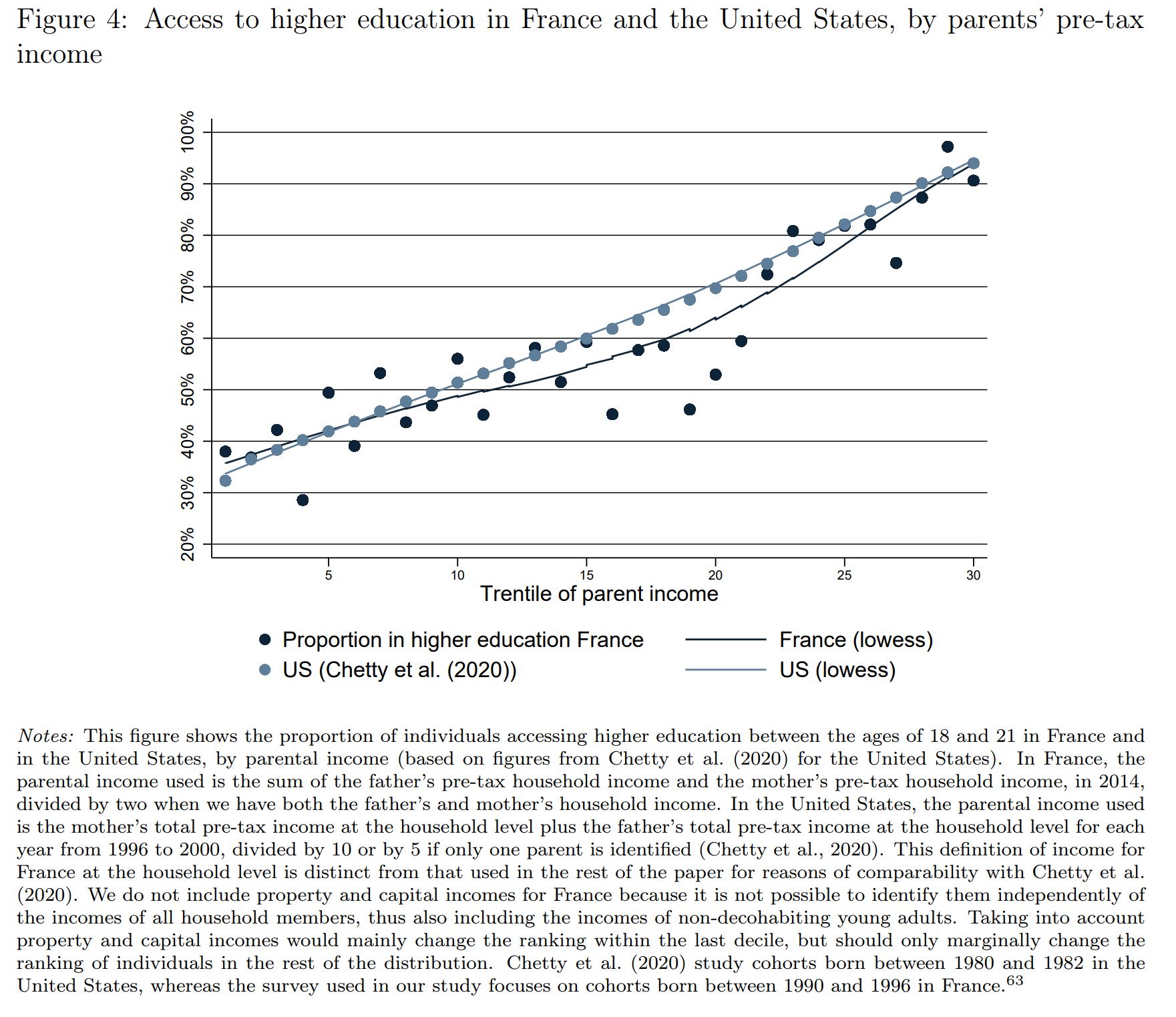 The World Inequality Database summarize the paper by Bonneau and Grobon in the article Unequal Access to Higher Education (2/7/2022).
In this paper, Cécile Bonneau and Sébastien Grobon provide new stylized facts on inequalities in access to higher education by parental income in France. At the bottom of the income distribution, 35% of individuals have access to higher education compared to 90% at the top of the distribution. This overall level of inequality is surprisingly close to that observed in the United States. The authors then document how these inequalities in access to higher education by parental income combine with inequalities related to parental occupation or degree. Finally, they assess the redistributivity of public spending on higher education, and present a new accounting method to take into account the tax contribution of parents in our redistributivity analysis.
The article lists 11 key findings such as:
Inequalities in access to higher education create large inequalities in public spending on higher education: Those in the bottom 30 percent of the income distribution receive between 7,000 and 8,000 euros of investment in higher education between the ages of 18 and 24, compared to about 27,000 euros –of which 18,000 euros correspond to public spending and 9,000 to private spending through tuitions paid by parents– for those in the top 10 percent of the income distribution (Figure 5a);
The paper (link in the first quote) has numerous graphs and the details of the modeling.
What new record was set in Feb?
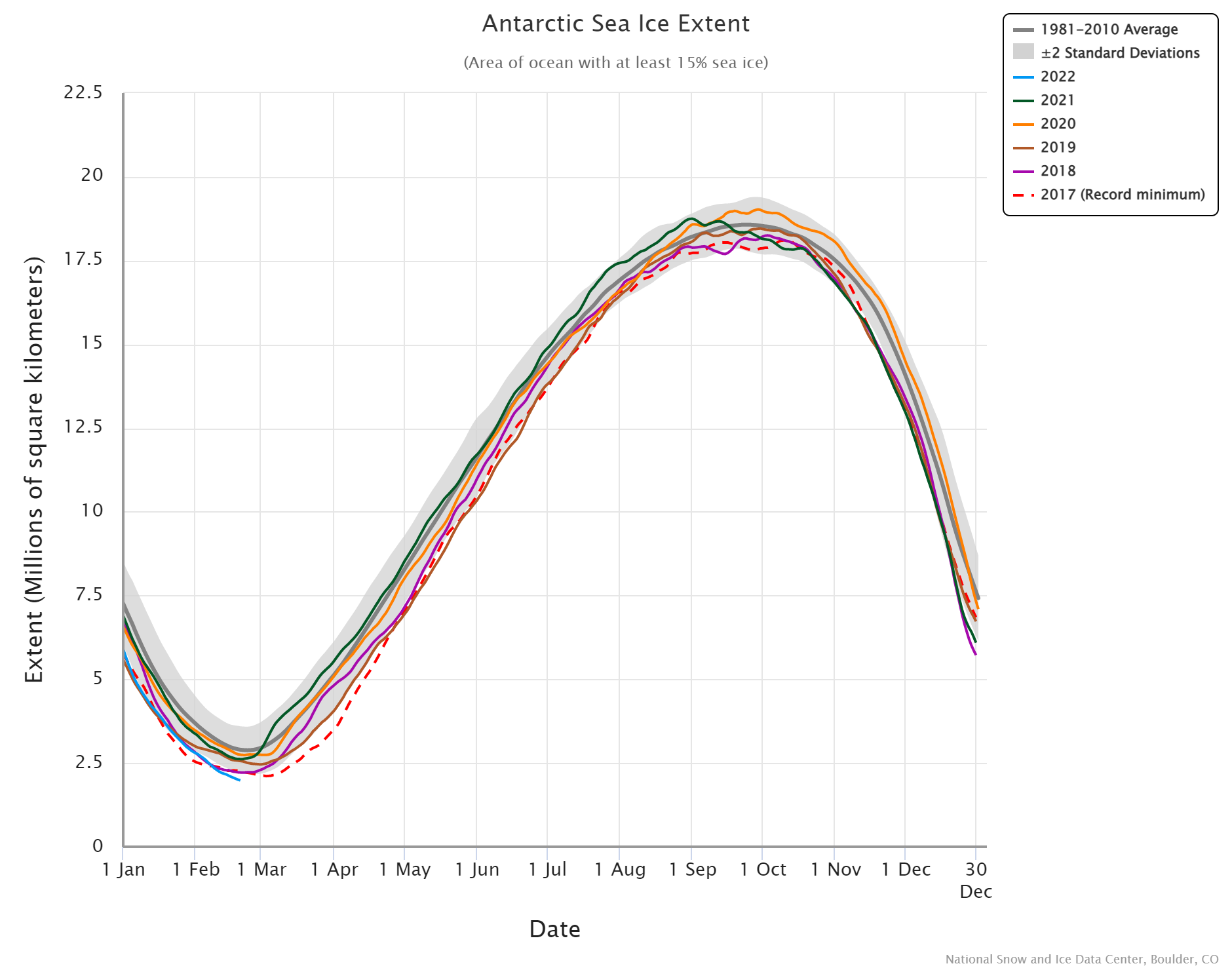 The Antarctic has broken the record low for sea ice extent and doesn’t appear to be done. The chart here is from the National Snow and Ice Data Center’s Charctic Interactive Sea Ice Graph page. Data is available from the Sea Ice Data and Analysis Tools page.
How hot was Jan 2022?
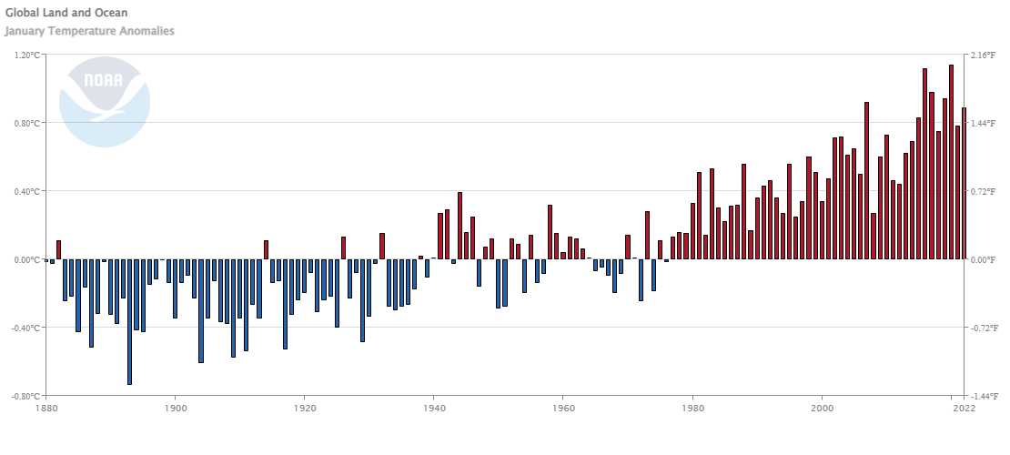 From NOAA’s Global Climate Report – January 2022:
The global surface temperature for January 2022 was 0.89°C (1.60°F) above the 20th century average and the sixth highest for January since global records began in 1880. The last eight Januarys (2015–2022) rank among the 10 warmest Januarys on record.
Similar to 2021, the year 2022 began with an episode of a La Niña in the tropical Pacific Ocean. The El Niño-Southern Oscillation (ENSO) can affect global temperatures. La Niña tends to cool global temperatures slightly, while El Niño tends to boost global temperatures. With a slightly cool start to the year, there is only a 10% chance of 2022 ending as the warmest year on record. However, there is over 99% chance of the year ranking among the 10 warmest years on record.
Time series data available at the top of the page.
What are the predicted climate changes for your state?
 NCICS (North Carolina Institute for Climate Studies) hosts the State Climate Summaries page. On this page you can select a state to arrive at a climate summary for the state. For example, the NYS page has ten graphs, including the one copied here, and summaries such as
Since the beginning of the 20th century, temperatures in New York have risen almost 2.5°F, and temperatures in the 2000s have been higher than in any other historical period (Figure 1). As of 2020, the hottest year on record for New York was 2012, with a statewide average temperature of 48.8°F, more than 4°F above the long-term average (44.5°F). This warming has been concentrated in the winter and spring, while summers have not warmed as much (Figures 2a and 2b). Summer warming is more influenced by the number of warm nights than by the occurrence of very hot days (Figures 2c and 2d). The state has experienced an increase in the number of warm nights and a decrease in the number of very cold nights (Figure 3). The increase in winter temperatures has had an identifiable effect on Great Lakes ice cover. Since 1998, there have been several years when Lakes Erie and Ontario were mostly ice-free (Figure 4).
A great site that allows educators to plan lessons around their state.
How do vaccination rate differ?
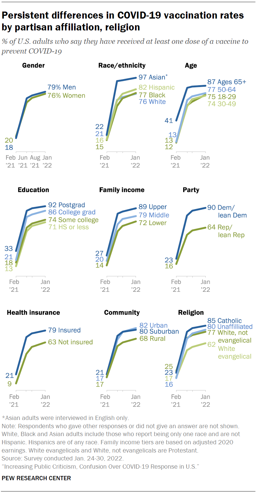
The Pew article Increasing Public Criticism, Confusion Over COVID-19 Response in U.S. by Alec Tyson and Cary Funk (2/9/2022) has the graph copied here, which seems unrelated to the title but is interesting. I’ll leave you to decide what is surprising and what isn’t. Further:
Some demographic differences in vaccination status are more pronounced within one partisan group than another. For instance, 80% of Republicans ages 65 and older say they have received a COVID-19 vaccine, compared with far fewer Republicans 18 to 29 (52%). There is a much more modest gap between the shares of Democrats 65 and older and those 18 to 29 who say they’ve received a vaccine (94% vs. 88%). See the Appendix for more details on vaccination status within partisan groups.
This all seems like good data for statistical tests. There are more graphs, a methodology section, and more data.