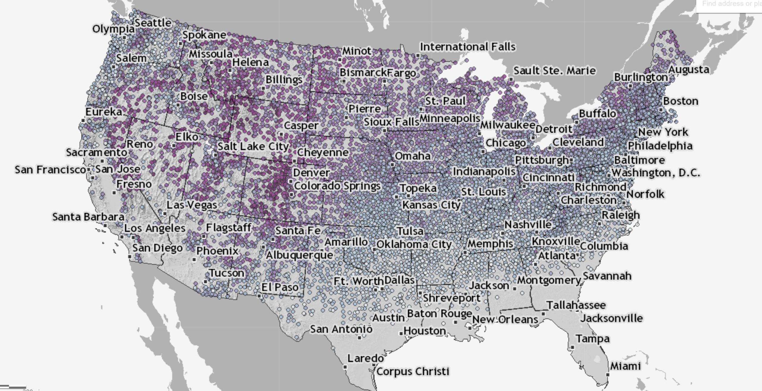
Tag Archives: charts and graphs

How old is Arctic sea ice?

The NSIDC page Springtime in the Artic (5/3/2022) has a section on sea ice age.

At the end of last summer, the extent of the oldest ice (greater than 4 years old) tied with 2012 for the lowest in the satellite record. This spring, we continue to see a dominance of first-year ice (Figure 4). The percentage of the greater than 4-year-old ice, which once comprised over 30 percent of the Arctic Ocean, now makes up only 3.1 percent of the ice cover.

The page has other graphs and maps related to ice. There is a link in the citations for data related to the graph copied here.


Where do I get a wind rose?

The first question is probably what is a wind rose? Take a look at the graph to see an example of a wind rose. Now you probably want one for your location.  Start at the Iowa State University IEM Site Information page. Select a network based on your state. Click switch network to change the map. You can then select a station by double clicking a dot or using the drop down menu. Once you click select a station you get a new page.  Click the Wind Roses tab to get a selection of wind roses. You’ll get a total data one and ones for each month of the year.  Each wind rose graph has a link to view the raw data, which can be downloaded. You can also generate a custom wind rose by clicking the Custom Wind Roses tab. Climate.gov has some information about the wind roses at Wind Roses from airports around the world – Graphics or Raw Data Tables.

What should get you into college?

The Pew article, U.S. public continues to view grades, test scores as top factors in college admissions by Vianney Gómez (4/26/2022), provides the result of a survey about college admissions:

More than nine-in-ten Americans (93%) say high school grades should be at least a minor factor in admissions decisions, including 61% who say they should be a major factor. Grades are, by far, the criteria the public says should most factor into admissions decisions. This is followed by standardized test scores (39% major factor, 46% minor factor) and community service involvement (19% major, 48% minor), according to a Pew Research Center survey conducted March 7-13, 2022.

By comparison, nearly three-quarters of Americans or more say gender, race or ethnicity, or whether a relative attended the school should not factor into admissions decisions.

There are three graphs in the article, such as the one copied here, and a methodology section.


Are we done with snow for the year?

If you check the Climate.gov page Interactive map: Latest snow on record for thousands of U.S. weather stations by Tom Di Liberto (updated 3/30/2022) you can find the date of the last snowfall on record at a weather station near you. On the map:

This interactive map shows the latest day for which measurable snow (accumulations of greater than 0.1 inches) was recorded for thousands of U.S. weather stations during their period of operation (up through April 11, 2018.) Purple colors reflect latest-snowfall dates that occurred later in the year, while bluer shades reflect earlier dates for the last snow of the year.

On one of the patterns in the map:

The interesting wrinkle is that the change in date of the latest final snow of the season does not follow a strictly east to west line across the country, even to the east of the Rockies, as it would if latitude were the only influence. Instead, it appears to occur on a diagonal across the Great Plains and into the Midwest. Why is that? Well the answer lies both to the south (the Gulf of Mexico) and the north (Canada).

As the calendar moves into spring, warmer air from closer to tropics and over the Gulf of Mexico begins to moderate temperatures enough over the southeast to make it difficult for temperatures to be cold enough for snow. Meanwhile, cold air that resides in the interior of Canada can still funnel south, bounded on one side by the Rocky Mountains, allowing for the occasional late spring snowfall, even as far south as higher elevations in New Mexico.

There are no direct data sources but the map is interesting.

What are the most important community issues for Black Americans?

The Pew article Race is Central to Identity for Black American and Affects How They Connect With Each Other by Kiana Cox and Christine Tamir (4/14/2022) is report on an extensive survey with about 37 charts and tables such as the one copied here.

When asked in an open-ended question to identify the most important issue in the community they live in, the top issue was violence or crime (17%). This includes Black Americans who listed specific issues such as drug activity, shootings, or theft; but also those who simply listed “violence” or “crime” as the most pressing issues in their communities. Another 11% of Black adults said economic issues such homelessness, poverty and taxes were most important.

How does this compare to the general public?

The Black population’s rating of the most important issue facing the community they live in is only slightly different from that of the general public. Americans overall name economic issues (15%), violence or crime (12%), and COVID-19 and public health (7%) as the most important issues in their community.

As usual, there is a detailed methodology section.


What about methane?

The focus on greenhouse gasses is typically on CO2, but we shouldn’t forget about methane. From the NOAA article Increase in atmospheric methane set another record in 2021 – Carbon dioxide levels also record a big jump (4/7/2022):

For the second year in a row, NOAA scientists observed a record annual increase in atmospheric levels of methane, a powerful, heat-trapping greenhouse gas that’s the second biggest contributor to human-caused global warming after carbon dioxide.

NOAA’s preliminary analysis showed the annual increase in atmospheric methane during 2021 was 17 parts per billion (ppb), the largest annual increase recorded since systematic measurements began in 1983. The increase during 2020 was 15.3 ppb. Atmospheric methane levels averaged 1,895.7 ppb during 2021, or around 162% greater than pre-industrial levels. From NOAA’s observations, scientists estimate global methane emissions in 2021 are 15% higher than the 1984-2006 period.

Methane data links are at the bottom of this Global Monitoring Laboratory page. There is also a methane project on the Calculus Projects page.


How may Arctic precipitation change?

Changes in total precipitation (TP) (red, orange), snowfall (snow) (blue, light blue) and rainfall (rain) (green, light green) in CMIP6 and CMIP5 are shown relative to the 1981–2009 climatological mean for a December–February (DJF), b March–May (MAM), c June–August (JJA) and d September–November (SON). The light blue vertical dashed line denotes when the historical period for CMIP5 ends and the light purple vertical dashed line denotes when the historical period of CMIP6 ends and thereafter the RCP8.5 and SSP5–8.5 climate scenarios for CMIP5 and CMIP6 are used. The shading around each line highlights the spread based upon the lower 5th and 95th percentiles among the model members. The violin plots represent the model spread from 2090 to 2100 for each total precipitation (TP), snowfall (snow) and rainfall (rain) with the dashed black lines representing the 25th and 75th percentiles, and the black vertical line representing the mean of all models.


The paper New climate models reveal faster and larger increases in Arctic precipitation than previous projected by Michelle R McCrystall, et. el (11/30/2021) in Nature Communication has some great graphs. In fact, stop reading here and study the graph along with the caption; so much inf. Of course, the results are important too. From the abstract:

The latest projections from the sixth phase of the Coupled Model Intercomparison Project (CMIP6) point to more rapid Arctic warming and sea-ice loss by the year 2100 than in previous projections, and consequently, larger and faster changes in the hydrological cycle. Arctic precipitation (rainfall) increases more rapidly in CMIP6 than in CMIP5 due to greater global warming and poleward moisture transport, greater Arctic amplification and sea-ice loss and increased sensitivity of precipitation to Arctic warming. The transition from a snow- to rain-dominated Arctic in the summer and autumn is projected to occur decades earlier and at a lower level of global warming, potentially under 1.5 °C, with profound climatic, ecosystem and socio-economic impacts.

There are other excellent graphs in this paper. If you need great graphs to talk about look here. Plus, there are links to data sources at the end. If you want a quick overview see this NSIDC summary.

When is your last freeze date?

Climate.gov has an interactive map in their article Interactive map: average date of last spring freeze across the United States by Rebecca Lindsey (3/21/2022). A picture of the map is posted here. You can zoom in on a location and click a dot to get and exact data for the day the chance of freeze drops below 50%.

Places where this milestone is reached before the first day of spring in mid-March appear in shades of purple, while places where it comes after that are colored in shades of green. Clearly, from the amount of green, the odds of freezing air temperature remain above 50 percent until after the solar start of spring in most of the Lower 48. As you’d expect, the farther north or higher in elevation you go, the later in the season (darker greens) this day generally arrives.

At the bottom of there is a link to Annual/Seasonal Normals and how to get data for this graph and for other cutoff percentages.

What is the connection between flu and humidity?

The NASA post NASA Finds Each State Has Its Climatic Threshold for Flu Outbreaks (3/4/2022) summarizes the recent paper Spatial Variation in Humidity and the Onset of Seasonal Influenza Across the Contiguous United States by E. Sherman, et. el (12/13/2021). From the NASA Post:

Researchers at NASA’s Jet Propulsion Laboratory in Southern California and the University of Southern California correlated AIRS measurements of water vapor in the lower atmosphere with flu case estimates for each week from 2003 to 2015. The researchers found that in each state, there is a specific level of low humidity that may signal a flu outbreak is imminent. When this threshold is crossed each year, a large increase in flu cases follows within two or three weeks, on average.

The graph here is from the paper. The x-axis is the humidity level and the y-axis is the number of flu cases. One interesting feature is that all states have this clear ben in the scatter plot. The paper could be interesting for a stats course or maybe an independent project for students. Data availability is at the bottom of the paper.