How may Arctic precipitation change?

Changes in total precipitation (TP) (red, orange), snowfall (snow) (blue, light blue) and rainfall (rain) (green, light green) in CMIP6 and CMIP5 are shown relative to the 1981–2009 climatological mean for a December–February (DJF), b March–May (MAM), c June–August (JJA) and d September–November (SON). The light blue vertical dashed line denotes when the historical period for CMIP5 ends and the light purple vertical dashed line denotes when the historical period of CMIP6 ends and thereafter the RCP8.5 and SSP5–8.5 climate scenarios for CMIP5 and CMIP6 are used. The shading around each line highlights the spread based upon the lower 5th and 95th percentiles among the model members. The violin plots represent the model spread from 2090 to 2100 for each total precipitation (TP), snowfall (snow) and rainfall (rain) with the dashed black lines representing the 25th and 75th percentiles, and the black vertical line representing the mean of all models.


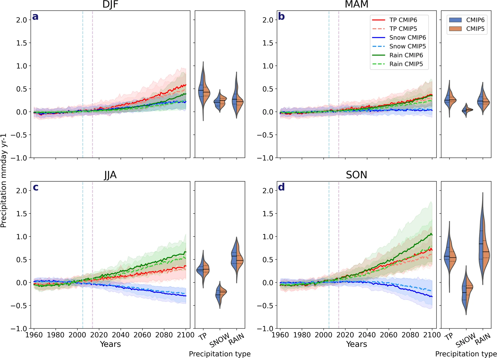
The paper New climate models reveal faster and larger increases in Arctic precipitation than previous projected by Michelle R McCrystall, et. el (11/30/2021) in Nature Communication has some great graphs. In fact, stop reading here and study the graph along with the caption; so much inf. Of course, the results are important too. From the abstract:

The latest projections from the sixth phase of the Coupled Model Intercomparison Project (CMIP6) point to more rapid Arctic warming and sea-ice loss by the year 2100 than in previous projections, and consequently, larger and faster changes in the hydrological cycle. Arctic precipitation (rainfall) increases more rapidly in CMIP6 than in CMIP5 due to greater global warming and poleward moisture transport, greater Arctic amplification and sea-ice loss and increased sensitivity of precipitation to Arctic warming. The transition from a snow- to rain-dominated Arctic in the summer and autumn is projected to occur decades earlier and at a lower level of global warming, potentially under 1.5 °C, with profound climatic, ecosystem and socio-economic impacts.

There are other excellent graphs in this paper. If you need great graphs to talk about look here. Plus, there are links to data sources at the end. If you want a quick overview see this NSIDC summary.

About Thomas J. Pfaff

Thomas J. Pfaff is a Professor of Mathematics at Ithaca College. He created this website because he believes that sustainability, ranging from climate change to social justice, should be included in all courses whenever possible.

Check Also

How hot was February 2024?

Here is the February anomaly showing that 2024 was barely a record anomaly for February, …