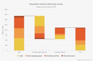
 The International Energy Agency’s Energy Access Outlook 2017 has your answer. For example, the chart here answers the question for 2000 and 2015 with an interesting graphic that includes how the change occurred. In 2000, 1684 million people lacked access, 1130 million people gained access, but population grew by 557 million people, leaving 1111 million people without access in 2015. The graph is interactive on the page and breaks these changes down into four regions. There are eight other interesting charts related to electricity as well as access to clean cooking.
Tags energy inequality QL
Check Also
A pause in posting
At the moment, I don’t plan on posting here anymore. The content I used to …