That is the title of a recent post on Briefed by Data. The graph here, from that post, shows our current electricity consumption and what we would need to add to move all cars to electric.
How does this compare to existing electricity generation? Figure 1 has the answer. We currently use somewhat more than 4 trillion kWh of electricity. If all vehicles were converted to electric, we would require an additional 7 trillion kWh of electricity.
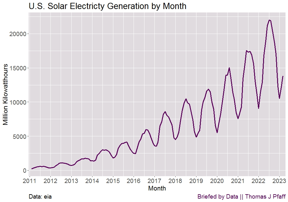
This is from my Briefed by Data post Seasonal Solar Electricity Generation. It looks like the difference between the maximum month and minimum months of solar electricity generation are growing. In fact, it is fairly consistent in terms of a percentage drop.
In Figure 2, we can see that the annual seasonal drop has averaged 56%, but it’s possible that this number is inflated because 2011 and 2012 had higher values. Since 2018, the drop has been extremely stable, staying between 50% and 55% of the previous level.
There is another graph and a reference to the data. Click the article link or visit the main page of Briefed by Data. Also on twitter @BriefedByData.
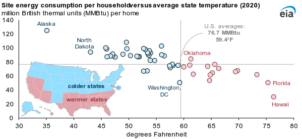
Site energy refers to the amount of energy that enters a home, including electricity from the grid, electricity from onsite solar panels, natural gas, propane, and fuel oil. Site energy includes different forms of energy, and with respect to electricity, it does not account for the losses associated with conversion of primary fuels to electricity or the electrical losses in the transmission and distribution system. Site energy consumption is a combination of the energy consumption from all energy end uses in a home, including seasonal end uses such as space heating and cooling, as well as non-seasonal end uses such as cooking and consumer electronics.
However,
In 2020, the average energy expenditures, or the amount of money a household spent on site energy, was affected by several factors beyond temperature, such as the type of energy used. Households in North Dakota (the second-coldest state) used an average of 94.3 MMBtu in 2020, nearly twice as much as homes in Florida (the second-warmest state), at 50.3 MMBtu. However, the average energy expenditures were about the same for homes in both states—$1,648 in North Dakota and $1,654 in Florida—in part because more than three-quarters of households in Florida reported that they only use electricity in their homes and U.S. average residential electricity prices are more than three times higher than residential natural gas prices.
There is one other nice graph of expenditures and links to data.
The sharp increase in natural gas prices in Europe has led to widespread production cutbacks in ammonia—an important input for nitrogen fertilizers. As of October 2022, about 70% of European ammonia production capacity had been reduced or shut down. However, input costs have declined in recent months due to increase imports of liquefied natural for national reserves in Europe as well as expectations of a milder winter. This could allow some shuttered nitrogen fertilizer production facilities in Europe to resume operations.
In China
Supply concerns have been exacerbated by China’s extension of export restrictions on fertilizers until the end of 2022 in order to maintain domestic availability. DAP exports from China, which accounts for 30% of global trade in DAP, fell by nearly 50% (y/y) during the first ten months of 2022. Meanwhile, Chinese urea exports declined by about 60% (y/y) over the same period.
There are four graphs and a link to the Commodity Markets page that has a bunch of data.
In 2021, 60% of the country’s coal was produced in the western United States, but only 28% of workers in the coal mining industry worked there, based on data from our Annual Coal Report. This difference is related to the technologies used in the East and West; surface mines in the West can use massive mining equipment to extract large amounts of coal with relatively fewer workers.
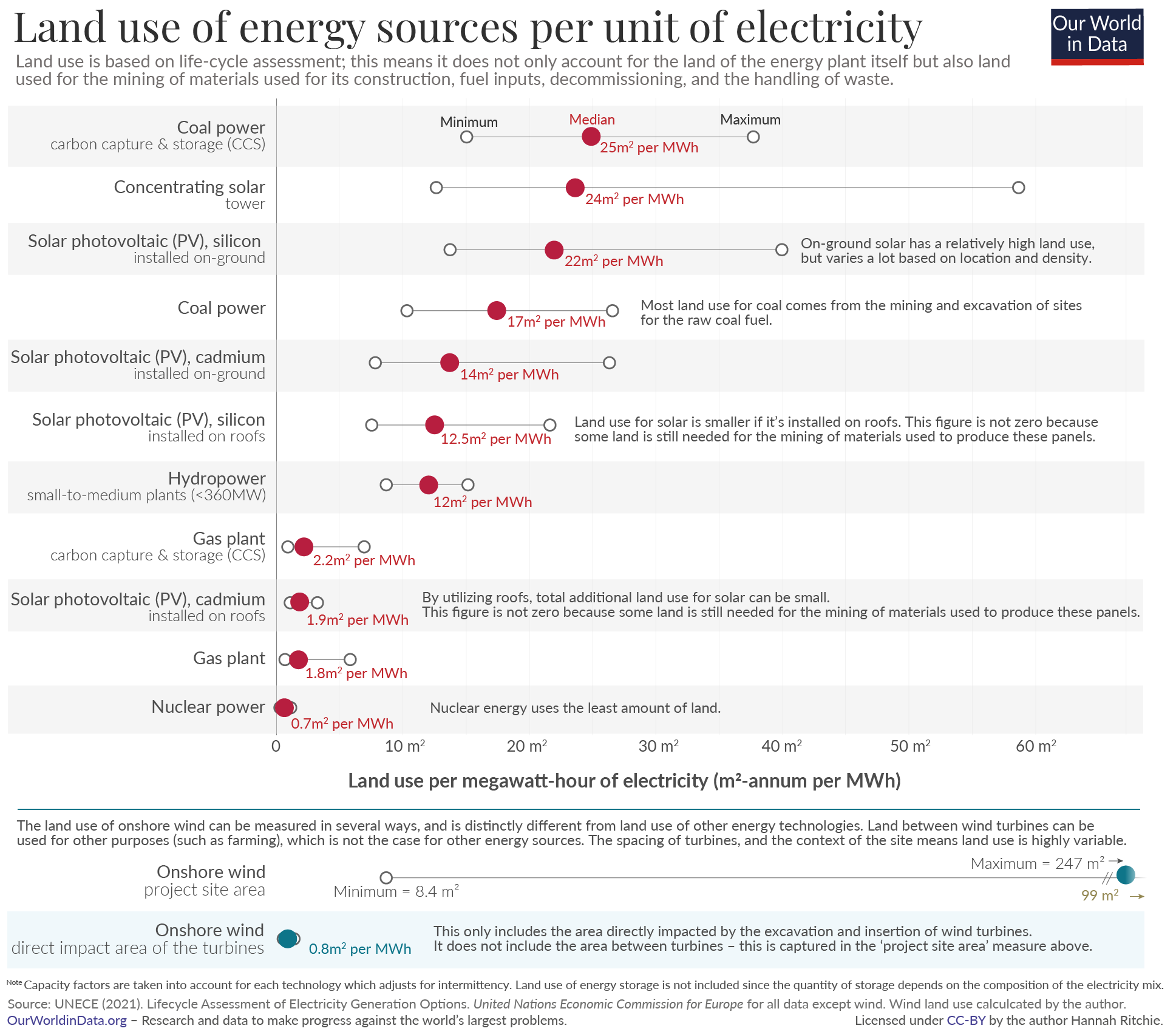
To capture the whole picture we compare these footprints based on life-cycle assessments. These cover the land use of the plant itself while in operation; the land used to mine the materials for its construction; mining for energy fuels, either used directly (i.e. the coal, oil, gas, or uranium used in supply chains) or indirectly (the energy inputs used to produce the materials); connections to the electricity grid; and land use to manage any waste that is produced.
The answer: Nuclear power.
At the bottom of the article there are links to other energy posts some of which have data.
Alongside a wealth of detail on mineral demand prospects under different technology and policy assumptions, it examines whether today’s mineral investments can meet the needs of a swiftly changing energy sector. It considers the task ahead to promote responsible and sustainable development of mineral resources, and offers vital insights for policy makers, including six key IEA recommendations for a new, comprehensive approach to mineral security.
The executive summary has 11 charts that are all interesting. I chose the one here as it point out potential geopolitical changes. Generally speaking, countries with fossil fuels don’t seem to be the ones with the minerals.
One of the challenges:
Our analysis of the near-term outlook for supply presents a mixed picture. Some minerals such as lithium raw material and cobalt are expected to be in surplus in the near term, while lithium chemical, battery-grade nickel and key rare earth elements (e.g. neodymium, dysprosium) might face tight supply in the years ahead. However, looking further ahead in a scenario consistent with climate goals, expected supply from existing mines and projects under construction is estimated to meet only half of projected lithium and cobalt requirements and 80% of copper needs by 2030.
A great report that can certainly be used as the basis for quantitative discussion related to clean energy. If you click on the charts you can then download the related data.
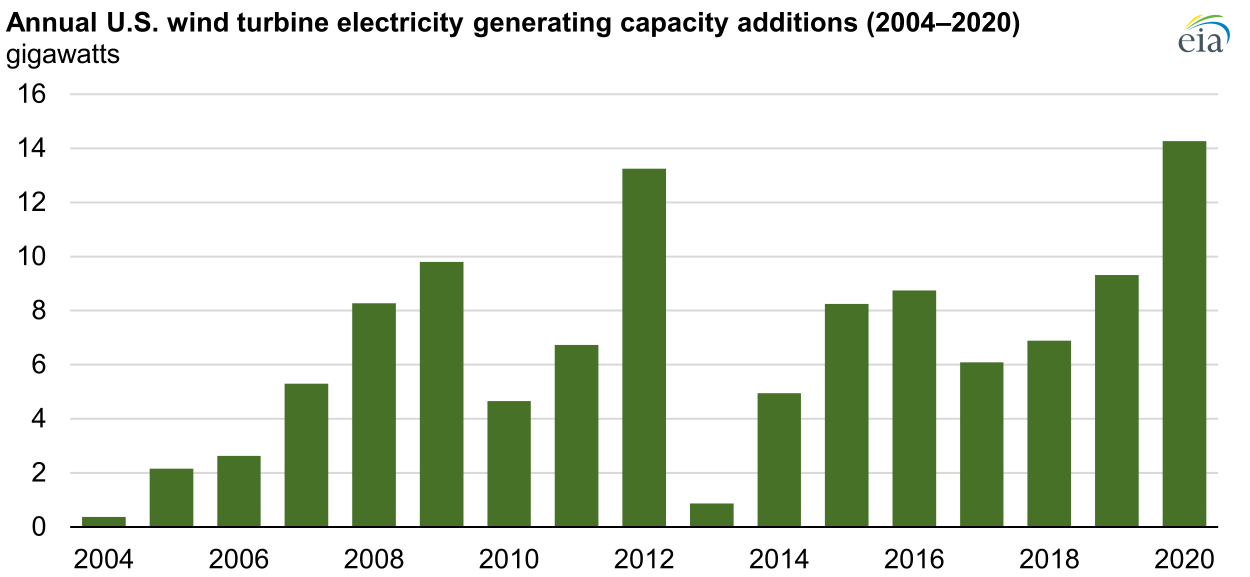
In both 2019 and 2020, project developers in the United States installed more wind power capacity than any other generating technology. According to data recently published by the U.S. Energy Information Administration (EIA) in its Preliminary Monthly Electric Generator Inventory, annual wind turbine capacity additions in the United States set a record in 2020, totaling 14.2 gigawatts (GW) and surpassing the previous record of 13.2 GW added in 2012. After this record year for wind turbine capacity additions, total wind turbine capacity in the United States is now 118 GW.
There are two other graphs in the article and an answer to the question of which state generates the most wind power. There are also links to the data.
This is not my typical post with charts, graphs, and data, but as a fan of both wood and boats the BBC article The futuristic cargo ship made of wood by Jocelyn Timperley (11/17/2020) is one I had to share.
In a small, rustic shipyard on the Pacific coast of Costa Rica, a small team is building what they say will be the world’s largest ocean-going clean cargo ship.
Ceiba is the first vessel built by Sailcargo, a company trying to prove that zero-carbon shipping is possible, and commercially viable. Made largely of timber, Ceiba combines both very old and very new technology: sailing masts stand alongside solar panels, a uniquely designed electric engine and batteries.
A major study found shipping emissions rose by 10% between 2012 and 2018, and projected that they could rise up to 50% further still by 2050 as more and more things are shipped around the world.
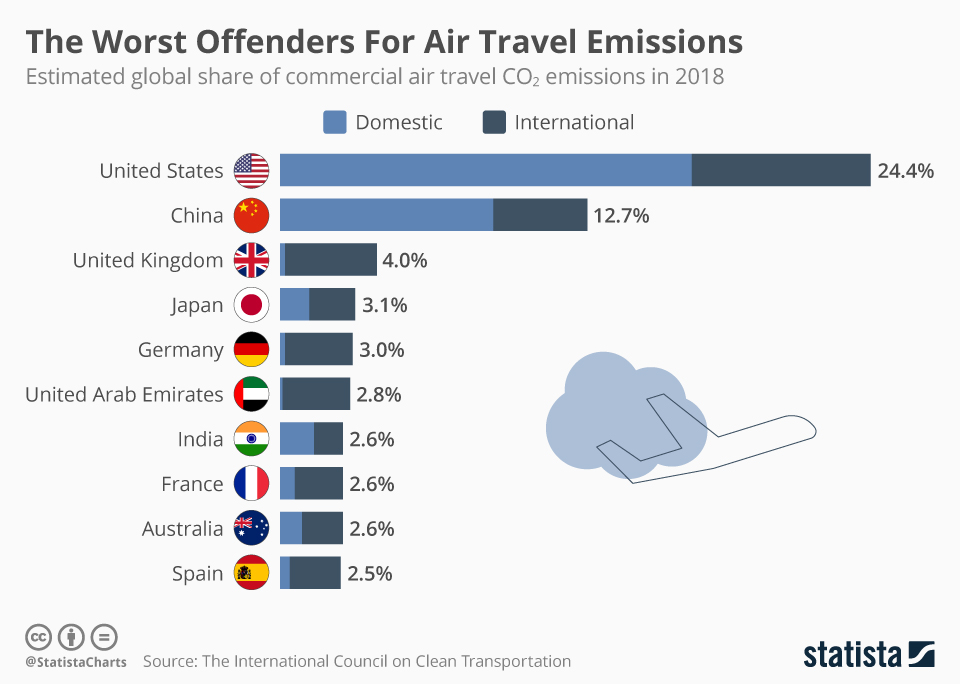
The 12 percent of Americans who make more than six round trips by air each year are actually responsible for two-thirds of all U.S. air travel and therefore two-thirds of all its emissions. Each of those travelers emits over 3 tons of CO2 per year and if everyone else in the world flew like them, global oil consumption would rise 150 percent while CO2 from fossil fuel use would go up 60 percent. As over half of the population does not generally fly, the U.S. ranks 11th in emissions per capita from flying.
CO2 emissions from all commercial operations in 2018 totaled 918 million metric tons—2.4% of global CO2 emissions from fossil fuel use. Using aviation industry values, there has been a 32% increase in emissions over the past five years.
At the bottom of the icct report there is a link to spreadsheet data with air travel emissions data by country.
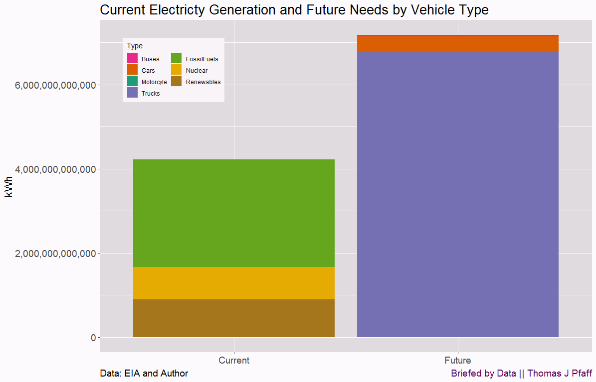 That is the title of a recent post on Briefed by Data. The graph here, from that post, shows our current electricity consumption and what we would need to add to move all cars to electric.