The question is answered in the Census Bureau post Census Bureau Data Show Third Quarter is Peak Time for Electric and Water Utilities by Justin Jarrett (1/5/19).
During just this year, U.S. electric utility revenue (NAICS 2211) for the third quarter of 2018 was $137.9 billion, an increase of 20.1 percent (± 2.7 percent) from the second quarter of 2018.
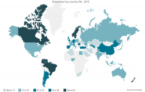
The graph here (copied from the post) has a couple of intriguing peaks between some Q3 years. Worth noting:
Industries that exhibit seasonal patterns, like electric and water utilities, can mask underlying economic conditions. However, seasonal adjustment produces data in which the values of neighboring quarters are usually easier to compare.
The Census Bureau has the data available on their Quarterly Services page (look under Historical Data tab).