Tag Archives: charts and graphs

Could the earth be cooling?

The NASA article Nope Earth Isn’t Cooling by Alan Buis (7/12/19) is a good primer on short and long term trends as it relates to global climate change. The main graphic (copied here), which is an animation zooming into a short time period and then back to the longer time period, demonstrates the classic misleading graph of selecting only a short time period to view.

So, what’s really important to know about studying global temperature trends, anyway?

Well, to begin with, it’s vital to understand that global surface temperatures are a “noisy” signal, meaning they’re always varying to some degree due to constant interactions between the various components of our complex Earth system (e.g., land, ocean, air, ice). The interplay among these components drive our weather and climate.

For example, Earth’s ocean has a much higher capacity to store heat than our atmosphere does. Thus, even relatively small exchanges of heat between the atmosphere and the ocean can result in significant changes in global surface temperatures. In fact, more than 90 percent of the extra heat from global warming is stored in the ocean. Periodically occurring ocean oscillations, such as El Niño and its cold-water counterpart, La Niña, have significant effects on global weather and can affect global temperatures for a year or two as heat is transferred between the ocean and atmosphere.

This means that understanding global temperature trends requires a long-term perspective. An examination of two famous climate records illustrate this point.

There are two other graphs. Global temp and CO2 can be found on the Calculus Projects page.

How easy is it to understand mass incarceration?

The details of mass incarceration is complicated, but the Prison Policy Initiative report Mass Incarceration: The Whole Pie 2019 by Wendy Sawyer and Peter Wagner (3/19/19) provides an extensive look at the data. The report has over 20 graphs and links to data. A few excerpts:

The American criminal justice system holds almost 2.3 million people in 1,719 state prisons, 109 federal prisons, 1,772 juvenile correctional facilities, 3,163 local jails, and 80 Indian Country jails as well as in military prisons, immigration detention facilities, civil commitment centers, state psychiatric hospitals, and prisons in the U.S. territories.

Every year, over 600,000 people enter prison gates, but people go to jail 10.6 million times each year. Jail churn is particularly high because most people in jails have not been convicted.

People in prison and jail are disproportionately poor compared to the overall U.S. population. The criminal justice system punishes poverty, beginning with the high price of money bail: The median felony bail bond amount ($10,000) is the equivalent of 8 months’ income for the typical detained defendant. As a result, people with low incomes are more likely to face the harms of pretrial detention. Poverty is not only a predictor of incarceration; it is also frequently the outcome, as a criminal record and time spent in prison destroys wealth, creates debt, and decimates job opportunities.

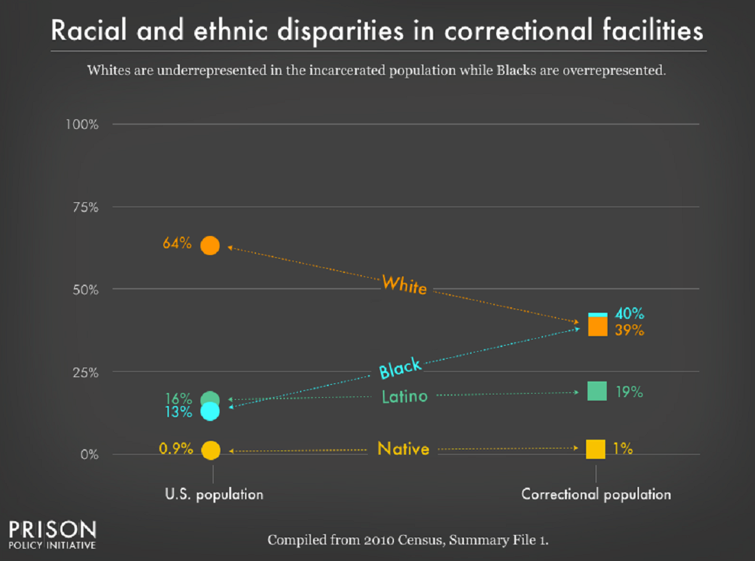
It’s no surprise that people of color — who face much greater rates of poverty — are dramatically over represented in the nation’s prisons and jails. These racial disparities are particularly stark for Black Americans, who make up 40% of the incarcerated population despite representing only 13% of U.S residents. The same is true for women, whose incarceration rates have for decades risen faster than men’s, and who are often behind bars because of financial obstacles such as an inability to pay bail.

Read the whole report for considerably more information and data.
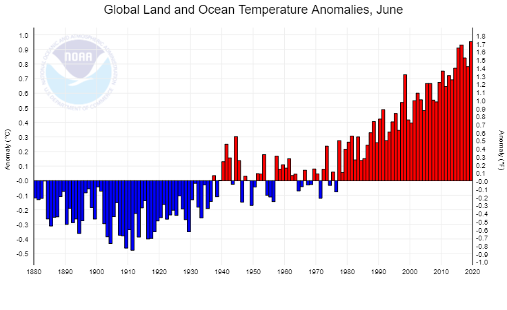
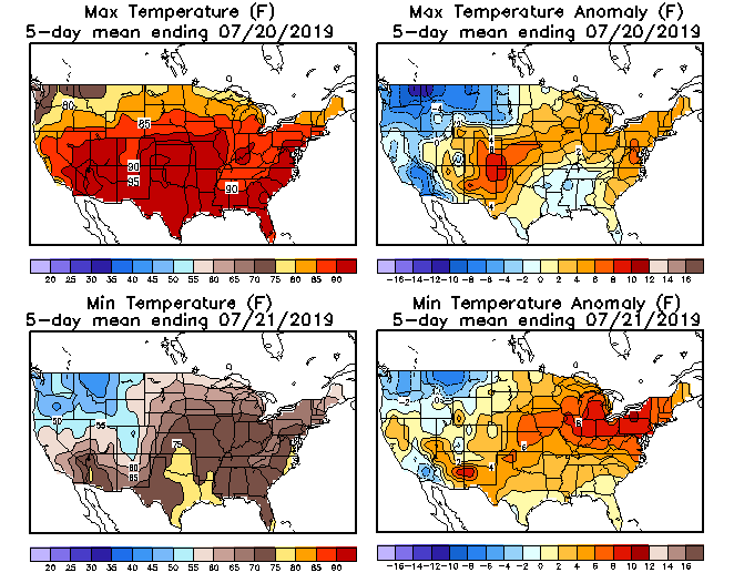
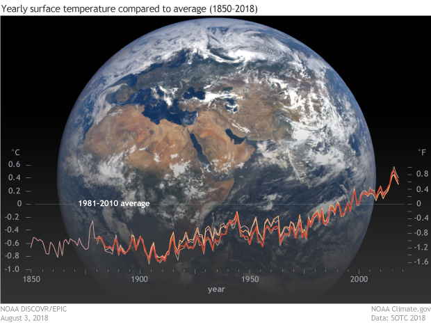
How much energy does the U.S. government consume?

The eia article U.S. government energy consumption continues to decline by Fred Mayes (7/25/19) has a half dozen charts showing U.S. government energy consumption.  For example, the chart copied here provides energy consumption by defense and civilian agencies by type (vehicles/equipment or buildings).

The U.S. federal government consumed 915 trillion British thermal units (Btu) of energy during the 2017 fiscal year (FY), or 20% less than a decade before. The slight decline in FY 2017 marks the fifth consecutive decline in annual federal government consumption.

To put this in some perspective, the eia article In 2018, the United States consumed more energy then ever before by Allen McFarland (4/16/19) shows that the U.S. consumed almost 100 quadrillion BTUs in 2017.

Primary energy consumption in the United States reached a record high of 101.3 quadrillion British thermal units (Btu) in 2018, up 4% from 2017 and 0.3% above the previous record set in 2007.

So, the U.S. government consumes about 1% of overall energy. Both articles have links to the data.

How hot was June 2019?

The NOAA National Centers for Environmental Information Global Climate Report – June 2019:

Averaged as a whole, the June 2019 global land and ocean temperature departure from average was the highest for June since global records began in 1880 at +0.95°C (+1.71°F). This value bested the previous record set in 2016 by 0.02°C (0.04°F). Nine of the 10 warmest Junes have occurred since 2010. June 1998 is the only value from the previous century among the 10 warmest Junes on record, and it is currently ranked as the eighth warmest June on record. Junes 2015, 2016, and 2019 are the only Junes that have a global land and ocean temperature departure from average above +0.90°C (+1.62°F). June 2019 also marks the 43rd consecutive June and the 414th consecutive month with temperatures, at least nominally, above the 20th century average.

How about land-only temps?

The global land-only surface temperature for June 2019 was 1.34°C (2.41°F) above the 20th century average. This was also the highest June temperature in the 140-year record, exceeding the previous record of +1.30°C (+2.34°F) set in 2015.

What about Europe?

Europe had its warmest June on record at 2.93°C (5.27°F) above the 1910–2000 average, surpassing the previous record of 1.95°C (3.51°F) set in 2003 by +0.98°C (+1.76°F). June 2019 also marked the first time since continental records began in 1910 that Europe’s June temperature departure from average surpassed the +2.0°C (+3.6°F) mark and nearly reaching +3.0°C (+5.4°F).

That is the way to beat a record. That isn’t a type the record was beat by almost 1°C.

Data for the chart here as well as land only or ocean only can be obtained from the NOAA Climate at a Glance page.


What percent of congress are immigrants or children of immigrants and what part of the country do they represent?

The PEW article In 116th Congress, at least 13% of lawmakers are immigrants or the children of immigrants by A.W. Geiger (1/24/19) provides an overview of the immigrant status of congress. The chart copied here show that the West has a greater number of immigrant or child of immigrant lawmaker.

While at least 13% of voting members in Congress are immigrants or children of immigrants, relatively few of these are foreign born: 13 in the House, and just one – Sen. Mazie Hirono, D-Hawaii – in the Senate. These 14 immigrant lawmakers represent just 3% of all voting members in both chambers, a slight uptick from recent Congresses but substantially below the foreign-born share of Congresses many decades ago. (For example, about 10% of members in the first and much smaller Congress of 1789-91 were foreign born. About a century later, in the 50th Congress of 1887-89, 8% of members were born abroad, according to a previous analysis.) The current share of foreign-born lawmakers in Congress is also far below the foreign-born share of the United States as a whole, which was 13.5% as of 2016.

The article includes a time series of the percent of foreign-born members in congress dating back to 1789. There is also a chart tracking were the immigrant or children of immigrant congress members are from.

Collectively, 74% of immigrants and children of immigrants in Congress have origins in countries in Europe, Latin America or Asia.

Much smaller shares claim heritage in countries in the Middle East, North America and sub-Saharan Africa – each below 10%.

How much does a half a degree Celsius matter?

Human-induced warming reached approximately 1 degree Celsius (1.8 degrees Fahrenheit) above pre-industrial levels in 2017. At the present rate, global temperatures would reach 1.5 degrees Celsius (2.7 degrees Fahrenheit) around 2040. The green section of the diagram represents the range of uncertainty in how much global temperature would continue to rise before leveling off, assuming that reductions in carbon dioxide emissions were to begin immediately and reach zero by 2055. Credit: IPCC


In terms of climate change a half a degree Celsius matters a lot. NASA has a two part series A Degree of Concern: Why Global Temperatures Matter and Part 2: Selected Findings of the IPCC Special Report on Global Warming both by Alan Buis (6/19/2019). The two part series is visually well done and an excellent example of telling a story on the web (especially part I).

Higher temperature thresholds will adversely impact increasingly larger percentages of life on Earth, with significant variations by region, ecosystem and species. For some species, it literally means life or death.

“What we see isn’t good – impacts of climate change are in many cases larger in response to a half a degree (of warming) than we’d expected,” said Shindell, who was formerly a research scientist at NASA’s Goddard Institute for Space Studies in New York City. “We see faster acceleration of ice melting, greater increases in tropical storm damages, stronger effects on droughts and flooding, etc. As we calibrate our models to capture the observed responses or even simply extrapolate another half a degree, we see that it’s more important than we’d previously thought to avoid the extra warming between 1.5 and 2 degrees Celsius.”

Read both reports for details.  This two part series could be the basis for a QL course.

Who gets injured by fireworks?

The U.S. Consumer Product Safety Commission has annual reports on fireworks. The 2018 report on the Fireworks Information Center page includes data on injuries. In 2018 64% of injuries were male. From 2003 to 2018 injury rates varied from a low of 2.8 per 100,000 to a high of 4.0 per 100,00. Some facts:

Males experienced an estimated 2.2 fireworks-related, emergency department-treated injuries per 100,000 individuals during the special study period. Females had 1.2 injuries per 100,000 people.

There is not a statistically significant trend detected in the fireworks-related injury estimates from 2003 to 2018.8.

When considering injury rates (number of injuries per 100,000 people), children and young adults had higher estimated rates of injury than the other age groups during the 2018 special study period. Children 10 to 14 years of age had the highest estimated injury rate at 5.2 per 100,000 population. This was followed by 3.1 injuries per 100,000 people from older teens 15 to 19 years of age, and 2.7 injuries per 100,000 people from children 5 to 9 years of age.

The report has a number of tables with data and the report could easily be used in a statistics or QL course.

How do we keep track of Greenland surface melt extent?

The NSIDC has a Greenland Surface Melt Extent Interactive Chart. For the graph here we selected 2012, 2016, and 2019 (blue). There was an early peak this year on June 12, 2019. How is this data collected (from Greenland Ice Sheet Today – About the Data):

Near-real-time images are derived from gridded brightness temperatures (TBs) from the Defense Meteorological Satellite Program (DMSP) Special Sensor Microwave Imager/Sounder (SSMIS) passive microwave radiometer. The TBs are calculated for each 25 kilometer grid cell. An algorithm is applied to produce an estimate of melt or no melt present for each grid cell. The data, images, and graphs are produced daily.

The colored areas on the daily image map records those grid cells that indicate surface melt from the algorithm, as a binary determination (melt / no melt). The melt extent graph indicates what percent of the ice sheet area is mapped as having surface melt, again from the binary determination per grid cell, using the summed area of the melt grid cells divided by the total ice sheet area.

Learn more at the NSIDC Greenland Ice Sheet Today page.  The data that is used to create the graph here doesn’t appear to be easily accessible. If you are interested and email may do the trick.

A recent Guardian article, Photograph lays bare reality of melting Greenland sea ice by Alison Rourke and Fiona Harvey (6/17/19) has an excellent photo of sled dogs appearing to walk on water. The article provides some context related to Greenland and ice.

How big is the disconnect between how we die and what the media reports?

The Our World in Data article Does the news reflect what we die from? by Hannah Ritchie (5/29/19) provides data on causes of death, google searches, and media reports by the NYT and the Guardian. The graph copied here is for 2016. As you can see there is a big disconnect. Why does this matter?

Media and its consumers are stuck in a reinforcing cycle. The news reports on breaking events, which are often based around a compelling story. Consumers want to know what’s going on in the world — we are quickly immersed by the latest headline. We come to expect news updates with increasing frequency, and media channels have clear incentives to deliver. This locks us into a cycle of expectation and coverage with a strong bias for outlier events. Most of us are left with a skewed perception of the world; we think the world is much worse than it is.5

The article has four time series from 1999 to 2016 (2004 to 2016 for google searches) corresponding to each of the four categories in the chart here. The charts are interactive and the data is available.

Footnote 5 is worth noting and Factfulness in worth reading: There are many results which show we have a negative bias of global progress. Factfulnesspublished by the Roslings, is packed with public survey results of Gapminder’s Ignorance Test. The test shows that the vast majority of people get the most basic questions on global development wrong (nearly always thinking the world is in a worst state than it is).


How has the economic situation of college students changed?

The Pew article A Rising Share of Undergraduates Are From Poor Families, Especially at Less Selective Colleges, by Richard Fry and Anthony Cilluffo (5/22/19) summarizes the change in the economic background of students from 1996 to 2016.

As of the 2015-16 academic year (the most recent data available), about 20 million students were enrolled in undergraduate education, up from 16.7 million in 1995-96.1 Of those enrolled in 2015-16, 47% were nonwhite and 31% were in poverty, up from 29% and 21%, respectively, 20 years earlier.2

The rising proportion of undergraduates in poverty does not mirror wider trends in society. The official poverty rate for adults age 18 to 64 (12%) was similar in 1996 and 2016, suggesting that access to college for students from lower-income backgrounds has increased since 1996.

As the graph copied here shows:

The growth in the share of dependent students from families in poverty has been uneven across postsecondary education. Their growing presence has been most dramatic among less selective institutions.

The article has a eight charts, a methodology section, and links to the data sources.