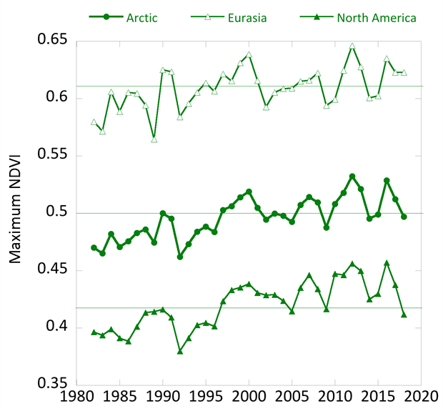
Tag Archives: charts and graphs

What are college persistence rates?

The St. Louis Fed post Staff Pick: College Education Persists Less for Blacks and Hispanics by Ana Kent (11/12/19 – reposted from Feb) explains:

Educational attainment tells us quite a bit about the types of financial outcomes we should expect a family to have. So does the education of the family’s parents. Unsurprisingly, most people tend to achieve the same level of education as their parents, with college “persisters” (college graduates for whom at least one parent was also a college grad) having the best financial outcomes.

There are racial differences, for example (note: the chart here is population composition – see the table in the article for persistence rates by race):

Blacks had the lowest intergenerational college persistence. If at least one parent had a degree, only 1 in 3 continued to get a college degree themselves.

Intergenerational no-college persistence also showed marked racial differences. Hispanics had the highest no-college persistence, with just under 9 in 10 not achieving a four-year degree if neither parent did.

The post has two graphs and one table.

How does food move around the U.S.?

An article by Fast Company, The first map of America’s food supply chain is mind-boggling by Megan Konar (10/28/19), reports on the paper Food flows between counties in the United States by Xiaowen Lin, et. el. The author of the paper created the network graph of food flow copied here.  From the article:

Overall, there are 9.5 million links between counties on our map.

At 22 million tons of food, Los Angeles County received more food than any other county in 2012, our study year. It also shipped out the most of any county: almost 17 million tons.

Some of the other largest links were inside the counties themselves. This is because of moving food items around for manufacturing within a county—for example, milk gets off a truck at a large depot and is then shipped to a yogurt facility, then the yogurt is moved to a grocery distribution warehouse, all within the same county.

The article has a link to data that created the map. There must be a good graph theory project here.

What is the status of the ozone hole?

According to the NOAA article Five questions about 2019’s record-small ozone hole by Rebecca Lindsey (10/21/2019):

In 2019, the hole that developed in the ozone layer over Antarctica was the smallest on record since 1982, according to the NASA/NOAA press release. In an average spring, the hole expands throughout September and early October to a maximum extent of about 8 million square miles (21 million square kilometers), an area larger than the United States and Canada combined. In 2019, the hole reached 6.3 million square miles (16.4 million square kilometers) on September 8, but then shrank to less than 3.9 million square miles (10 million square kilometers) for the remainder of September and the first half of October.

Why so small?

An uncommon weather event—a sudden stratospheric warming—disrupted the circulation in the polar stratosphere in early September, just as the ozone hole was beginning to form.

What about the future?

No, this year’s small ozone hole was simply the result of an isolated weather event, not part of a trend. Thanks to the international treaty banning the production and use of CFCs (short for chlorofluorocarbons), levels of these compounds have been declining since about 2000. But because CFCs are so long-lived, concentrations remain high enough to cause significant ozone loss each spring. With continued declines in CFCs, experts project the ozone layer will recover to its 1980 conditions around 2070.

There are three other graphics and the article is worth reading. If you are looking for classroom materials related to the ozone hole consider the Near-Ground Level Ozone Pollution Lab posted by NOAA and designed by SERC. Also note the Ozone project in the Calculus Projects page.

What’s the difference between consumption and production CO2 emissions?

The Our World in Data article How do CO2 emissions compare when adjusted for trade by Hannah Ritchie (10/7/2019) answers the question.

To calculate consumption-based emissions we need to track which goods are traded across the world, and whenever a good was imported we need to include all CO2 emissions that were emitted in the production of that good, and vice versa to subtract all CO2 emissions that were emitted in the production of goods that were exported.

Consumption-based emissions reflect the consumption and lifestyle choices of a country’s citizens.

The map copied here show consumption CO2 emissions per capita. As some countries consume more than they produce this this may be a more accurate way to compare CO2 emissions.

We see that the consumption-based emissions of the US are higher than production: In 2016 the two values were 5.7 billion versus 5.3 billion tonnes – a difference of 8%. This tells us that more CO2 is emitted in the production of the goods that Americans import than in those products Americans export.

The opposite is true for China: its consumption-based emissions are 14% lower than its production-based emissions. On a per capita basis, the respective measures are 6.9 and 6.2 tonnes per person in 2016. A difference, but smaller than what many expect.

The article has seven charts with data including time series data.

How do food systems differ between rich and poor countries?

The World Bank post The high price of healthy food and the low price of unhealthy food by Derke Headey and Harold Alderman (7/23/19) explores the connection between food systems and wealth in a country, along with the impacts. For example, their graph here show a correlation between stunting in children and the caloric price of milk.

The metric we use to analyze the global food system from a consumer perspective is the “relative caloric price” of a given food. Take eggs, for example: how expensive is an egg calorie in Niger compared to the most important staple foods in that country? Egg calories in Niger are 23.3 times as expensive as a calorie from a staple food, such as rice or corn. In contrast, egg calories in the US are just 1.6 times as expensive as staple food calories.

The big picture:

Hence the problem in less developed countries is that poor people also live in poor food systems: nutrient-dense foods like eggs, milk, fruits and vegetables can be very expensive in these countries, making it much harder to diversify away from nutrient-sparse staple foods like rice, corn and bread. The problem in more developed countries is rather different: unhealthy calories have simply become a very affordable option. In the US, for example, calories from soft drinks are just 1.9 times as expensive as staple food calories and require no preparation time.


What 5 states had the highest mortality rates?

The CDC data brief, Mortality Patterns Between Five States with Highest Death Rates and Five States with Lowest Death Rates: United States, 2017 by Jiaquan Xu, M.D. (9/5/2019), provides the  graph here of death rates by age (pay attention to the log scale on the x-axis). The five states with the lowest age-adjusted death rates: California, Connecticut, Hawaii, Minnesota, and New York. The highest: Alabama, Kentucky, Mississippi, Oklahoma, and West Virginia.  By gender:

Among males, the average death rate for the states with the highest rates (1,094.3) was 48% higher than that for the states with the lowest rates (741.2).

Among females, the average death rate for the states with the highest rates (785.7) was 49% higher than that for the states with the lowest rates (526.4).

For Hispanics:

The rate for Hispanic persons was 27% lower (374.6 compared with 509.7) for the states with highest rates than for the states with the lowest rates.

There are four graph each with links to the data.

Which country is most responsible for atmospheric CO2?

The our world in data post, Who has contributed most to global CO2 emissions? by Hannah Ritchie (10/1/2019) provides this chart of cumulative CO2 emissions from 1751 to 2017 by region and country.

Since 1751 the world has emitted over 1.5 trillion tonnes of CO2.1 To reach our climate goal of limiting average temperature rise to 2°C, the world needs to urgently reduce emissions. One common argument is that those countries which have added most to the CO2 in our atmosphere – contributing most to the problem today – should take on the greatest responsibility in tackling it.

The article has three other interactive graph, with data, to explore CO2 emissions by country over time, although none of them consider per capita emissions.

What is the distribution of people by age and race?

The Pew article, The most common age among whites in U.S. is 58, more than double that of racial and ethnic minorities by katherine Schaeffer (7/30/19) provides this graph of the distribution of age by race.

Whites had a median age of 44, meaning that if you lined up all whites in the U.S. from youngest to oldest, the person in the middle would be 44 years old. This compares with a median age of just 31 for minorities and 38 for the U.S. population overall.

U.S. Hispanics were also a notably youthful group, with a median age of 30. As a separate Pew Research Center report noted, Latinos have long been one of the nation’s youngest racial or ethnic groups, dating back to at least 1980.

The demographic differences leads to questions about studies that compare variables by race. If they don’t adjust for these differences they may be inaccurate. In general, a random sample of people will end up with an older cohort for whites and some variables are correlated with age.

How much energy will we use in the future?

The EIA article EIA projects nearly 50% increase in world energy usage by 2050, led by growth in Asia by ARi Kahan (9/24/2019) provides regional energy consumption projections by decade through 2050.  The report includes six other graphs including sources of energy.

With the rapid growth of electricity generation, renewables—including solar, wind, and hydroelectric power—are the fastest-growing energy source between 2018 and 2050, surpassing petroleum and other liquids to become the most used energy source in the Reference case. Worldwide renewable energy consumption increases by 3.1% per year between 2018 and 2050, compared with 0.6% annual growth in petroleum and other liquids, 0.4% growth in coal, and 1.1% annual growth in natural gas consumption.

The eia projects that even with the rapid growth of renewables they will only make up 28% of energy production. There are links to the data.

How closely linked are CO2 and Global Temperature?

The Climate.gov article, If carbon dioxide hits a new high every year, why ins’t every year hotter than the last by Rebecca Lindsey (9/9/19), provides a primer on the carbon dioxide and global temperature link, along with the role of the oceans.

Thanks to the high heat capacity of water and the huge volume of the global oceans, Earth’s surface temperature resists rapid changes. Said another way, some of the excess heat that greenhouse gases force the Earth’s surface to absorb in any given year is hidden for a time by the ocean. This delayed reaction means rising greenhouse gas levels don’t immediately have their full impact on surface temperature. Still, when we step back and look at the big picture, it’s clear the two are tightly connected.

There are nice rate of change statements:

Atmospheric carbon dioxide levels rose by around 20 parts per million over the 7 decades from 1880­–1950, while the temperature increased by an average of 0.04° C per decade.

Over the next 7 decades, however, carbon dioxide climbed nearly 100 ppm (5 times as fast!). . . . At the same time, the rate of warming averaged 0.14° C per decade.

There is another graph, a fun cartoon, and links to the data.