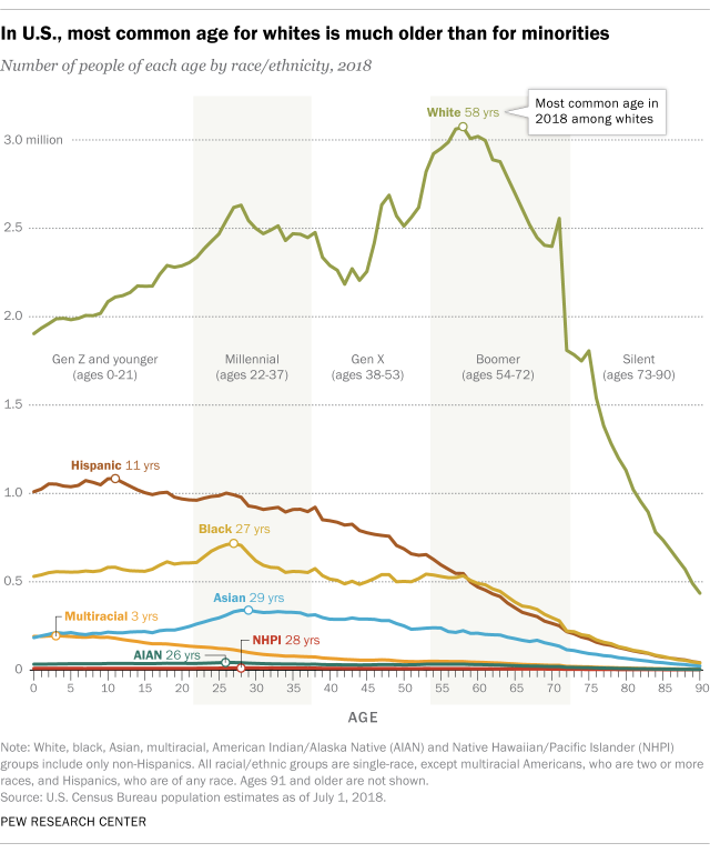
Tag Archives: charts and graphs

What is in the Income and Poverty 2018 report?

The U.S. Census Bureau report Income and Poverty in the United States: 2018 by Jessica Semega, Melissa Kollar, John Creamer, and Abinash Mohanty (9/10/19) is now available.  A few highlights can be found in the post Pay is Up. Poverty is Down. How Women are Making Strides  by Jessica Semega (9/10/19). For example, the graph copied here is poverty rates for  2917 and 2018 for men, women, and by race for women. In terms of households:

Median incomes of married-couple households and those with male householders did not change from 2017.

In 2018, the poverty rate for families with a female householder was 24.9%, higher than that for married-couple families (4.7%) and families with a male householder (12.7%).

However, the poverty rate for families with a female householder declined from the previous year, at 26.2% in 2017.

The full report contains 20 pages of charts and summaries related to income and poverty by numerous categories. The other 50 or so pages are data tables that are also available in excel files (see links on right sidebar of the report page).  There is ample data here for use in courses.

Is the sun causing climate change?

The NASA post, What is the Sun’s Role in Climate Change (9/6/19) make it clear that the sun isn’t to blame for climate change.

For more than 40 years, satellites have observed the Sun’s energy output, which has gone up or down by only .01 percent during that period. Since 1750, the warming driven by greenhouse gases coming from the human burning of fossil fuels is over 50 times greater than the slight extra warming coming from the Sun itself over that same time interval.

Even a grand minimum won’t help:

Several studies in recent years have looked at the effects that another grand minimum might have on global surface temperatures.2 These studies have suggested that while a grand minimum might cool the planet as much as 0.3 degrees C, this would, at best, slow down (but not reverse) human-caused global warming. There would be a small decline of energy reaching Earth, and just three years of current carbon dioxide concentration growth would make up for it. In addition, the grand minimum would be modest and temporary, with global temperatures quickly rebounding once the event concluded.

Where does NY state rank on energy consumption?

The eia Beta site allows users to choose a state to obtain energy information for that state.  When selecting a state users get data about energy consumption and production, along with other facts.

New York generates about one-third of its electricity from nuclear power plants, and the state includes nuclear power as a zero emissions resource that counts toward New York’s 2040 emissions reduction goals.

New York is the fifth-largest consumer of petroleum among the states, but, in part because almost three-tenths of state residents use public transit to commute to work (more than five times the U.S. average), New Yorkers consume less petroleum per capita than residents of any other state in the nation.

There is a tab for rankings. The graph copied here ranks states based on energy consumption per person. Only one other state, Rhode Island, has a lower energy consumption per capita than NY. Louisiana tops the ranking.

How different is weekly pay of women and men by race?

The BLS report, Highlights of women’s earning in 2017 has four charts with data about women’s earnings and occupation.  The chart copied her compares men and women by race.

Asian women and men earned more than their White, Black, and Hispanic counterparts in 2017. Among women, Whites ($795) earned 88 percent as much as Asians ($903); Blacks ($657) earned 73 percent; and Hispanics ($603) earned 67 percent. Among men, these earnings differences were even larger: White men ($971) earned 80 percent as much as Asian men ($1,207); Black men ($710) earned 59 percent as much; and Hispanic men ($690), 57 percent. (See chart 3 and table 1.)

Note:

The earnings comparisons in this report are on a broad level and do not control for many factors that can be important in explaining earnings differences, such as job skills and responsibilities, work experience, and specialization.

The BLS is an excellent source for data.

How are CEOs doing?

The EPI article, CEO compensation has grown 940% since 1978 by Lawrence Mishel and Julia Wolfe (8/14/2019), summarizes CEO compensation.  Selected Key findings:

Using the stock-options-realized measure, we find that the average compensation for CEOs of the 350 largest U.S. firms was $17.2 million in 2018. Compensation dipped 0.5% in 2018 following a 7.6% gain in 2017.

The fact that CEO compensation has grown far faster than the pay of the top 0.1% of wage earners indicates that CEO compensation growth does not simply reflect a competitive race for skills (the “market for talent”) that also increased the value of highly paid professionals: Rather, the growing differential between CEOs and top 0.1% earners suggests the growth of substantial economic rents in CEO compensation (income not related to a corresponding growth of productivity). CEO compensation appears to reflect not greater productivity of executives but the power of CEOs to extract concessions. Consequently, if CEOs earned less or were taxed more, there would be no adverse impact on the economy’s output or on employment.

Over the last three decades, CEO compensation increased more relative to the pay of other very-high-wage earners than did the wages of college graduates relative to the wages of high school graduates. This finding indicates that the escalation of CEO pay does not simply reflect a more general rise in the returns to education.

There are six tables/graphs in the article and the data is available for download.

How much time do we spend on our phones?

The RescueTime blog post Screen time stats 2019: Here’s how much you use your phone during the workday? by Jory MacKay (3/21/2019) provides data on phone use. Note that

Let’s start with the high-level stats. When we looked at the data of 11,000 users who actively use the RescueTime app, we found that most peopleon average, spend 3 hours and 15 minutes on our phones.

So, the data comes from users of the RescueTime app and even though the sample size is large it is not a random sample. It is an interesting question if this sample of users is under users or over users of their phones. Still, the data is interesting.

And while a recent Deloitte survey found the average American checks their phone 47 times a day, our number was slightly higher. We found that, on average, users check their phones 58 times a day with 30 check-ins happening during working hours (9am–5pm).

Most people spend about 1 minute and 15 seconds on their phone each time they pick them up. This means we’re losing 37.5 minutes a day during working hours to our phones (at a minimum).

The graph copied here is a representation of what those 37.5 minutes may look like.  Why does this matter?

Psychologists have found that even brief mental blocks created by shifting between tasks can cost as much as 40% of your productive time.

And when it comes to our phones especially, it’s not just the switches themselves that interrupt our day, but the expectation of being interrupted.

In fact, a recent study in the Journal of the Association for Consumer Researchfound that even the presence of a turned off smartphone lowered our cognitive performance. In other words, just having your phone around undercuts your ability to do good work.

There are more graphs in the article and plenty of quantitative information for a stats or QL course.

How hot was July 2019?

NOAA’s Global Climate Report – July 2019 notes

The July 2019 global land and ocean surface temperature departure from average was the highest for July since global records began in 1880 at 0.95°C (1.71°F) above the 20th century average. This value surpassed the previous record set in 2016 by 0.03°C (0.05°F). Nine of the 10 warmest Julys have occurred since 2005, with the last five years (2015–2019) ranking among the five warmest Julys on record.

This makes July the hottest month ever. If we consider land-only (oceans absorb much of the warming)

The global land-only surface temperature for July 2019 was 1.23°C (2.21°F) above the 20th century average and was the second highest July temperature in the 140-year record. July 2017 holds the record for the highest July global land-only temperature at +1.24°C (+2.23°F).

The links in the quotes point to the data sets.

What happened with the Climate in 2018?

The NOAA article Reporting on the State of the Climate in 2018 by Jessica Blunden (8/12/19) summarizes key climate markers from 2018 such as

Last year was the fourth warmest year on record despite La Niña conditions early in the year and the lack of a short-term warming El Niño influence until late in the year.

Global sea level was highest on record. For the seventh consecutive year, global average sea level rose to a new record high in 2018 and was about 3.2 inches (8.1 cm) higher than the 1993 average, the year that marks the beginning of the satellite altimeter record.

Glaciers melted around the world. Preliminary data indicate that the world’s most closely tracked glaciers lost mass for the 30th consecutive year. Since 1980, the cumulative loss is the equivalent of slicing 79 feet (24 meters) off the top of the average glacier.

There are a number of graphs and plenty of quantitative information in this article.

What new energy record did the U.S. set?

The eia reports that 44.5 Bcf of natural gas was consumed in the lower 38 on July 19 in their post United States sets new daily record high for natural gas use in the power sector by Katie Dyl (8/5/19).

Higher electricity demand for air conditioning during a heat wave from July 15 through July 22 drove the increased power generation, especially from natural gas-fired generators. Although the highest temperatures occurred during the weekend, most states east of the Rocky Mountains experienced warmer-than-normal weather in the days leading up to the heat wave. From July 16 through July 21, the average maximum temperature exceeded 85°F in most parts of the country.

Note the feedback loop. As the planet warms we use more energy (still mostly fossil fuels) to cool homes  and business (cooling takes more energy than heating) and thus emitting more co2 to warm the planet.  The post has other graphs and links to the data.

How can we find out how much a city may warm?

The BBC Visual and Data Journalism team has posted How much warmer is your city? (7/31/19) The page includes a menu to select a city around the globe to see how January and July temperatures may increase under different scenarios. For example, the graph here is for Washington DC. The page includes animations and reveals information as we scroll down. Other information on the page, for example,

The Indonesian capital (Jakarta), home to 10 million people, is one of the fastest sinking cities in the worldThe northern part of the city is sinking at a rate of 25cm a year in some areas. The dramatic rate is due to a combination of excessive groundwater extraction causing subsidence and sea level rise caused by climate change. A 32km sea wall and 17 artificial islands are being built to protect the city at a cost of $40bn.

There are links to data sources.