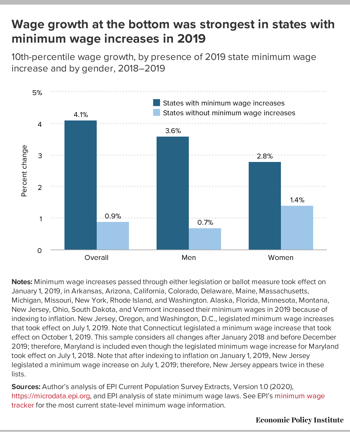
 This graph from the EPI post Low-wage workers saw the biggest wage growth in sates that increased their minimum wage between 2018 and 2019 by Elise Gould (3/4/2020) answers part of the question. It is worth noting that:
Strong wage growth at the 10th percentile is not simply due to stronger overall wage growth in those states.
Between 2018 and 2019, the median and 80th percentile wage in states with minimum wage changes increased 0.7% and 1.5%, respectively, while they increased 2.1% and 2.4%, respectively, in non-changing states.
There are three other graphs in the article and each has a link to data.
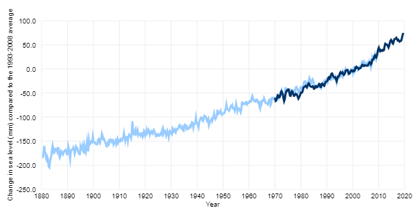
 No, as can be easily seen by the graphic here copied from the NASA article