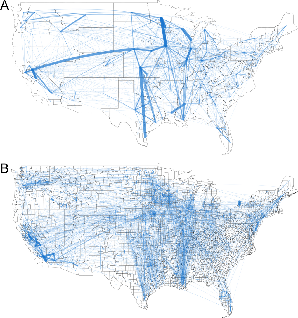
 An article by Fast Company, The first map of America’s food supply chain is mind-boggling by Megan Konar (10/28/19), reports on the paper Food flows between counties in the United States by Xiaowen Lin, et. el. The author of the paper created the network graph of food flow copied here. From the article:
Overall, there are 9.5 million links between counties on our map.
At 22 million tons of food, Los Angeles County received more food than any other county in 2012, our study year. It also shipped out the most of any county: almost 17 million tons.
Some of the other largest links were inside the counties themselves. This is because of moving food items around for manufacturing within a county—for example, milk gets off a truck at a large depot and is then shipped to a yogurt facility, then the yogurt is moved to a grocery distribution warehouse, all within the same county.
The article has a link to data that created the map. There must be a good graph theory project here.
