Tag Archives: charts and graphs

Who Votes?

Pew has a summary of voter demographics by party in their article What the 2020 electorate looks like by party, race and ethnicity, age, education and religion by John Gramlich (10/26/2020). For example, see the graph copied here.

White Americans accounted for 67% of eligible voters nationally in 2018, but they represented a much larger share in several key battlegrounds in the Midwest and Mid-Atlantic, including Wisconsin (86%), Ohio (82%), Pennsylvania (81%) and Michigan (79%). The reverse was true in some battleground states in the West and South. For example, the White share of eligible voters was below the national average in Nevada (58%), Florida (61%) and Arizona (63%). You can see racial and ethnic breakdown of eligible voters in all 50 states – and how it changed between 2000 and 2018 – with this interactive feature.

Check out the interactive graph that is referenced in this quote, along with the half a dozen other graphs in the article. All great for a QL or stats based course.

How do we compare the racial differences in home ownership?

To address this question we start with a recent post by Kevin Drum (10/23/2020): Are Black Homeowners Suffering from Slow Price Growth?

There’s no question that homes in majority-Black neighborhoods are undervalued compared to similar homes in majority-White neighborhoods, but do they also appreciate more slowly?

The article goes through four charts with the last one copied here.

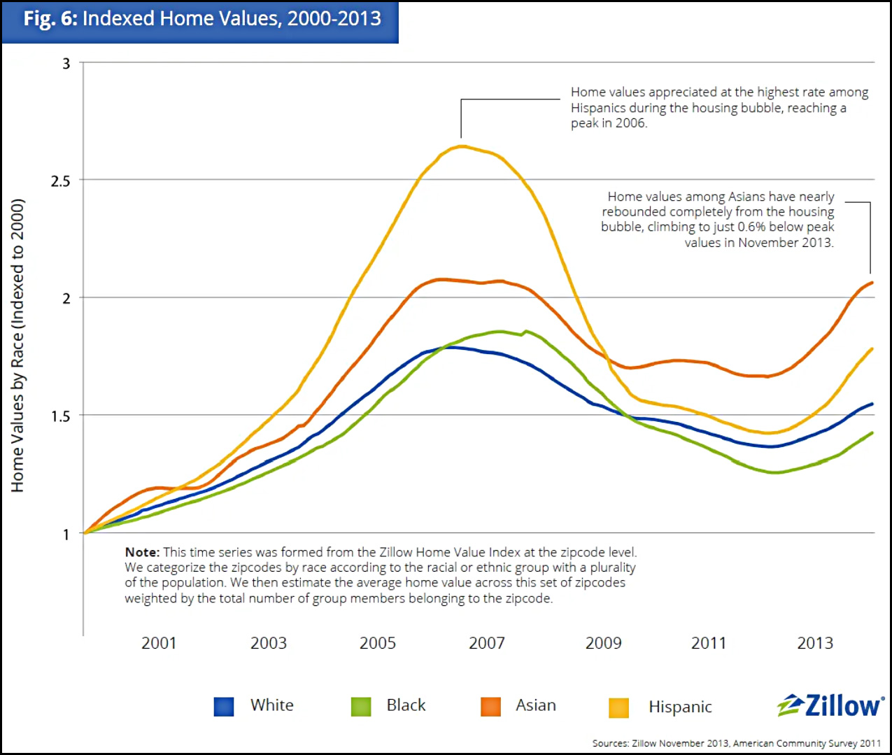
However, if I were forced to choose one of these as the most telling, I’d take the Zillow chart since its data covers the entire nation and it provides a useful time series that fits what I know about the bubble-era lending industry—although I’d sure like to see it extended to the present. It shows that over a somewhat longish term, home appreciation has been lower in Black neighborhoods than in white neighborhoods, primarily because of a huge drop following the housing bubble. The culprit here, however, is not Black neighborhoods per se, but the mortgage industry, which oversold to Black borrowers during the bubble and drove prices far higher than even normal bubble standards. That wretched episode has been documented in considerable detail in a lot of places, but you can read a good outline here if you want to learn more.

One of the articles linked to is Devaluation of housing in black neighborhoods, Part 2: Appreciation by Joe Cortright (7/24/2019):

A key question the Brooking’s report leaves unanswered is whether the black/white housing differential is larger or smaller than it was 10 or 20 years ago.  If it was larger in the past and is smaller today, that implies that homes in majority black neighborhoods, although still undervalued relative to homes in predominantly white neighborhoods, have enjoyed greater relative appreciation. From the standpoint of wealth creation, the amount of appreciation since you bought your home is likely to matter more than whether the current price of your house is more or less than otherwise similar properties. Another way of expressing this is that homeowners in black neighborhoods had a lower purchase price (or basis) in their home, and even though it is still undervalued, it may have gained more value in percentage terms than homes in non-majority black neighborhoods.

Indeed, Dan Immergluck and his colleagues at the Georgia State University found that for those who bought homes in 2012, price appreciation for black homebuyers from 2012 through 2017 was higher than for white homebuyers.  Immergluck’s data show that in most markets, homes bought by black buyers appreciated more than homes bought by white homebuyers.

This article also references the Zillow study,  A House Divided – How Race Colors the Path to Homeownership by Skylar Olsen (1/15/2014), which includes a number of graphs related to homeownership by race. As Drum notes it would be nice if this study was updated.
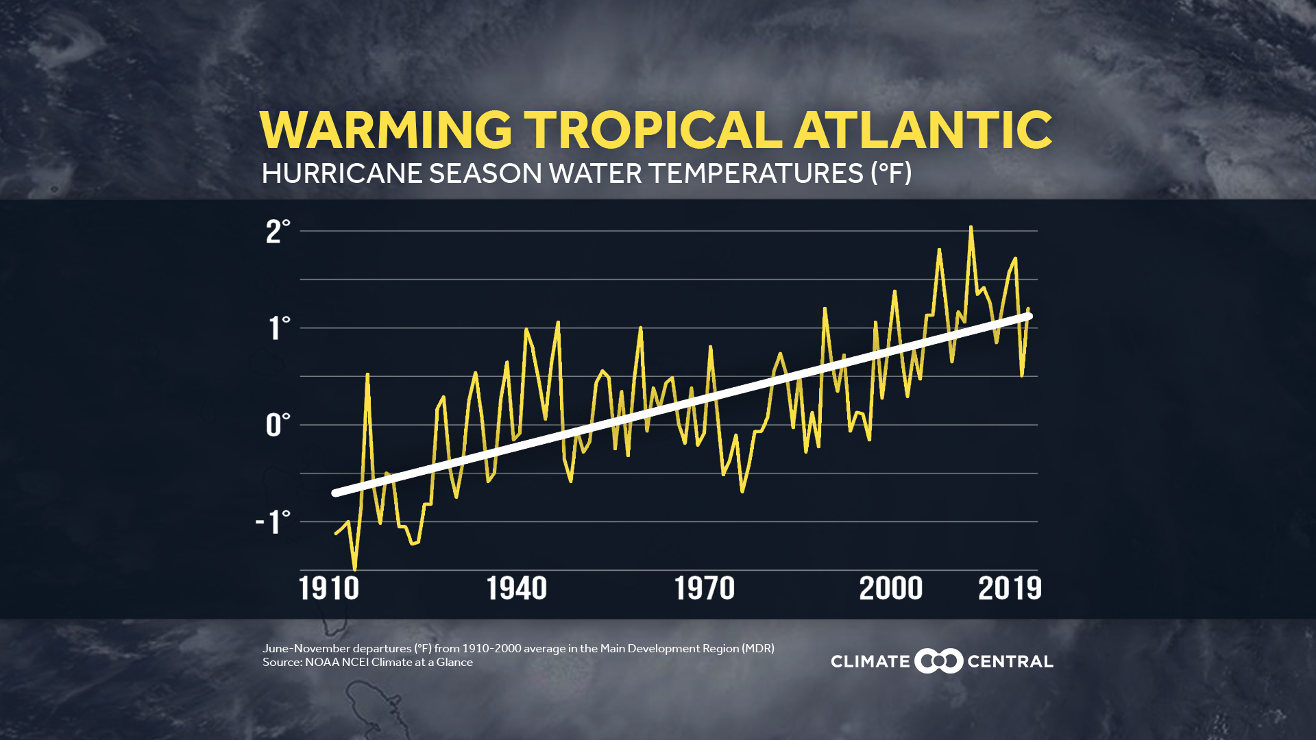
Do oil and gas companies go bankrupt?

Well, of course they do. While we may be happy with low gas prices at the pump, may this cause problems in the future? I’m not sure but someone has to cover the debt that we see in the graphic here from Tracking the Growing Wave of Oil & Gas Bankruptcies in 2020 by Omri Wallach (7/24/2020).

For oil and gas producers, the second quarter of 2020 saw 18 bankruptcies, the highest quarterly total since 2016.

So far, they’re largely centered in the U.S., which saw a boom of surface-level shale oil production in the 2010’s to take advantage of rising crude prices. As prices have dropped, many heavily leveraged companies have started to run out of options.

If this peaks your interest then a related article, Today’s Energy Predicament – A Look at Some Charts by Gail Tverberg  (9/1/2020) at Our Finite World is a good follow up.


Who are the extreme poor?

The World Bank Data Blog post Where the extreme poor live by Marta Schoch, Christoph Lanker and Melina Fleury (10/12/2020) provides the graph copied here.

Although the number of poor people has fallen in many regions, most notably East Asia and Pacific, and more recently South Asia, there has been no reduction in Sub-Saharan Africa, where the regional poverty rate remains above 40% in 2017.

The Middle East and North Africa has also seen an increase in the number of poor in recent years, driven largely by the economies in the region that are affected by conflict.

The post has links to reports with data.

How important is manufacturing to the U.S. economy?

At the end of August I posted about the number of manufacturing jobs in the U.S in the post How many people are employed in manufacturing? The Census Bureau has a recent post, Manufacturing Still Amon Top Five U.S. Employer by Adam Grundy (10/2/2020) that adds some context. Manufacturing is the fifth-largest employer with health care and social assistance at the top.  As the graphic here shows, manufacturing has a better than average salary. Also,

According to the Census Bureau’s Preliminary Profile of US Exporting Companies in 2017-2018, nearly six in 10 U.S. exporting dollars come from manufacturers.

There are other graphics and links to data in the article.

How does U.S. covid testing compare to other countries?

Our World in Data has an interactive graph that plots covid confirmed cases by tests both per million people and including an element of time. Copied here is one example with the U.S. and other selected countries. The paths for each country is from Jan 21 to Oct 5. So, for example, while the U.S. has increased testing (going up along the y-axis)  it has also had an increase in the confirmed cases (moving to the right along the x-axis). In the end the test positive rate has been fairly stable around 6-7%. Explore this graph by comparing other countries. As always, Our World in Data makes the data available.

Are hurricanes getting stronger?

Climate Central provides some graphs and facts related to hurricanes in their article Stronger Hurricanes (9/23/2020).  The graph shows the trend in Atlantic water temperature and here are the related key concepts from the article:

Sea surface temperatures in the tropical Atlantic, known as the Main Development Region for tropical systems (depressions, storms, and hurricanes), have risen 1.85°F in the last century.

The likelihood of tropical cyclones (the term scientists broadly use to represent hurricanes, typhoons, etc) reaching Category 3 status has increased since 1979.

Warming water and air from climate change creates the potential for stronger hurricanes, with heavier rain and higher storm surge, increasing the risk of flooding when they make landfall.

There are two other graphs, further information, and citations of data sources along with methodolgy.

What was the 2020 Arctic sea ice minimum?

The climate.gov article 2020 Arctic sea ice minimum second lowest on record by Michon Scott (9/21/2020) reports:

On September 15, 2020, the National Snow and Ice Data Center (NSIDC) announced, Arctic sea ice appeared to have reached its annual minimum extent. At 1.44 million square miles (3.74 million square kilometers), this minimum was second only to the record-low extent observed on September 17, 2012. The 2020 figure—preliminary because a late-season surge of summer warmth could still drop the extent further—continued an observed trend of long-term Arctic sea ice decline.

The graph here is from the National Snow and Ice Data Center’s Chartic Interactive Sea Ice Graph (a really great visual). I selected 2010-2020. The year 2012, still the current record, was an impressive minimum and this year is the first in the last 8 to come close.

From the article:

Among long-time observers of Arctic sea ice, the 2020 value was significant in that it not only punctuated a long-term decline, but also because it fell below the 4-million-kilometer (1.5-million-mile) threshold for only the second time in the satellite record—after  2012, when the minimum extent dipped to 1.31 million square miles (3.39 million square kilometers). Ted Scambos, senior research scientist at the Earth Science Observation Center at the University of Colorado-Boulder, says, “This threshold means the Arctic is more ocean than ice, a blue highway that’s been open since mid-July and won’t close until well into October, and a huge fetch for wave action along an 8,000-mile open coast of Siberia and Alaska.” The combination of sea ice decline and permafrost thaw can lead to coastal erosion as more abundant waves wear away newly softened coastlines.

What is the fossil fuel percent of our energy consumption?

The eia post Fossil fuels account for the largest share of U.S. energy production and consumption by Bill Sanchez (9/14/2020) summarizes our energy production and consumption since 1950. From the graph copied here we see that even though we have increased renewable energy capacity they still make up a small percent of our total energy consumption. Some good news:

The share of U.S. total energy consumption that originated from fossil fuels has fallen from its peak of 94% in 1966 to 80% in 2019. The total amount of fossil fuels consumed in the United States has also fallen from its peak of 86 quads in 2007.

There are three other graphs and links to data.

How hot was July 2020?

From NOAA’s Global Climate Report – July 2020:

The July 2020 global land and ocean surface temperature of 0.92°C (1.66°F) above the 20th century average tied with 2016 as the second highest July global temperature since records began in 1880. This value was only 0.01°C (0.02°F) shy of tying the record warm July of 2019.

The Northern Hemisphere land and ocean surface temperature was the highest in the 141-year record at 1.18°C (2.12°F) above average.

Regionally, the Caribbean region had its warmest July on record, with a temperature departure of 1.24°C (2.23°F) above average. This was 0.09°C (0.16°F) above the previous record set in 2016.

The summary includes links to the data.