 The EPI article, Wages grew in 2020 because the bottom fell out of the low-wage labor market, by Elise Gould and Jori Kandra (2/24/2021) provides insights into changes in the labor market this past year. Key find:
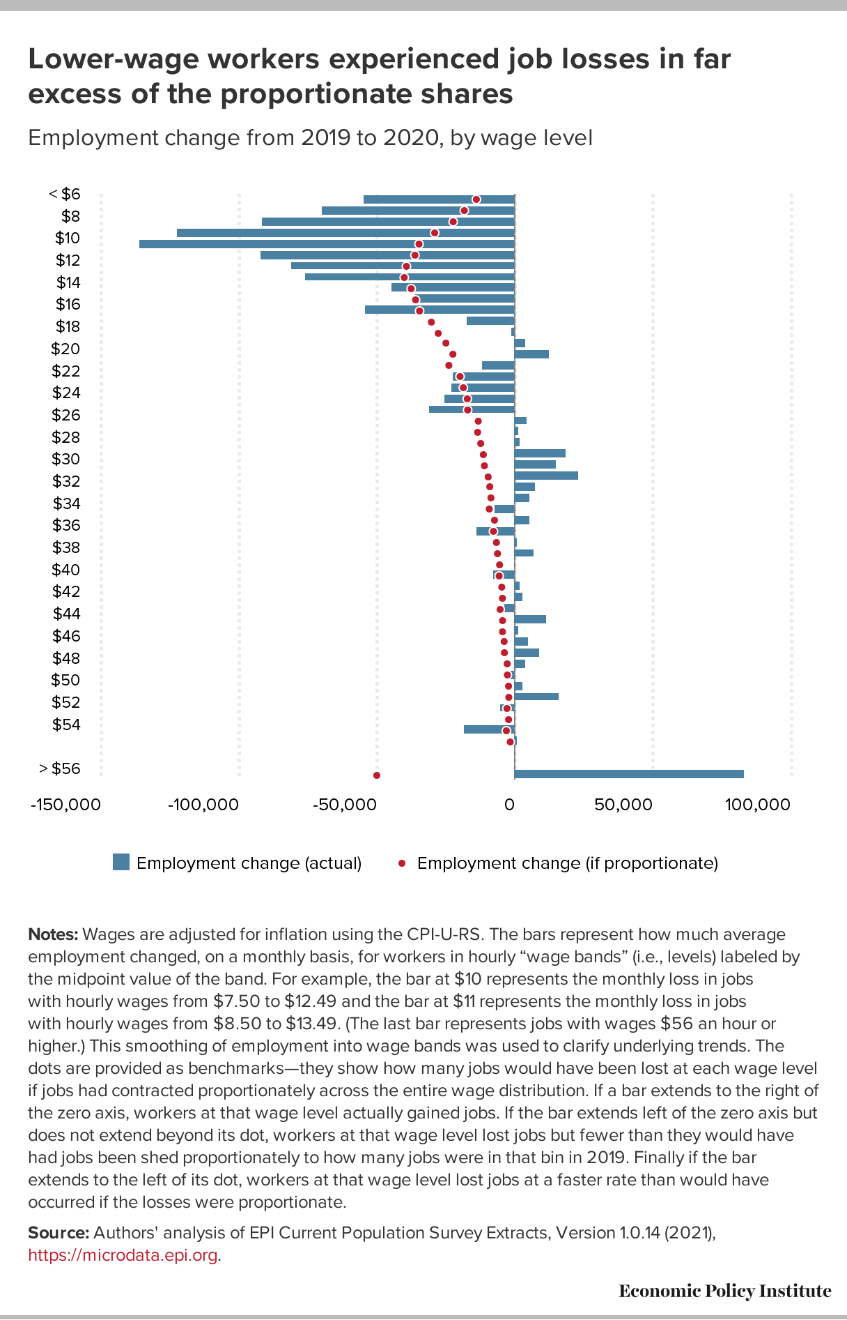
Wages grew largely because more than 80% of the 9.6 million net jobs lost in 2020 were jobs held by wage earners in the bottom 25% of the wage distribution. The exit of 7.9 million low-wage workers from the workforce, coupled with the addition of 1.5 million jobs in the top half of the wage distribution, skewed average wages upward.
There are seven graphs or tables in the article with the associated data. The last two graphs are of the same type as the one copied here but for the 2000 and 2008 recessions, respectively.