NASA’s Scientific Visualization Studio’s post Shifting Distribution of Land Temperature Anomalies, 1951-2020 by mark SubbaRao (4/23/2021) provides the animation here.
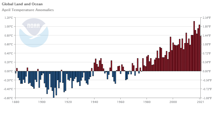
This visualization shows how the distribution of land temperature anomalies has varied over time. As the planet has warmed, we see the peak of the distribution shifting to the right. The distribution of temperatures broadens as well. This broadening is most likely due to differential regional warming rather than increased temperature variability at any given location.
The data is available:
NASA’s full surface temperature data set – and the complete methodology used to make the temperature calculation – are available at: https://data.giss.nasa.gov/gistemp
You will also find similar shifting normal distribution animations on the animations page.