 From the climate.gov article NOAA-led drought task force concludes current Southwest drought is a preview of coming attractions by Rebecca Lindsey (9/23/2021):
The team found that the record-low precipitation that kicked off the event could have been a fluke—just the rare bad luck of natural variability. But the drought would not have reached its current punishing intensity without the extremely high temperatures brought by human-caused global warming.
The key points:
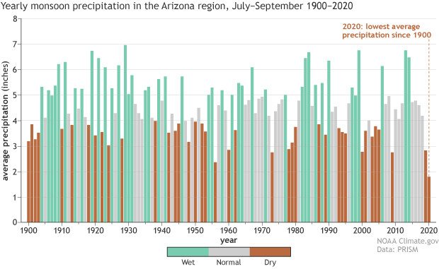
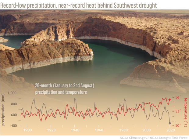
The cumulative precipitation for the 20-month period was the lowest on record, dating back to 1895. That left almost the entire western half of the contiguous United States in some level of drought at the end of August.
and
Meanwhile, the average temperatures over the same 20-month period were near-record high. High temperatures make the atmosphere thirsty for moisture, which it draws vigorously out of the region’s soil, rivers, lakes—even the snowpack. This atmospheric demand, called a vapor pressure deficit (“VPD” for short), reached record highs during the current drought.
No relief in site:
As for when the current event will break, the task force warns that it’s unlikely to be this winter. Thanks in part to the expectation that La Niña will settle into the tropical Pacific by later this fall, odds are that winter precipitation across the Southwest will be below average once again. That means the drought will likely persist well into 2022, and perhaps longer, depending on how unfavorable the coming wet season is.
There is a link to the full report for those interested.