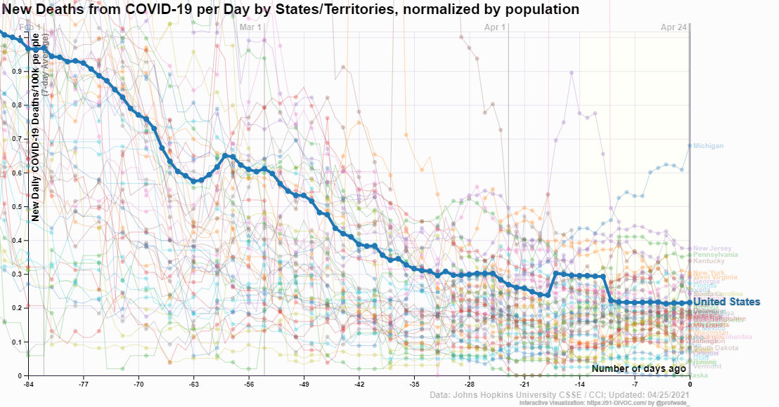
 The media tends to focus on extremes and generally bad ones at that. If you focus on Michigan one would come to believe that things aren’t improving much with COVID-19. The graph here is from 91-DIVOC, which has a number of interactive graphs, along with making the data available. Over the last 12 weeks deaths are down about 1/5 and only one state is really going against the downward trend. The trend should continue downward as more folks are vaccinated, so please get vaccinated. Note: At this point we are passing half the U.S. adult population vaccinated.
Is there a place to go to help understand climate?
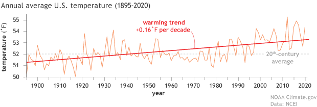 Climate.gov has the page Understanding Climate where they post all of their articles related to climate change. You’ll find information, explanations, graphs, and sources for data related to understanding climate. For example, the April 19, 2021 article Climate change and the 1991-2020 U.S. Climate Normals has the graph copied here. This is a perfect first place to look for educational materials related to climate change, along with graphs and quantitative information for statistics and QL courses.
Happy Earth Day!
What is the relationship between COVID-19 deaths, education, and race/ethnicity?
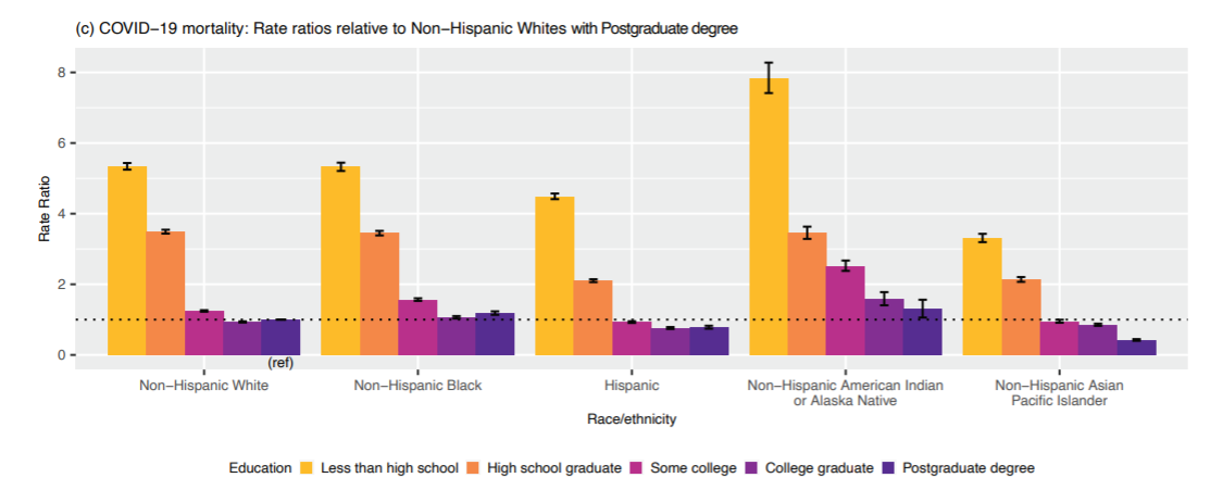 The working paper, from the Harvard Center for Population and Development Studies, Intersectional inequalities in COVID-19 mortality by race/ethnicity and education in the United States, Jan 1, 2020-Jan 31, 2021 by J.T. Chen, et. el. (2/23/2021) contains the graph copied here.
It is interesting to note that within educational categories, Hispanic mortality rates were consistently lower than rates among Non-Hispanic Whites. This suggests that the overall increased mortality rates experienced by Hispanics is driven in large part by their overrepresentation in more disadvantaged education groups. Similarly, for the non-Hispanic Black population, their equivalent mortality rates to Non-Hispanic Whites in the two lowest educational strata, and their only slightly elevated risk in the higher educational strata suggests that it is the inequities in educational distribution that drive the overall higher crude rates among the non-Hispanic Black vs non-Hispanic White populations.
This provides evidence that COVID-19 deaths are connected to education more so than race/ethnicity. This, of course, isn’t causation, as education level is likely a marker for risk factors of COVID-19 such as health habits and employment.
This paper also supplies a nice example of Simpson’s paradox. Graph 1b provides mortality rates per 100,000 by race/ethnicity (157 Non-Hispanic White, 199 Non-Hispanic-Black, 171 Hispanic). By education category the Hispanic population had lower death rates than Non-Hispanic White, but in the aggregate it is the other way around.
How hot was March 2021
 From NOAA’s Global Climate Report – March 2021:
Following a strongly negative Arctic Oscillation (AO) in February 2021, a strongly positive AO was present in March 2021. In a positive phase, the jet stream strengthens and circulates the North Pole, confining the cold Arctic Air across the Polar Regions. The AO value for March 2021 was 2.11—the fifth highest March value since 1950. The peak value on March 11 was the ninth highest daily value and the third highest for a day in March. In addition, during March 2021, La Niña continued to be present across the tropical Pacific Ocean; however, it weakened in strength.
The global surface temperature departure of +0.85°C (+1.53°F) in March 2021 was the smallest March temperature departure since 2014 and was the eighth highest for March in the 142-year record. March 2021 also marked the 45th consecutive March and the 435th consecutive month with temperatures, at least nominally, above the 20th-century average.
The data is available near the top of the page under Temperature Anomalies Time Series.
What were the leading causes of death in 2020?
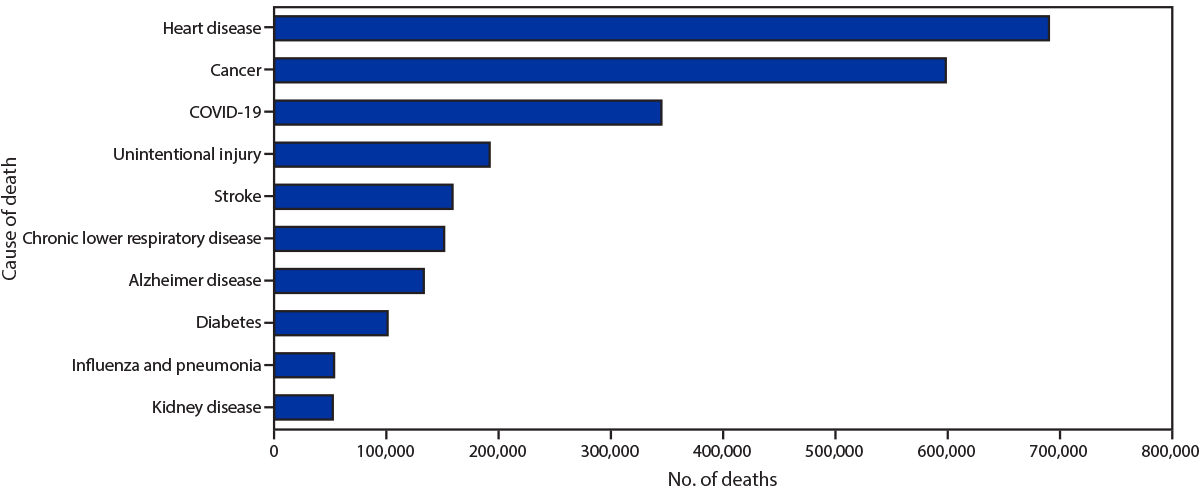 The CDC’s report, Provisional Mortality Data – United States 2020 (3/31/2021) provides the chart presented here. COVID-19 was the third leading cause of death, although there were only deaths attributed to COVID-19 for nine months of the year. There is also this:
During January–December 2020, the estimated 2020 age-adjusted death rate increased for the first time since 2017, with an increase of 15.9% compared with 2019, from 715.2 to 828.7 deaths per 100,000 population. COVID-19 was the underlying or a contributing cause of 377,883 deaths (91.5 deaths per 100,000). COVID-19 death rates were highest among males, older adults, and AI/AN and Hispanic persons. The highest numbers of overall deaths and COVID-19 deaths occurred during April and December. COVID-19 was the third leading underlying cause of death in 2020, replacing suicide as one of the top 10 leading causes of death (6).
The findings in this report are subject to at least four limitations. First, data are provisional, and numbers and rates might change as additional information is received. Second, timeliness of death certificate submission can vary by jurisdiction. As a result, the national distribution of deaths might be affected by the distribution of deaths from jurisdictions reporting later, which might differ from those in the United States overall. Third, certain categories of race (i.e., AI/AN and Asian) and Hispanic ethnicity reported on death certificates might have been misclassified (7), possibly resulting in underestimates of death rates for some groups. Finally, the cause of death for certain persons might have been misclassified. Limited availability of testing for SARS-CoV-2, the virus that causes COVID-19, at the beginning of the COVID-19 pandemic might have resulted in an underestimation of COVID-19–associated deaths.
There is a table with data of total and covid deaths by age, sex, and race/ethnicity, as well as another chart.
How’s the labor market for college grads?
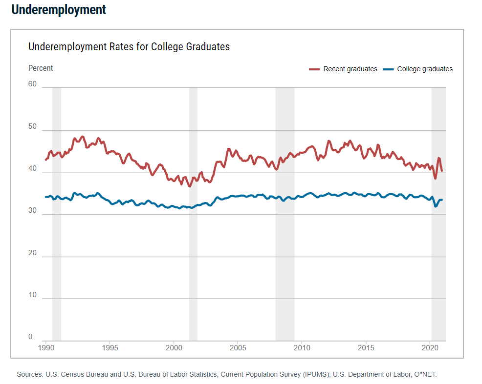 The Federal Reserve Bank of New York’s page The Labor Market for Recent College Graduates has a number of graphs related to employment for recent and not so recent grads. For example, their graph here is the percent that are underemployed defined as
The underemployment rate is defined as the share of graduates working in jobs that typically do not require a college degree. A job is classified as a college job if 50 percent or more of the people working in that job indicate that at least a bachelor’s degree is necessary; otherwise, the job is classified as a non-college job. Rates are seasonally adjusted and smoothed with a three-month moving average. College graduates are those aged 22 to 65 with a bachelor’s degree or higher; recent college graduates are those aged 22 to 27 with a bachelor’s degree or higher.
There are graphs for unemployment, underemployed job types, wages and a table of outcomes by major. In all cases the data can be downloaded.
What is the connection between life expectancy and education?
 The PNAS paper Life expectancy in adulthood is falling for those without a BA degree, but as educational gaps have widened, racial gaps have narrowed by Anne Case and Angus Deaton (3/16/2021) provides an answer. From the abstract:
We construct a time series, from 1990 to 2018, of a summary of each year’s mortality rates and expected years lived from 25 to 75 at the fixed mortality rates of that year. Our measure excludes those over 75 who have done relatively well over the last three decades and focuses on the years when deaths rose rapidly through drug overdoses, suicides, and alcoholic liver disease and when the decline in mortality from cardiovascular disease slowed and reversed. The BA/no-BA gap in our measure widened steadily from 1990 to 2018. Beyond 2010, as those with a BA continued to see increases in our period measure of expected life, those without saw declines.
By 2018, intraracial college divides were larger than interracial divides conditional on college; by our measure, those with a college diploma are more alike one another irrespective of race than they are like those of the same race who do not have a BA.
The appendix has 7 graphs including the one copied here. A few observations: Hispanics with a BA have a greater life expectancy by sex. In fact, a Hispanic female with no BA has a life expectancy similar to that of a White Male with a BA. The gap in life expectancy between Black and White by sex is about the same by BA/no BA (about 1 year in all 4 cases) but the gap between those with a BA and those without is larger. For example, a Black male with a BA lives almost 3 years longer than a White male without a BA. This is about 2 years for women. The no BA group has seen decreasing life expectancy, in general, since about 2010, while the BA group has continued with an increasing life expectancy.
I didn’t find the data in the appendix but there is an email to contact an author and they may provide it if you ask.
How has unemployment changed over the last year?
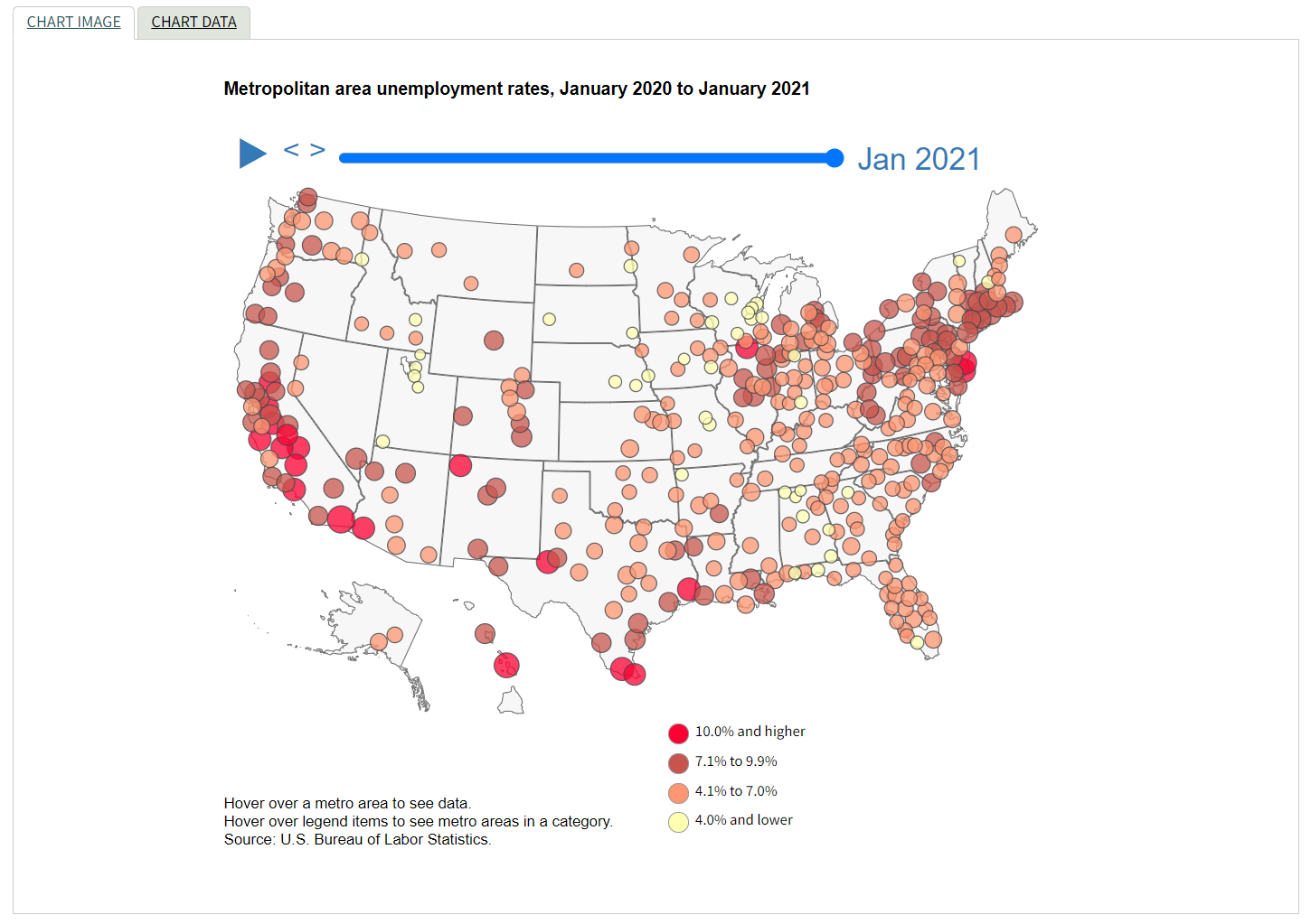 The U.S. Bureau of Labor Statistics has an interactive graph of unemployment for cities from Jan 2020 to Jan 2021.
Unemployment rates were higher in January 2021 than a year earlier in 376 of the 389 metro areas, lower in 9 areas, and unchanged in 4 areas. The largest over-the-year unemployment rate increase occurred in Kahului-Wailuku-Lahaina, Hawaii. Rates rose over the year by at least 5.0 percentage points in an additional 11 areas.
Unemployment rates were 10.0 percent or higher in 21 metro areas in January 2021. This was greater than the 4 areas with unemployment rates of at least 10.0 percent in January 2020 but much less than the 339 areas in April 2020, at the onset of the COVID-19 pandemic.
The data is available on the page and provides unemployment rates for metropolitan areas from Jan 2020 to Jan 2021.
What is the distribution of global income?
 The Our World in Data article How much economic growth is necessary to reduce global poverty by Max Roser (2/15/2021) includes the graph copied here. Note that all countries incomes are adjusted for price differences so it is fair comparison from county to country. It is easy to forget how much wealthier the U.S. is compared to almost all other countries.
The reason why such substantial economic growth is necessary for reducing global poverty is that the average income in many countries in the world is very low: 82% of the world population live in countries where the mean income is less than $20 per day.
There are three other graphs in the article, which is suitable for a QL based course. There isn’t data associated with these particular graphs but there are links at the top of the article with related economic data.
Is there a polar vortex climate change connection?
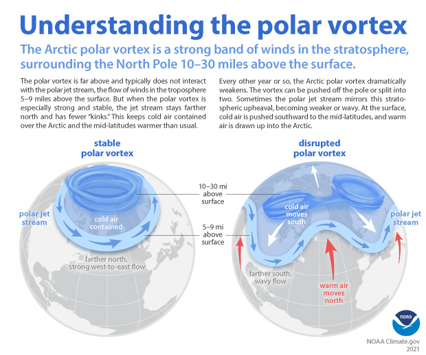
The climate.gov article Understanding the Arctic polar vortex by Rebecca Lindsey (3/5/2021) is a complete primer on the polar vortex, jet stream, and what we know (and don’t) abut the connection to climate change.
According to NOAA stratosphere expert Amy Butler, people often confuse the polar vortex with the polar jet stream, but the two are in completely separate layers of the atmosphere. The polar jet stream occurs in the troposphere, at altitudes between 5-9 miles above the surface. It marks the boundary between surface air masses, separating warmer, mid-latitude air and colder, polar air. It’s the polar jet stream that plays such a big role in our day-to-day winter weather in the mid-latitudes, not the polar vortex.
Any relationships to climate change is unclear, for example:
The uncertainty due to a relatively short history of observations isn’t the only reason experts can’t dismiss the possibility that something could be up with polar vortex. Some climate model experiments do predict that continued warming will lead to a weakening of the polar vortex. “It’s true that when you run some high-resolution climate models, with a realistic stratosphere, and a realistic sea ice layer, and you reduce sea ice cover, these models predict that the polar vortex gets weaker,” Butler said. And some studies combining models and observations have shown a connection between low sea ice extent in the Barents and Kara Seas of the eastern Arctic, sudden stratospheric warming events, and cold winters in North America.
At the same time, other model simulations predict that warming and sea ice loss will lead to a stronger polar vortex. Part of the reason for the disagreement is that the impact of Arctic surface warming and sea ice loss on the atmospheric waves that can disrupt the polar vortex is very sensitive to exactly where and when the sea ice loss occurs, and that hasn’t been consistent across model simulations.
No data in this article but there are some useful graphs, such as the one copied here, and the article is just generally interesting.