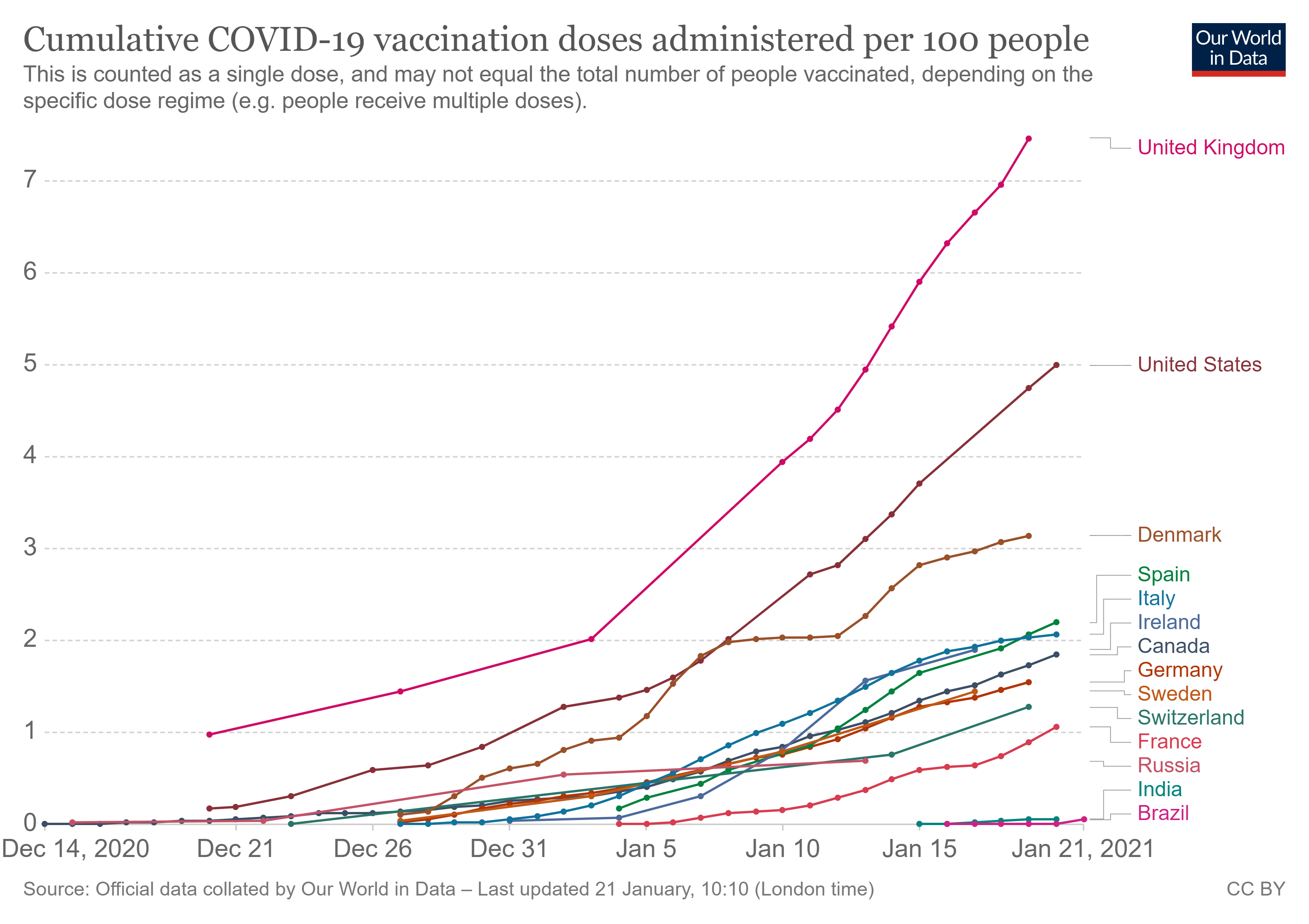
Tag Archives: charts and graphs

What book do I Recommend?

I’ve never done a book recommendation before and that changes today. If you are looking for a book that has about 75 excellent graphs and uses paleoclimatology data to connect changing climate as it impacts society during the time period of roughly 1200 to 1500, then I recommend Bruce M. S. Campbell’s book The Great Transition – Climate, Disease and Society in the Late-Medieval WorldThe book connects modern science along with data and graphs to tell the story of medieval Europe. I can certainly see this book being used in some form of interdisciplinary seminar or a data science course where student work to reproduce the graphs (of course, you can just read the book for fun). The book pointed me toward the Paleoclimatology Datasets posted at NOAA. The is a lot of data here and it takes some work to get what you might want, but it is a valuable resource.

What ten things should we know?

Kevin Drum provides an answer is his post the Top Ten Things You Might Not Know But Probably Should (12/31/2020) and each one has a graph. I copied the graph from 3, The Federal Judiciary Is About the Same As It’s Always Been:

The Supreme Court gets all the attention, but the vast majority of judicial decisions that make a difference in our lives either start or end in circuit courts. Here’s what that looks like:

It’s true that Donald Trump has appointed a lot of circuit court judges, but many of them simply replaced other conservative judges. The upshot of all this is that far from being unusually dominated by Republicans, the circuit courts today are less Republican than the 40-year average of 54 percent.

His sources are cited so you can likely track down the data.

What are the projections for northeast high school graduates?

The last post, What are the projections for high school graduates? provided national high school graduation rates from WICHE. I noted in that post that regional data and reports are available along with race and ethnicity. The graph here (for public high school only) is from the report for the northeast  (use the drop down menu to select northeast). There is a wealth of information and available data in the WICHE report.

How has COVID-19 changed geographically?

The Pew article The Changing Geography of COVID-19 in the U.S. by Bradley Jones and Jocelyn Kiley provides data about the geographic impact of COVID-19:

Early in the course of the pandemic, the health impacts were felt most severely in dense urban centers. From March to May, congressional districts in the most urbanized parts of the country were experiencing about five times as many deaths on average compared with those in the least dense parts of the country, and in some places this disparity was much larger.

However, by the summertime the urban-rural split had largely disappeared, and over the last several months, those districts with small shares of residents in densely populated places have been experiencing twice as many deaths as those in the parts of the country where all or nearly all residents live in urban neighborhoods.

The article has an interactive graphic of the U.S. with COVID-19 deaths by congressional district over time, along with a few other tables and graphs. There is also a longer report that can be downloaded.

How are the top 0.1% doing?

The EPI article Wages for the top1% skyrocketed 160% since 1979 while the share of wages for the bottom 90% shrunk by Lawrence Mishel and Jori Kandra (12/1/2020) reports:

As Figure A shows, the top 1.0% of earners are now paid 160.3% more than they were in 1979. Even more impressive is that those in the top 0.1% had more than double that wage growth, up 345.2% since 1979 (Table 1). In contrast, wages for the bottom 90% grew only 26.0% in that time.

The top 0.1% go off the chart. There are two other tables of data nd the data for the chart copied here is available.

How many people live in poverty?

It depends on what we mean by poverty.  The World Bank blog post A quarter of the world lives in societal poverty by Marta Schoch, Dean Mitchell Joliffe, & Christoph Lakner (12/2/2020):

Measures of absolute poverty, such as poverty at the US$1.90US$3.20 and the US$5.50 international poverty lines, have the advantage of remaining fixed (in constant dollars), allowing one to measure poverty against the same benchmark over time and across countries. However, when countries set their own national poverty lines, they typically increase the real value of these lines as their economies evolve.

The absolute poverty line  misses the fact that “the ability to participate in society is costlier in richer countries.”  So,

In 2018, the World Bank introduced a Societal Poverty Line (SPL),

The SPL is a hybrid line, combining the US$1.90-a-day absolute poverty line with a relative component that increases as median consumption or income in an economy rises.

The SPL is the max of US$1.90 and US$1+ 0.5*median, where median is the daily median income or consumption per capita in the household survey.

The is more information and other graphs in the article.

How hot was October 2020?

From the NOAA Global Climate Report – October 2020:

The October 2020 global land and ocean surface temperature was the fourth highest for October since global records began in 1880 at 0.85°C (1.53°F) above the 20th century average of 14.0°C (57.1°F). Only Octobers of 2015 (+1.03°C / +1.85°F), 2019 (+0.95°C / +1.71°F), and 2018 (+0.93°C / +1.67°F) were warmer. The ten warmest Octobers have occurred since 2005, while the seven highest October temperature departures from average have occurred in the last seven years (2014–2020). October 2020 also marks the 44th consecutive October and the 430th consecutive month with temperatures, at least nominally, above the 20th century average.

Europe was warm:

According to NCEI’s regional analysis, Europe had its warmest October on record, with a temperature departure of +2.17°C (+3.91°F). This surpassed the previous record set in 2001 by 0.06°C (0.11°F).

For the year so far:

Averaged as a whole, this was the second warmest January–October for global land and ocean, with a temperature departure at 1.0°C (1.8°F) above the 20th century average. This value is only 0.03°C (0.05°F) shy of tying the record set in January–October 2016. According to our Global Annual Temperature Rankings Outlook, the year 2020 is very likely to rank among the three warmest years on record.

The data is available in the additional resources box near the top of the page.

How frequently are high tides occurring?

NASA’s Vital Signs of the Planet article Beating Back the Tides by Jenny Marder (11/11/2020) provides an update on the increasing frequency of high tides (see the graph copied here for one example).

Between 2000 and 2015, high-tide flooding in the U.S. doubled from an average of three days per year to six along the Northeast Atlantic, according to a 2018 NOAA report. It is especially common along the East Coast and Gulf Coast, where the frequency is up by roughly 200% over the last two decades. In some areas like Annapolis, the numbers are even more extreme. Annapolis had a record 18 days of high-tide flooding from May 2019 to April 2020, according to flooding thresholds for the city established by NOAA. That’s up from the previous record of 12 days in 2018. Before 2015, the record number of high-tide flood days in one year was seven, and the yearly average of high-tide floods from 1995 to 2005 was two.

The article includes a 7 minute video on high tide flooding. There is also a link to NOAA’s Tides and Currents page The State of High Tide Flooding and Annual Outlook. The page has a map of projected high tide flood days for 2020. For more detailed information, including lots of graphs, see the 2019 State of U.S. High Tide Flooding with 2020 Outlook technical report from NOAA.

Who earned the most in the 3rd quarter of 2020?

The U.S. Bureau of Labor Statistics has a Graphics for Economic News Releases page. The graph copied here is median usual weekly earnings of full-time wage and salary workers. Most of the patters are not a surprise, such as men earning more than women.  What may be new here is that Asian women ($1224) out earned White men ($1122). Asian men out earned all others at $1542. The page includes seven other charts with the data.