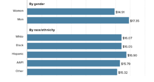
The Pew article How the American middle class has changed in the past five decades by Rakesh Kochhar and Stella Sechopoulos (4/20/2022) has seven facts about changes in the middle class. Overall though, The share of adults who live in middle-class households fell from 61% in 1971 to 50% in …
Read More »How much do corporation pay in local taxes?
We tend to think of corporate taxes as a federal issues and less a local issue, but the article Reclaiming corporate tax revenues by Josh Bivens (4/14/2022) in EPI has some key takeaways: Depending on how it is measured, the effective state and local tax rate on corporate profits shrunk …
Read More »Do men always earn more than women?
The Pew article, Young women are out-earning young men in several U.S. cities by Richard Fry (3/28/2022) provides the graph copied here. Overall, about 16% of all young women who are working full time, year-round live in the 22 metros where women are at or above wage parity with men. …
Read More »What is the connection between attending college and parental income?
The World Inequality Database summarize the paper by Bonneau and Grobon in the article Unequal Access to Higher Education (2/7/2022). In this paper, Cécile Bonneau and Sébastien Grobon provide new stylized facts on inequalities in access to higher education by parental income in France. At the bottom of the income distribution, 35% of …
Read More »How much did wage inequality change in 2020?
The EPI article Wage inequality continued to increase in 2020 by Lawrence Mishel and Jori Kandra (12/13/2021) provides the graph copied here. As for the share of the overall pot: This disparity in wage growth reflects a sharp long-term rise in the share of total wages earned by those at …
Read More »Has much has poverty decreased?
The Our World in Data article Extreme poverty: how far have we come, how far do we still have to go by Max Roser (11/22/2021) provides numerous graphs that quantify changes in poverty. The most general graph is copied here. This one is for the world but users can select …
Read More »How did CEOs do during the pandemic?
Did CEOs take a pay hit like many workers did during the pandemic? The article CEO pay has skyrocketed 1,322% since 1978 by Lawrence Mishel and Jori Kandra (8/10/2021) suggests CEOs did just fine last year. Their chart shows that realized CEO compensation grew during 2020 compared to the average …
Read More »How much debt do students have by race?
The EducationalData.org post Student Loan Debt by Race by Melanie Hanson (6/9/21) has three excellent graphs such as the one copied here. It may not be surprising that Asians have the least debt given Asians have the highest income, but Hispanic and Latino debt is almost identical to White and …
Read More »How’s the labor market for college grads?
The Federal Reserve Bank of New York’s page The Labor Market for Recent College Graduates has a number of graphs related to employment for recent and not so recent grads. For example, their graph here is the percent that are underemployed defined as The underemployment rate is defined as the …
Read More »How has unemployment changed over the last year?
The U.S. Bureau of Labor Statistics has an interactive graph of unemployment for cities from Jan 2020 to Jan 2021. Unemployment rates were higher in January 2021 than a year earlier in 376 of the 389 metro areas, lower in 9 areas, and unchanged in 4 areas. The largest over-the-year …
Read More »