Our World in Data’s latest visualization is a bar chart from 1990 to 2016 of the number of people with and without electricity. In 2016, out of about 7.5 billion people nearly 1 billion lived without electricity or about 12%. In 1990, 1.5 billion people were without electricity, a decrease of 1/2 a billion, but also a decrease from 35% to 2016’s 12%. Their graph is interactive and users can choose individual countries, download the graph, and download the data.
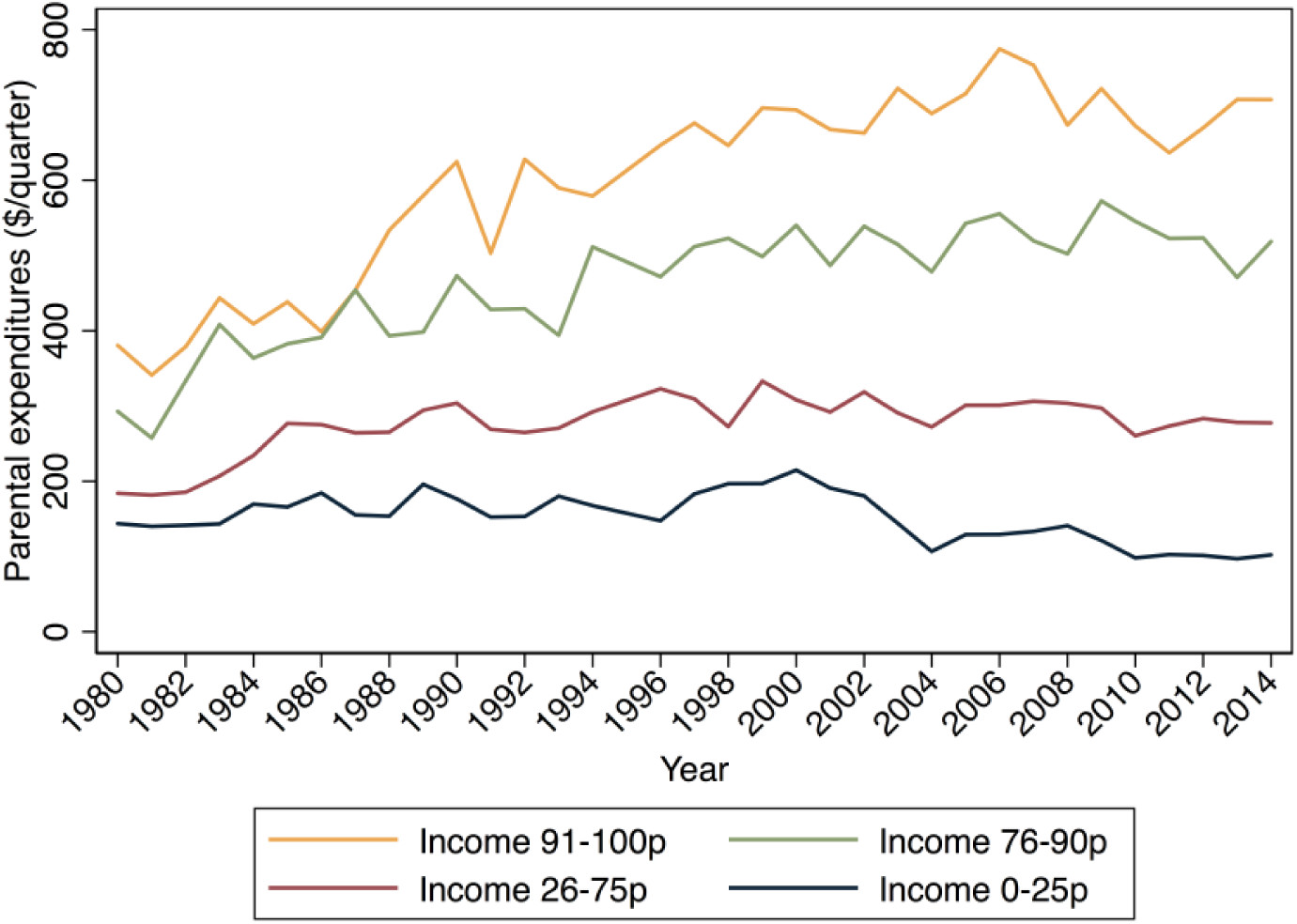
The past 40 years have witnessed historic increases in income inequality in the United States (Piketty and Saez 2003). Over the same period, existing class divides—by household income and by parents’ educational attainment—in how much money parents spend on children and how much time parents spend in childcare have widened considerably (Altintas 2016; Kornrich and Furstenberg 2013; Ramey and Ramey 2010). These increasingly evident class divides in parental investments of time and money spark concern, because parental investment is an important factor in the intergenerational perpetuation of advantage (Downey, von Hippel, and Broh 2004; Potter and Roksa 2013; Waldfogel and Washbrook 2011). If affluent families are increasingly able to transmit their advantages to children, that bodes poorly for an open opportunity structure.
Of course,
We would expect rising income inequality to increase class gaps in parental financial investments in children mechanically if rising income inequality simply means the affluent have more to spend. But, rising income inequality might also widen class gaps in investments in children if it reshapes parents’ preferences for these practices differentially by class.
It is also possible that income inequality is not related to class gaps in parental investment. Indeed, recent work suggests a narrowing of gaps in early achievement by family income, and a narrowing or arrested divergence in some gaps in parenting practices, even as income inequality has continued to rise, raising questions about this often assumed empirical relationship (Kalil et al. 2016; Reardon 2011; Reardon and Portilla 2016).
We empirically investigate these questions.
The paper has interesting charts and data, and worth reading for their conclusions. Also, the supplemental materials include some mathematical modeling.
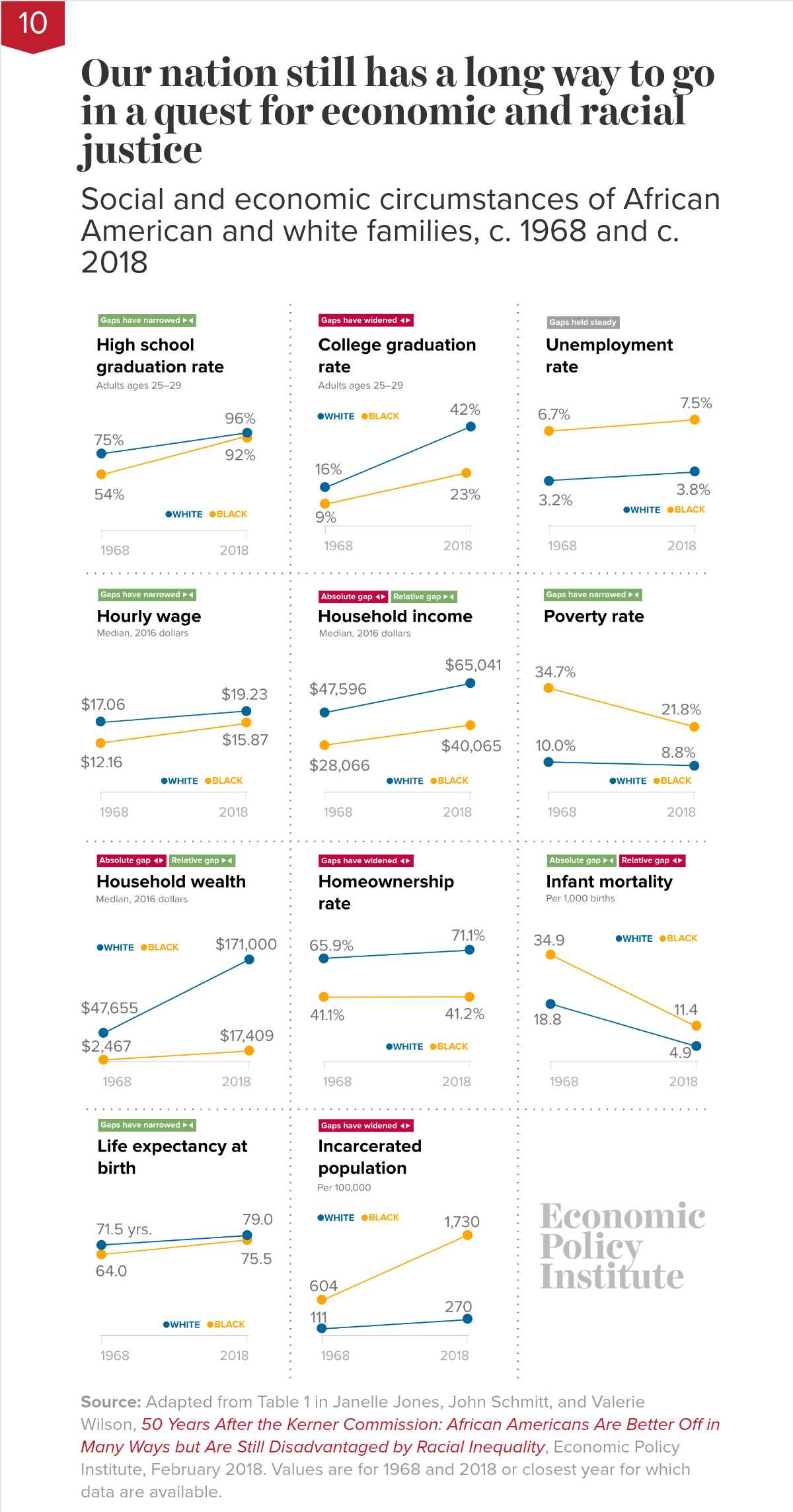
Not nearly far enough. The chart shows that, while African Americans are in many ways better off in absolute terms than they were in 1968, they are still disadvantaged in important ways relative to whites. African Americans today are much better educated than they were in 1968—but young African Americans are still half as likely as young whites to have a college degree. Black college graduation rates have doubled—but black workers still earn only 82.5 cents for every dollar earned by white workers. And—as consequences of decades of discrimination—African American families continue to lag far behind white families in homeownership rates and household wealth. The data reinforce that our nation still has a long way to go in a quest for economic and racial justice.
There are 11 other economic related charts. Each chart has a link to data and can be downloaded.
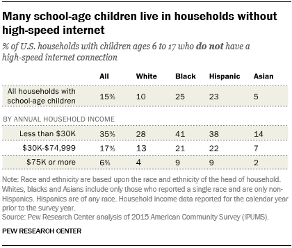
The Pew Research Center article Nearly one-in-five teens can’t always finish their homework because of the digital divide by Monica Anderson and Andrew Perrin (10/26/18) provides insights on how lacking access to the internet impacts the ability to complete homework. Their chart (copied here) gives the percent of school-age children by race and income without high-speed internet. A second chart provides the results of survey about how this impacts homework. In particular,
One-quarter of black teens say they are at least sometimes unable to complete their homework due to a lack of digital access, including 13% who say this happens to them often. Just 4% of white teens and 6% of Hispanic teens say this often happens to them. (There were not enough Asian respondents in this survey sample to be broken out into a separate analysis.)
The article includes a link at the bottom for results and methodology. This includes sample sizes making this article particularly useful for statistics courses.
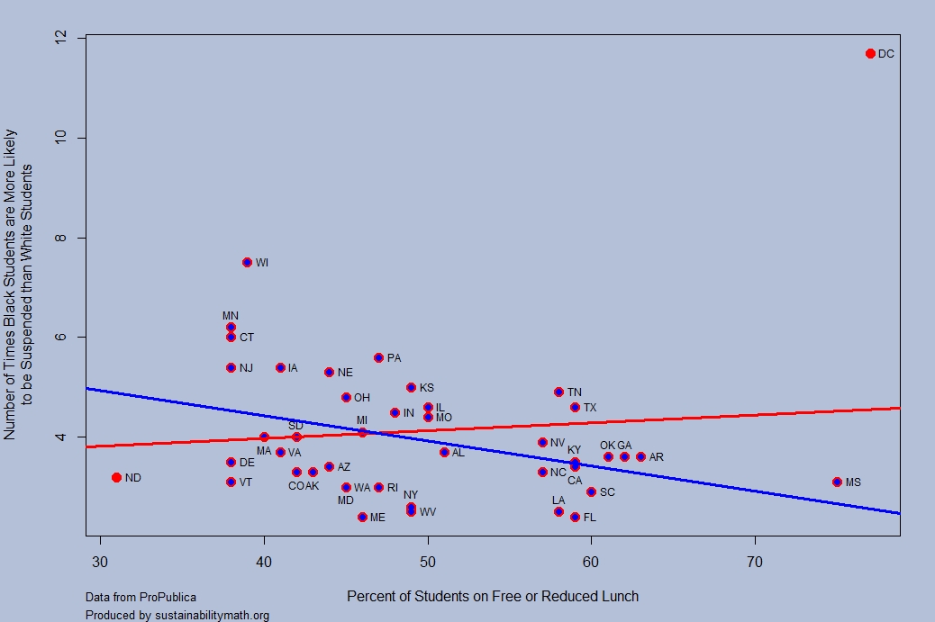
Propublica’s article, Miseducation – Is There Racial Inequality at Your School? by Lena V. Groeger, Annie Waldman and David Eads, (10/16/18), provides data by state on the percent of nonwhite students, the percent of students who get free/reduced-price lunch, high school graduation rate, the number of times White students are likely to be in an AP class as compared to Black students, and the number of times Black students are likely to be suspended as compared to White students. The comparison is also available for Hispanic students.
The graph here was created with their data and compares the percent of students on free and reduced lunch with the number of times Black students are likely to be suspended compared to White students (state data isn’t available for HI, ID, MT, NH, NM, OR, UT, or WY). The red lines uses all the data where as the blue line removes the outliers of DC and ND. The blue regression line has a p-value of 0.012 and R-squared of 0.15. This suggests that wealthier states, as measured by free and reduced lunch programs, have a greater disparity is suspensions between black and white students. The impact of outliers is instructive here and there are other scatter plots worth graphing from the article. There are also statistics projects waiting to be created with this data.
The article also has an interactive map or racial disparities by districts, but the map can be misleading based on missing data from districts. Can you see how? This makes the map itself useful for QL courses. R Script that created this graph. Companion csv file.
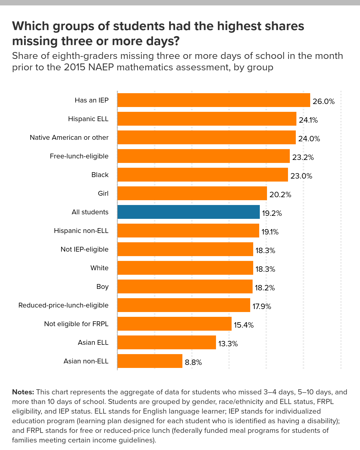
The EPI article, Student absenteeism – Who misses school and how missing school matters for performance by Emma García and Elaine Weiss (9/25/18) provides a detailed account of absenteeism based on race and gender. For example, their chart here is the percent of students that missed three or more days in the month prior to the 2015 NAEP mathematics assessment. There are noticeable differences. For instance, the percentage of Black, White, and Asian (non ELL) that missed three or more days in the month is 23%, 18.3%, and 8.8% respectively.
Why does this matter?
In general, the more frequently children missed school, the worse their performance. Relative to students who didn’t miss any school, those who missed some school (1–2 school days) accrued, on average, an educationally small, though statistically significant, disadvantage of about 0.10 standard deviations (SD) in math scores (Figure D and Appendix Table 1, first row). Students who missed more school experienced much larger declines in performance. Those who missed 3–4 days or 5–10 days scored, respectively, 0.29 and 0.39 standard deviations below students who missed no school. As expected, the harm to performance was much greater for students who were absent half or more of the month. Students who missed more than 10 days of school scored nearly two-thirds (0.64) of a standard deviation below students who did not miss any school. All of the gaps are statistically significant, and together they identify a structural source of academic disadvantage.
These results “… identify the distinct association between absenteeism and performance, net of other factors that are known to influence performance?” The article has 12 graphs or charts, with data available for each, including one that reports p-values.
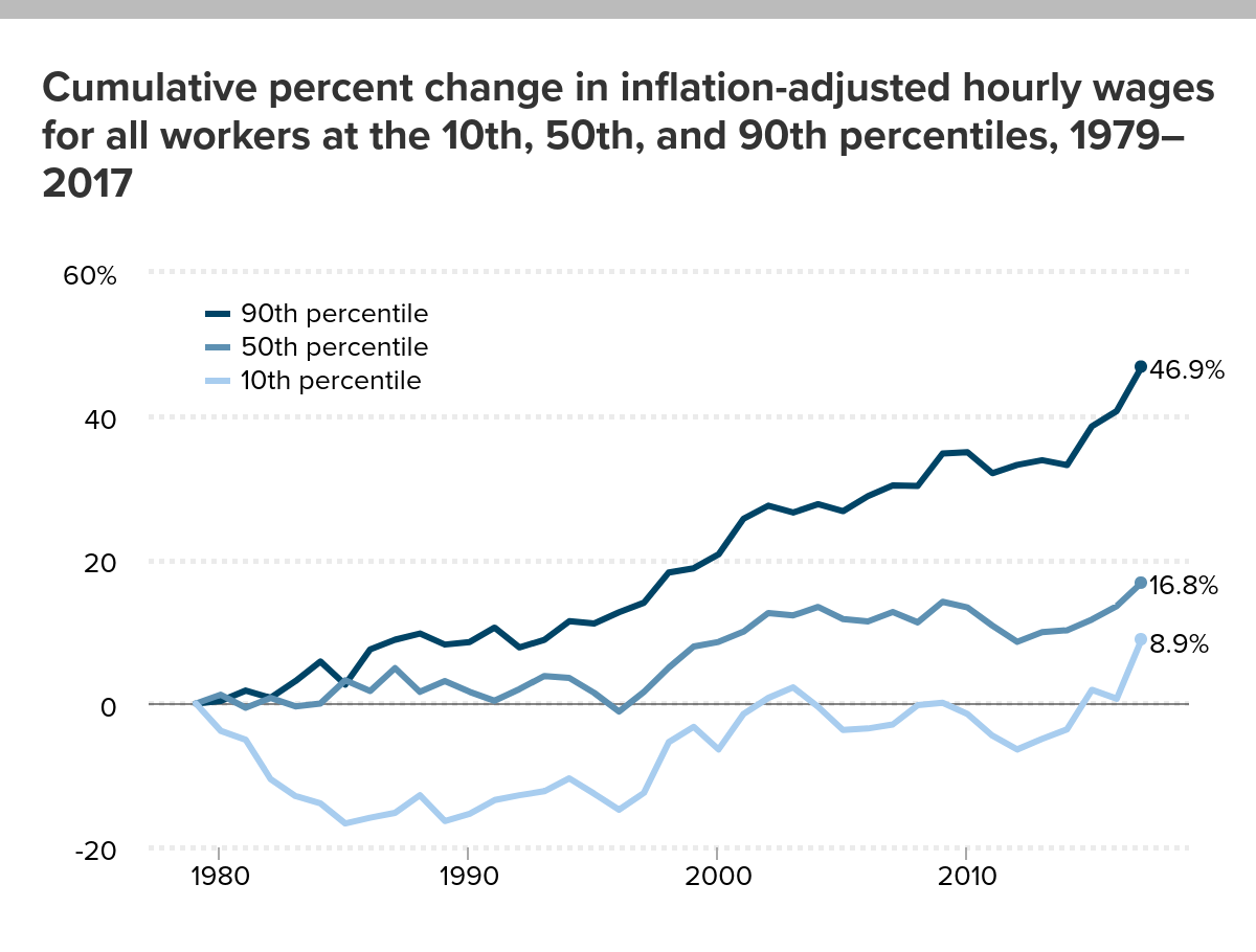
Wage growth has varied depending on numerous factors such as gender, race, income level, and education. The EPI article, America’s slow-motion wage crisis-Four decades of slow and unequal growth by John Schmitt, Elise Gould, and Josh Bivens (9/13/18) summarizes the findings with 30 graphs or tables (data included). For example, the cumulative percent change in inflation-adjusted hourly wages for workers in the 10th, 50th, and 90th percentile is given in the graph here (downloaded from the article).
The first key trend since 1979 is the historically slow growth in real wages. In 2017, middle-wage workers earned just 16.8 percent more than their counterparts almost four decades earlier. This corresponds to an annualized inflation-adjusted growth rate over the 38-year period of just 0.4 percent per year. The real wage increase for low-wage workers (those at the 10th percentile) was even slower: 8.9 percent over 38 years, or a 0.2 percent annualized growth rate.
This slow growth is particularly disappointing for two reasons. First, as we will see in the next section, U.S. workers today are generally older (and hence potentially more experienced) and substantially better educated than workers were at the end of the 1970s.10 Second, for workers at the bottom and the middle, most of the increase in real wages over the entire period took place in the short window between 1996 and the early 2000s. For the large majority of workers over the last four decades, wages were essentially flat or falling apart from a few short bursts of growth.
Quiz Questions: What was the cumulative change in hourly wages from 1979 to 2017 for
What was the cumulative change in hourly wages from 1979 to 2017 for workers with an advanced degree?
What was the cumulative change in hourly wages from 1979 to 2017 for workers with less than a high school diploma?
Which ethnic group had the greatest change?
What was the cumulative change in hourly wages from 1979 to 2017 for Women in the 50th percentile?
What was the cumulative change in hourly wages from 1979 to 2017 for Men in the 50th percentile?
The article and/or corresponding data is ready for use in a stats or QL course in the 90th percentile.
The current overall health workforce is mostly composed of women. Nonetheless, female health workers remain underrepresented in highly skilled occupations, such as in surgery. As of 2015, just under half of all doctors are women across OECD countries on average. The variation across countries is significant: in Japan and Korea only around 20% of doctors are women, in Latvia and Estonia this proportion is over 70%.
It is worth noting that the U.S. is well below the OECD average with only 34.1% of its doctors female in 2015, although the current posted data set has the U.S. at 35.06% for 2015 (35.52% for 2016).
Time series data for OECD countries is available at the OECD.stat Health Care Resources page. Data for the U.S. dates back to 1993 (19.59%) through 2016. For this specific data set click physicians by age and gender on the left side bar. Within the chart click variable, measure, and year, to change the scope of the data in the spreadsheet. The data can be downloaded in multiple formats.
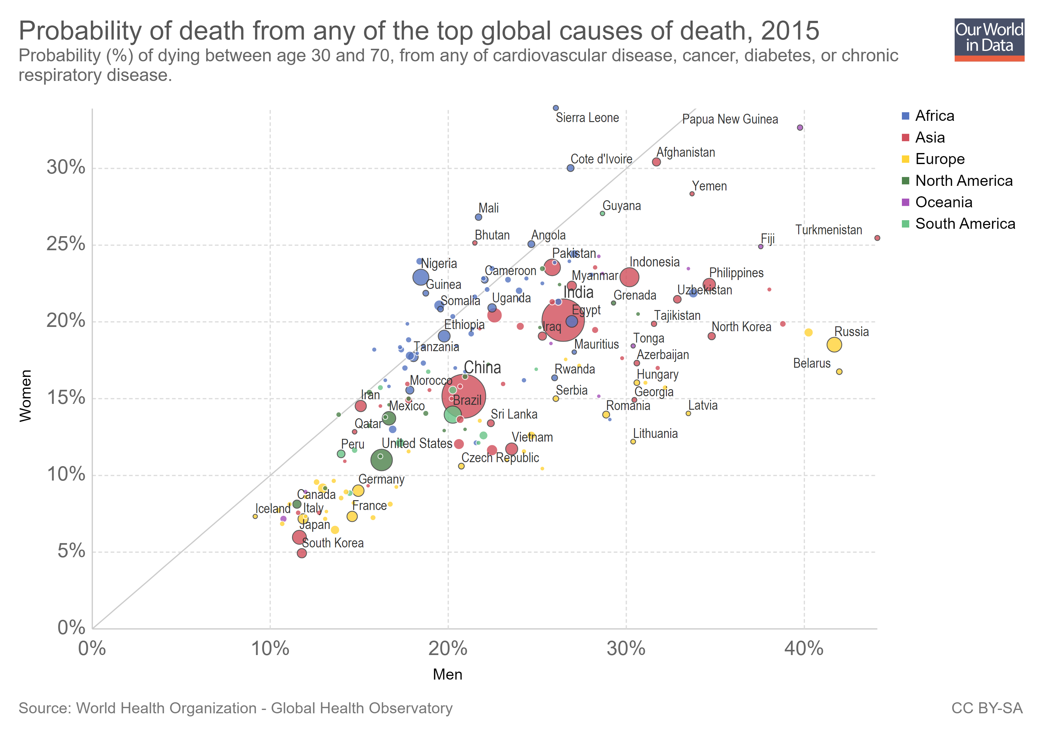
The Our World in Data post, Why do women live longer than men? by Esteban Ortiz-Ospina and Diana Beltekian (8/14/18) answers the question with the graph copied here.
As the next chart shows, in most countries for all the primary causes of death the mortality rates are higher for men. More detailed data shows that this is true at all ages; yet paradoxically, while women have lower mortality rates throughout their life, they also often have higher rates of physical illness, more disability days, more doctor visits, and hospital stays than men do. It seems women do not live longer than men only because they age more slowly, but also because they are more robust when they get sick at any age. This is an interesting point that still needs more research.
Interestingly, it seems that except for Bhutan it is only countries in Africa where women are more likely to die of a major disease. The article is an excellent example of telling a story with data while also posing questions.
The evidence shows that differences in chromosomes and hormones between men and women affect longevity. For example, males tend to have more fat surrounding the organs (they have more ‘visceral fat’) whereas women tend to have more fat sitting directly under the skin (‘subcutaneous fat’). This difference is determined both by estrogen and the presence of the second X chromosome in females; and it matters for longevity because fat surrounding the organs predicts cardiovascular disease.
But biological differences can only be part of the story – otherwise we’d not see such large differences across countries and over time. What else could be going on?
The article has three other graphs beyond this one. One compares life expectancy by country for women and men, one for life expectancy for men and women in the U.S. (and three other countries that can be selected) since 1790, and one for the difference in life expectancy at age 45 since 1790 for selected countries. All graph can be downloaded and the data is available for each.
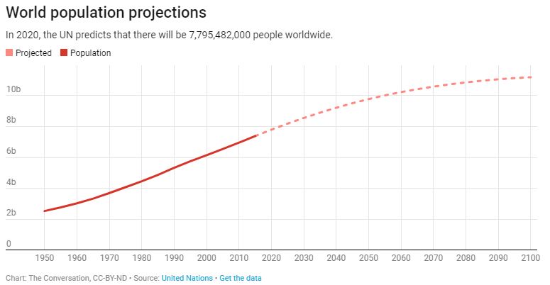
For real populations, doubling time is not constant. Humans reached 1 billion around 1800, a doubling time of about 300 years; 2 billion in 1927, a doubling time of 127 years; and 4 billion in 1974, a doubling time of 47 years.
On the other hand, world numbers are projected to reach 8 billion around 2023, a doubling time of 49 years, and barring the unforeseen, expected to level off around 10 to 12 billion by 2100.
The article provides a link to download the data and discusses key points related to inequality. For example,
According to the Worldwatch Institute, an environmental think tank, the Earth has 1.9 hectares of land per person for growing food and textiles for clothing, supplying wood and absorbing waste. The average American uses about 9.7 hectares.
These data alone suggest the Earth can support at most one-fifth of the present population, 1.5 billion people, at an American standard of living.
This article is useful for QL and Stats classes, as well as anyone that would like to use population data and/or discuss carrying capacity.
 Our World in Data’s latest visualization is a bar chart from 1990 to 2016 of the number of people with and without electricity. In 2016, out of about 7.5 billion people nearly 1 billion lived without electricity or about 12%. In 1990, 1.5 billion people were without electricity, a decrease of 1/2 a billion, but also a decrease from 35% to 2016’s 12%. Their graph is interactive and users can choose individual countries, download the graph, and download the data.