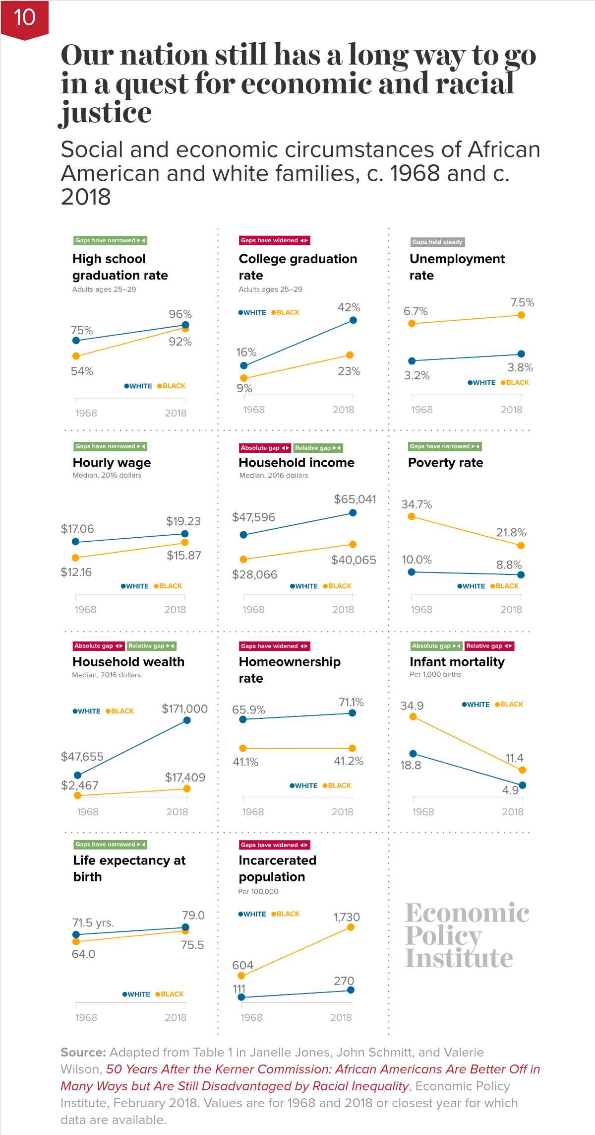
 EPI puts forth its top twelve charts of 2018 in the post Top charts of 2018 Twelve charts that show how policy could reduce inequality—but is making it worse instead (12/20/2018). For example, chart 10 (copied here) compares 11 economic and social indicators between white and African american families from 1968 to 2018.
Not nearly far enough. The chart shows that, while African Americans are in many ways better off in absolute terms than they were in 1968, they are still disadvantaged in important ways relative to whites. African Americans today are much better educated than they were in 1968—but young African Americans are still half as likely as young whites to have a college degree. Black college graduation rates have doubled—but black workers still earn only 82.5 cents for every dollar earned by white workers. And—as consequences of decades of discrimination—African American families continue to lag far behind white families in homeownership rates and household wealth. The data reinforce that our nation still has a long way to go in a quest for economic and racial justice.
There are 11 other economic related charts. Each chart has a link to data and can be downloaded.