Tag Archives: inequality

What is the poverty rate in OECD countries?

The OECD (Organisation for Economic Co-operation and Development) defines poverty as an income below half the median household income. The chart here was created using the most recent year of data from the OECD poverty rate page .  The U.S. leads the pack with a rate of 17.8%, with Israel right behind at 17.7%. At the bottom are Denmark and Finland with rates of 5.5% and 5.8% respectively.  It is important to note, as the OECD does,

However, two countries with the same poverty rates may differ in terms of the relative income-level of the poor.

The data is available for more than OECD countries on their page and there is an interactive graph, but the graph can’t be dowloaded. The data and R script that created the graph here are available: csv file, R script.

Citation for data:OECD (2018), Poverty rate (indicator). doi: 10.1787/0fe1315d-en (Accessed on 11 July 2018)

What is the story of suicides in the U.S.?

The article in the Conversation, Why is suicide on the rise in the US – but falling in most of Europe? by Steven Stack (6/28/18), tries to get at the story. The first chart (copied here), clearly shows that the suicide rate rose from 199-2015 overall and considerably more for the 45-54 age group (stats regression problem here).  There is a second chart showing changes in suicide rates in Western European countries:

However, suicide rates in other developed nations have generally fallen. According to the World Health Organization, suicide rates fell in 12 of 13 Western European between 2000 and 2012. Generally, this drop was 20 percent or more. For example, in Austria the suicide rate dropped from 16.4 to 11.5, or a decline of 29.7 percent.

The obvious question is why?

There has been little systematic research explaining the rise in American suicide compared to declining European rates. In my view as a researcher who studies the social risk of suicide, two social factors have contributed: the weakening of the social safety net and increasing income inequality.

The article has two more charts showing that the U.S. is low on Social Welfare Expenditures as a percent of GDP and is high on inequality. In all instances the data is available for download and there are links to the original sources.

What economic impacts does some college education have on men?

The article in the Conversation 22 percent of men without college don’t have jobs. Here’s why they’re being left behind. by Erin Wolcott (6/7/2018) makes two points:

But the unemployment rate doesn’t tell the full story because it only includes people actively looking for work. People who report not having looked for work in the previous four weeks are completely left out of this number. The employment rate, which is the share who are actually employed, captures the full picture.

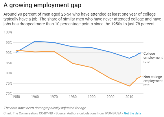
And the numbers are stark. Back in the 1950s, there was no education-based gap in employment. About 90 percent of men aged 25-54 – regardless of whether they went to college – were employed.

The Great Recession was particularly painful for men without any college. By 2010, only 74 percent had a job, compared with 87 percent of those with a year or more of college.

By 2016, from the graph here copied from the article, the gap was 90% vs 78%. For the second point:

The gap extends to the wages of those who actually had jobs as well. As recently as 1980, real hourly wages for the two groups were nearly identical at about US$13. In 2015, men with at least a little college saw their wages soar 65 percent to over $22 an hour. Meanwhile, pay for those who never attended plunged by almost half to less than $8.

The article has another graph for wages. Both graphs are interactive and contain links to download the data. Read the article.
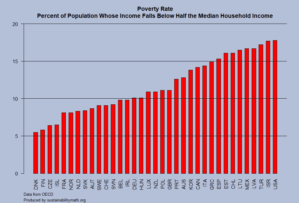
What are the symptoms of inequality?

The Guardian article, Trump’s ‘cruel’ measures pushing US inequality to dangerous level – UN warns by Ed Pilkington (6/1/18) lists some symptoms two of which are:

Americans now live shorter and sicker lives than citizens of other rich democracies;

The US incarceration rate remains the highest in the world;

The article lacks some data, which we provide here. It is true that incarceration rates in the U.S. are shockingly the highest in the world, see the chart here from the Prison Policy Initiative’s States of Incarceration: The Global Context 2018. But, this isn’t much different than in 2016 as compared to Prison Policy Initiative’s States of Incarceration: The Global Context 2016 report. Both PPI pages have links to the data sets at the bottom as well as other graphs.

As for U.S. life expectancy Our World in Data has an interactive life expectancy graph.  The last year for this graph is 2015, but by that time the U.S. already had a lower life expectancy than other wealthy countries. This graph allows us to choose other countries, has a map version, and a link to download the data.

In short, the symptoms of inequality stated in the Guardian article are not new (at least the two we focused on here), although they may be getting worse. The article is worth wording as well as the PPI report. Also explore the Our World in Data life expectancy graph. There is data and context to connect all this to stats or QL courses.


Do people in poverty work?

The EPI article, 50 years after the Poor People’s Campaign poverty persists because of a stingy safety net and a dysfunctional labor market by Elise Gould and Jessica Schieder (5/24/2018), answers the question with a graph (reposted here) and this:

The bottom bar shows us that, among those working-age individuals who are otherwise employable, 63 percent are working and 45.5 percent are working full time. An additional 37.2 percent are not working, but this share includes 1.6 million people living below the poverty line who are actively seeking a job. The data make it clear that millions of people who are active participants in the labor market are unable to make ends meet, either due to insufficient hours or low wages.

What is the CEO to worker pay gap?

U.S. Publicly held companies now have to report CEO and median worker salaries (this was part of the Dodd-Frank Wall Street Reform and Consumer Protection Act of 2010) and Bloomberg has an article, Alphabet CEO Page Makes a Tiny Fraction
Compared to Its Median Employee by Alicia Ritcey and Jenn Zhao (5/15/18), with an interactive graph (see image).   Mattel “wins” with a CEO to median worker pay ratio of 4,987-1. Walmart “wins” in the consumer staple category with 1,188-1 ratio.  In the interactive graph there is a button on the top right that hides outliers. This is useful, but be conscious of whether it is on or off.

The Guardian article ‘CEOs don’t want this released’: US study lays bare extreme pay-ratio problem by Edward Helmore (5/16/18)  provides some context and a summary.  The Bloomberg graph is being updated daily.  Rep. Keith Elliston’s staff prepared the report Rewarding or Hoarding? An Examination of Pay Ratios Revealed by Dodd-Frank, which has the data of the first 225 Fortune 500 companies to report and and details on the data collection. The data in the report can be used in statistics courses to test differences by sector.  At some point maybe Bloomberg will post a spreadsheet of the data (one can also ask for it too).

What are the differences in infant mortality by race?

The NYT has a lengthy article, Why America’s Black Mothers and Babies Are in a Life-or-Death Crisis (4/11/18 by Linda Villarosa)  and Kevin Drum follows this up with the handy chart posted here in his post Our Disgraceful Infant Mortality Epidemic.  He notes that although infant morality has decreased the difference between Black and White infant morality has increase (by percentage):

In 1950, according to the CDC, the black rate of infant mortality was 64 percent higher than the white rate. Today it’s 133 percent higher

We also aren’t keeping up with the rest of world:

In 1960, we ranked 11th in infant mortality among rich countries. Not great, but not terrible. Today we rank 24th out of 27 rich countries, ahead of only Turkey, Mexico, and Chile.

You can find infant mortality data at the CDC’s National Center for Health Statistics page  (tables 10-13).

Are teachers being paid fairly?

An August 2016 report by EPI, The teacher pay gap is wider than ever (8/9/16 by Allegretto and Mishel), suggests not. For instance, the graph here shows that teachers are paid 23% less than other college graduates in 2015 and the gap has been increasing since 1980.

Average weekly wages (inflation adjusted) of public-sector teachers decreased $30 per week from 1996 to 2015, from $1,122 to $1,092 (in 2015 dollars). In contrast, weekly wages of all college graduates rose from $1,292 to $1,416 over this period.

For all public-sector teachers, the relative wage gap (regression adjusted for education, experience, and other factors) has grown substantially since the mid-1990s: It was ‑1.8 percent in 1994 and grew to a record ‑17.0 percent in 2015.

The report includes 8 graphs with data plus two tales. There are comparisons between females and males, as well as union and non-union.

What is known about world income inequality?

The World Inequality Report 2018 provides a complete summary of world income inequality.  The executive summary contains thirteen charts to explore such as the one here.

The poorest half of the global population has seen its income grow significantly thanks to high growth in Asia (particularly in China and India). However, because of high and rising inequality within countries, the top 1% richest individuals in the world captured twice as much growth as the bottom 50% individuals since 1980 (Figure E4). Income growth has been sluggish or even zero for individuals with incomes between the global bottom 50% and top 1% groups. This includes all North American and European lower- and middle-income groups.

The executive summary also notes:

Research has demonstrated that tax progressivity is an effective tool to combat inequality. Progressive tax rates do not only reduce post-tax inequality, they also diminish pre-tax inequality by giving top earners less incentive to capture higher shares of growth via aggressive bargaining for pay rises and wealth accumulation. Tax progressivity was sharply reduced in rich and some emerging countries from the 1970s to the mid-2000s. Since the global financial crisis of 2008, the downward trend has leveled off and even reversed in certain countries, but future evolutions remain uncertain and will depend on democratic deliberations. It is also worth noting that inheritance taxes are nonexistent or near zero in high-inequality emerging countries, leaving space for important tax reforms in these countries.

The methodology page includes files with all the data.

How do NYC securities employee bonuses compare to U.S. household income?

Statista has your answer with their post Wall Street Bonuses Outpace Household Income  (3/28/18 by Dyfed Loesche) and their chart here.

Compared to the average U.S. household income this is quite some money, keeping in mind these are payments on top of the regular pay. In 2016, the average Wall Street bonus stood at close to $158,000 and thus 2.5 times as high as the median household income of a little more than $59,000. (The U.S. Census Bureau has not yet released official household figures for 2017). The average number of people living in an American household stands at 2.5.

The post has links to the median household data as well as the bonuses. Not only is this useful data for a stats course, but there is also an interesting discussion to be had on the use of mean and median in this post.