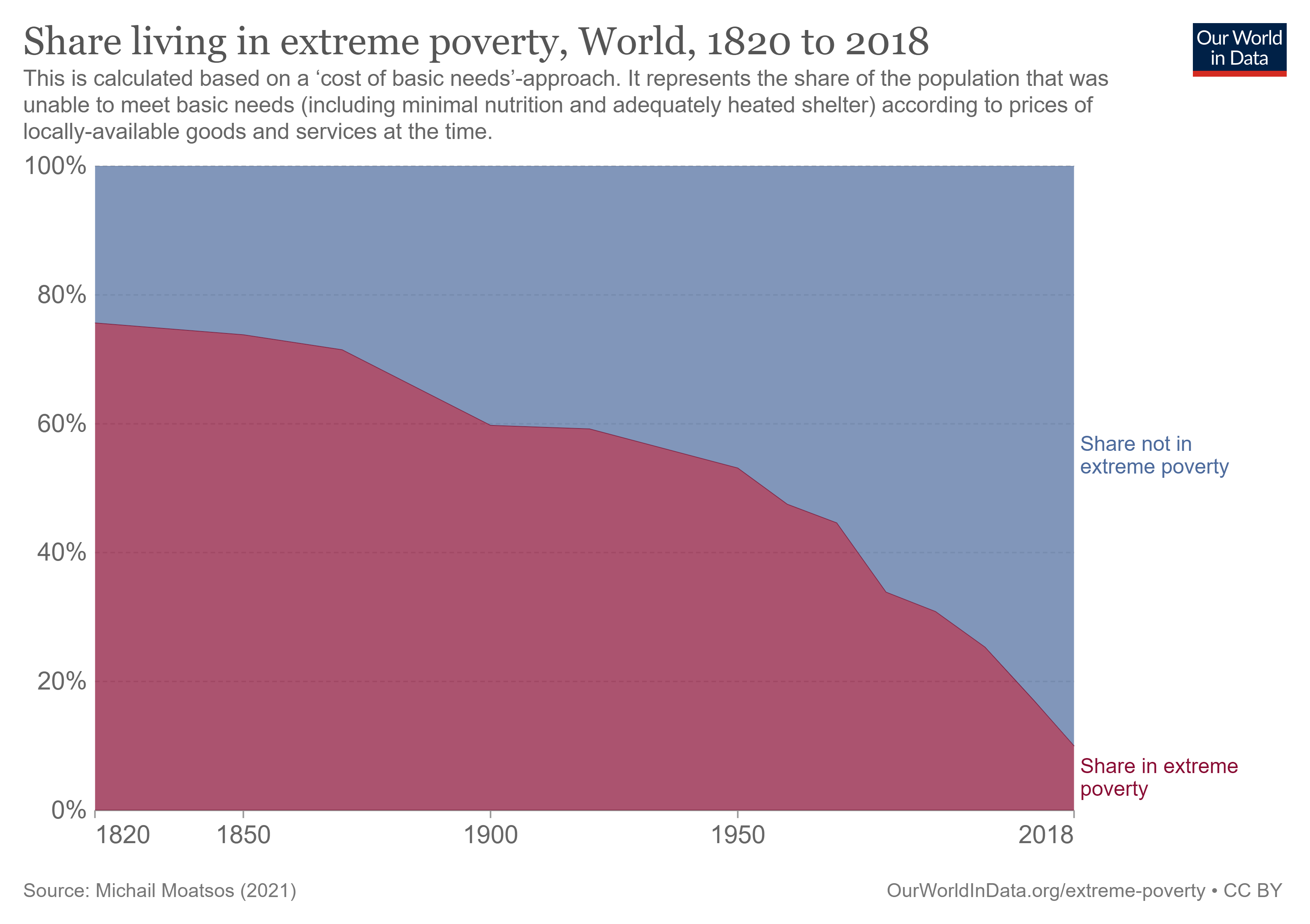
 The Our World in Data article Extreme poverty: how far have we come, how far do we still have to go by Max Roser (11/22/2021) provides numerous graphs that quantify changes in poverty. The most general graph is copied here. This one is for the world but users can select specific countries instead of the world to produce a related graph.
The overall conclusion is summed up well by their summary:
Two centuries ago the majority of the world population was extremely poor. Back then it was widely believed that widespread poverty was inevitable. But this turned out to be wrong. Economic growth is possible and poverty can decline. The world has made immense progress against extreme poverty.
But even after two centuries of progress, extreme poverty is still the reality for every tenth person in the world. This is what the ‘international poverty line’ highlights – this metric plays an important (and successful) role in focusing the world’s attention on these very poorest people in the world.
The poorest people today live in countries which have achieved no growth. This stagnation of the world’s poorest economies is one of the largest problems of our time. Unless this changes millions of people will continue to live in extreme poverty.
There are some distribution type graphs that could be useful for statistics classes and most of the graph have an option to download the data.