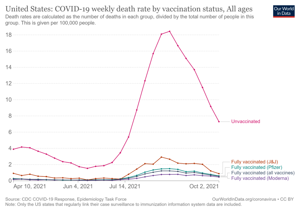
 The Our World in Data article How do death rates from COVID-19 differ between people who are vaccinated and those who are not? by Edouard Mathieu and Max Roser (11/23/2021) provide the answer. For example, their graph here is the death rate by vaccination status. The weakly death rate for Oct 2 for the unvaccinated group is about 15 times more than the vaccinated group. Even this is a little misleading. One of the options for these interactive graphs is to select the age group. The 80+ age group has weakly death rates of 6.51% and 38.28% for vaccinated and unvaccinated. There are also charts for England and Chile. For each chart the data is available. This would be good data for comparing groups in stats.
One other plus is the article starts of with an explanation, with graphics, about why it is misleading to report the percent of vaccination status of those that died. Good quantitative literacy and stats reading.