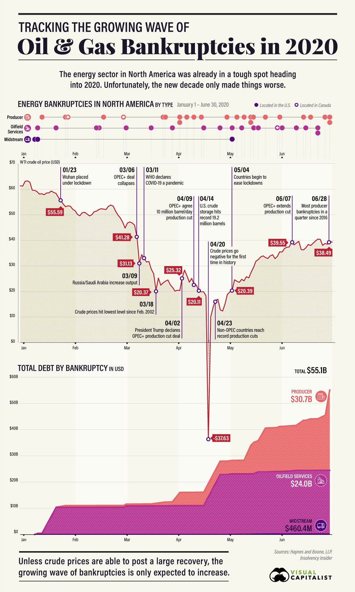
This is something different. Since many of the folks that read this blog are educators, I’m posting this essay by Michael Rogers (michael.b.rogers (at) ucdenver.edu) and myself. I hope you find it thought provoking.
The Face-to-Face Classroom isn’t Scalable
As covid-19 has required faculty to engage in different modes of teaching, moving us from face-to-face to various forms of remote, blended, or online learning it is natural for us to try and replicate the classroom experience by, for example, holding synchronous zoom classes. Instead we might step back and consider what it is about face-to-face teaching that makes it the seemingly “gold standard” of teaching. Is it simply that it is in person? Are the attributes of personal, engaging, and responsive what makes the small face-to-face classroom so valuable? On the other end of the spectrum what can we learn from fully automated online courses, which have their place for some learners, but lack the attributes of face-to-face classes? One of the distinct differences between fully automated online courses and face-to-face classes is that face-to-face is not scalable. According to Taleb in The Black Swan a profession that is “scalable” is one “in which you are not paid by the hour and thus subject to the limitation of the amount of your labor.” The context here is very similar in that the professor’s labor, the interaction with students, is a limitation on the number of students they can accommodate in a classroom. For example, a fully automated online course scales to as many students as want to take it with no extra effort on the part of an instructor, which decreases the cost per student. If a course is scalable it isn’t going to be personally responsive.
What we do in face-to-face classes really isn’t scalable. We know that there is a big difference between 20 and 300 students in a classroom which requires us to change our modes of instruction, assessments, feedback, student-student interactions, and student-teacher interactions as enrollment increases. When does the change happen? Going from a 300 to a 500-person lecture course likely does not require changing methods but moving from 20 to 60 will. Factors that can affect scalability include classroom design and technology. For example, the SCALE-UP project has introductory science courses with 100+ students and uses a classroom design that has nine students sitting at round tables. So, while the overall enrollment is scaled up the classroom layout scales the learning experience back down to one that is responsive to the needs of the individual learner. As we navigate remote and online learning, we should ask ourselves if what we are doing is scalable or not and if it is scalable then we are likely not creating a personal learning environment and students may question the cost.
So, what makes face-to-face so effective? A successful curriculum will be designed for diverse learners with varying backgrounds, perspectives, and academic preparation. It will use multiple forms of engagement, representations, and expressions (Universal Design for Learning). It will be individualized and pluralized (Gardner). In short, the instructor and curriculum need to be responsive to those students in the classroom at that time. In face-to-face education faculty get to know their students and often see them in other courses and settings during their education. We talk with them before classes, after class, in the hallways, during office hours, etc. This helps faculty learn how to connect with and support individual students. This personal connection happens more in smaller classes than large lectures and is nonexistent in fully automated online courses. It is much easier to provide feedback that is timely and personalized in the face-to-face environment. Instruction can be adjusted in real-time to address questions, confusion, and provide alternative explanations or representations. Also consider how often a student asks a question or a faculty member provides motivation when they happen to come in contact in a hallway or when passing an office.
A face-to-face class also allows for nonverbal communication and other transition cues. For example, when students are asked to discuss a topic with their group or neighbors the noise volume increases and as that volume decreases the instructor is receiving a cue to bring the students back together and transition into the next part of the lesson. This example is scalable from a small enrollment class to a large lecture hall but does not scale well to Remote (aka zoom) and Online. Seeing that someone is excited via their facial expressions works well in a small classroom environment but does not scale well to a large lecture hall and definitely doesn’t scale to remote where students may prefer to not turn their cameras on. Similarly, there are several nonverbal cues to let an instructor know that students are confused and that they need to either explain something again and/or in a different way. In the face-to-face classroom instructors can quickly adjust using the nonverbal cues by, for example, interjecting a moment of socratic method or a think, pair, share session. Instructors and students alike use hand gestures in a wide variety of ways such as the right-hand rule for remembering the vector cross-product or simply raising their hand to ask a question. Again, these do not easily scale to remote and online environments. While zoom participants can raise their virtual hand and enter comments and questions into the chat monitoring all of these different sources of information can be challenging even for a small class.
If all we do as teachers is move our content to videos or classes to zoom, which at first glance may seem close to having in person classes, we will have lost much of what makes face-to-face valuable. So, what do we do? First, we need to recognize what exactly has been lost and then consider how to replace that information. For example, how do we recover some of the lost nonverbal communication? We may want to communicate to students that since we can’t see them, we have lost nonverbal information and need them to help us recover that information. We may consider regularly surveying students, something easily done with technology, about their learning in the course. We could also schedule a few one-on-one zoom meetings with each student to help recover some of the lost personal connections. Note though that all of this takes extra time and brings us back to the notion of scalability.
As we continue to adjust to the current crises, let’s pay attention to what makes face-to-face effective and worth the cost and not try to replicate it blindly with technology, while at the same time looking towards technology to make our classes as valuable as face-to-face. As we meet the challenge presented to us at this time and learn new skills and modes of teaching, let us also keep in mind that some of what we do now we may want to bring back with us to the face-to-face classroom. For example, YouTube is loaded with instructional videos, albeit at varying quality, with many quite good, that can provide alternative perspectives on topics covered during an in-person class. Links to these videos can be added to the course schedule making it easy for students to access them and the instructor can select high quality videos so that students are not trying to decide the quality. Instructors may want to make their own tutorial video covering a topic that has historically been challenging, increasing the resources a student has to be successful. Some students may find the chat and polling features in zoom a more comfortable way to express themselves when not feeling comfortable communicating verbally. While many face-to-face courses use student response systems or flashcards for polling, we should also look at chat tools such as Slack or Mentimeter.
Covid-19 and the move to remote learning can be considered a black swan event for faculty; an unpredictable event with severe consequence. We had been comfortable with face-to-face and may not have been exploring technology in the ways we could have. In general, we were not prepared for such a drastic change in our mode of teaching. We now have an opportunity to not just think about what makes face-to-face so effective, but also to try to provide a framework for the differences in modes of instruction. We suggested scalability as one such framework that may help us think about how to adjust to remote learning given what we know about face-to-face. When covid-19 subsides to the point where we return to face-to-face, we should not simply return to what we used to do as what we’ve learned in these past several months can be used to make the face-to-face experience even better. We should also look to continually experiment with online tools so that we are better prepared for an unpredictable future.