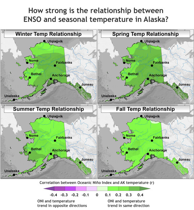
 The climate.gov article Moose tracks through Alaska and ENSO by Brian Brettschneider (6/23/2022) is a great example of using statistics in a real world setting; in this case the Pearson correlation. The graph copied here is interesting but the footnote may be even more so:
This statistical analysis uses the Pearson correlation of a linear regression, which measures how well two variables (like ENSO and Alaskan temperature) remain in sync. Correlation values range from -1 (completely out of sync) to +1 (completely in sync). Also, because Alaska’s temperatures have such a strong warming trend, the anomaly for each year was compared against a trailing 30-year average (or climatology). This mostly, but not entirely, removes the trend. We are interested in removing the climate trend in these maps because we are interested in isolating the ENSO signal (which does not include climate change signals).
Quick summary of the results:
The winter and spring seasons have the greatest connection between ENSO (as measured by the Oceanic Niño Index) and departures from average air temperature, and the correlation is positive. This means that El Niño tends to bring above-average temperatures; it also means La Niña is linked with below-average temperatures. Areas adjacent to and closer to the North Pacific Ocean tend to have a stronger connection with ENSO than areas inland. In the summer, the relationship weakens quite a bit (as indicated by the lighter shading) and is mostly nonexistent by fall.
The Oceanic Niño Index links to a data set. There are a few other maps in the article and a couple more footnotes.
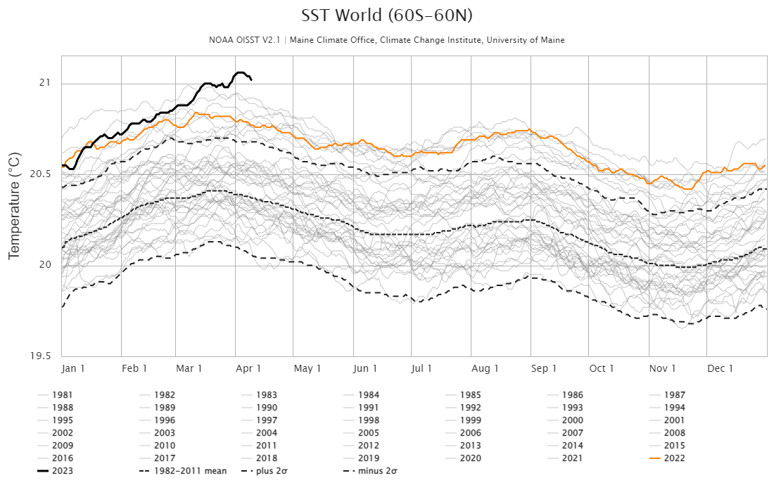
 Climate Reanalyzer has an interactive time series chart of ocean temperatures. The dark black line at the top is the current year and shall we say we are in uncharted waters. It would be nice if this graph was colored by ENSO status in the way NOAA has a global temperature graph by ENSO status. Why does this matter? According to a Guardian article:

