Tag Archives: women vs men

How many jobs from 18-32?

The U.S. Bureau of Labor Statistics post People born in early 1980s held an average of 8.2 jobs from ages 18 through 32 (6/3/2020) includes the graph copied here. They note

Women with higher levels of education held more jobs than women with lower levels. Women with a bachelor’s degree held 8.8 jobs from ages 18 through 32, compared with 6.5 jobs for female high school dropouts. Men held a similar number of jobs regardless of their level of education.

People held an average of 4.5 jobs from ages 18 to 22. The average number of jobs dropped to 3.3 from ages 23 to 27, and then dropped more, to 2.3 jobs, from ages 28 to 32. The pattern of people holding fewer jobs as they aged was similar among women and men and across racial and ethnic groups and levels of education.

The chart data is available and there are links to the original survey.

Is there a country where women smoke more than men?

The Our World in Data page Smoking by max Roser and Hannah Ritchie has 19 graph, with data, related to smoking. In general, men smoke more than women except in Nauru (see graph copied here).

Every 5th adult in the world smokes tobacco. But there are large differences between men and women.

More than one-third (35%) of men in the world smoke. Just over 6% of women do. Here is the data for men; here for women.

We see that almost all countries lie above the grey line, meaning a higher share of men smoke. But there are a few exceptions: in the Pacific island-state of Nauru 43% of women smoke compared to 37% of men; and smoking rates in Denmark and Sweden show almost no sex difference.

How different is weekly pay of women and men by race?

The BLS report, Highlights of women’s earning in 2017 has four charts with data about women’s earnings and occupation.  The chart copied her compares men and women by race.

Asian women and men earned more than their White, Black, and Hispanic counterparts in 2017. Among women, Whites ($795) earned 88 percent as much as Asians ($903); Blacks ($657) earned 73 percent; and Hispanics ($603) earned 67 percent. Among men, these earnings differences were even larger: White men ($971) earned 80 percent as much as Asian men ($1,207); Black men ($710) earned 59 percent as much; and Hispanic men ($690), 57 percent. (See chart 3 and table 1.)

Note:

The earnings comparisons in this report are on a broad level and do not control for many factors that can be important in explaining earnings differences, such as job skills and responsibilities, work experience, and specialization.

The BLS is an excellent source for data.

What are the gender trends in graduate school?

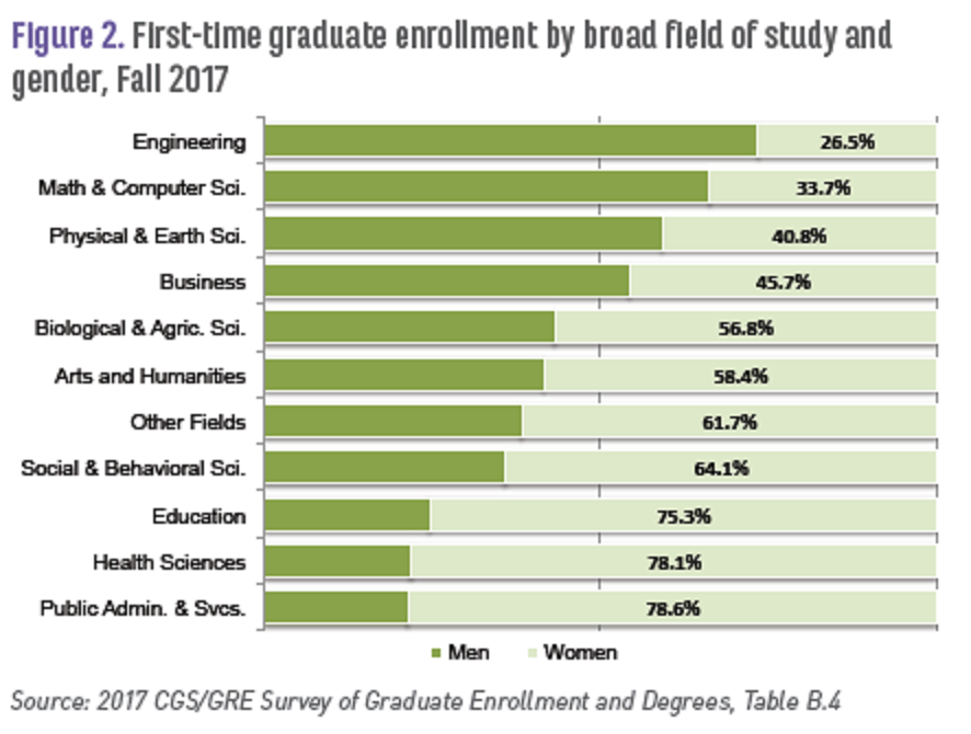
The Council of Graduate Schools (CGS) report, Graduate Enrollment and Degrees 2007 to 2017 (Oct 2018) provides data on enrollment and degrees in graduate school by gender and race.  For example, the graph here is Figure 2 in their report and provides enrollment data by field of study and  gender.  In the aggregate they note:

Academic year 2016-17 marked the eighth consecutive year in which women earned the majority of degrees awarded at the doctoral level. Women earned 64.0% of graduate certificates awarded in 2016-17, 57.3% of master’s degrees, and 53.0% of doctorates.

The report contains a number of graphs and data tables with various  demographic information (race, gender, international). For example,

Among first-time U.S. citizens and permanent resident graduate students in the Fall of 2017, about 23.9% were underrepresented minorities, including American Indian/Alaska Native (0.5%), Black/African American (11.9%), Native Hawaiian/Other Pacific Islander (0.2%), and Hispanic/Latino (11.3%) (Table B.11).

A summary page of the report, First-Time Enrollment Holds Steady – Application Counts Slightly Decline at U.S. Graduate Schools, also has a link to the full pdf report.

What are the differences in the college aspirations of teens?

Pew reports results of a detailed survey in their article Most U.S. Teens See Anxiety and Depression as a Major Problem Among Their Peers — For boys and girls, day-to-day experiences and future aspirations vary in key ways by Juliana Menasce Horowitz and Nikki Graf (2/20/19). Here, we highlight college aspirations:

Girls are more likely than boys to say they plan to attend a four-year college (68% vs. 51%, respectively), and they’re also more likely to say they worry a lot about getting into the school of their choice (37% vs. 26%). Current patterns in college enrollment among 18- to 20-year-olds who are no longer in high school reflect these gender dynamics. In 2017, 64% of women in this age group who were no longer in high school were enrolled in college (including two- and four-year colleges), compared with 55% of their male counterparts.

There are also differences by parental education and economic class:

Among teens with at least one parent with a bachelor’s degree or higher, as well as those in households with annual incomes of $75,000 or more, about seven-in-ten say they plan to attend a four-year college after high school. By comparison, about half of teens whose parents don’t have a bachelor’s degree or with household incomes below $75,000 say the same.

The article has a number of other charts and a detailed methodology section (perfect for a stats  course).


How many women have been in congress?

The Pew article, A record number of women will be serving in the new Congress by Drew Desliver (12/18/18) provides an historical overview and the chart copied here of women in congress.

When the 116th Congress convenes next month, women will make up nearly a quarter of its voting membership – the highest percentage in U.S. history, and a considerable increase from where things stood not too long ago.

A record 102 women will serve in the incoming House of Representatives, comprising 23.4% of the chamber’s voting members. More than a third of those women (35) won their seats for the first time in last month’s midterms.

The differences by party are notable. For instance, the most Republican women in the House of Representative was 25 in 2017-2019 and down to  13 this year.  On the other hand, there have been more than 25  Democrat women in the House since the 1993-1995 congress. As a percentage of each party’s delegation, women have never exceeded more than 10% of Republican House members. From 109th through 112th congress (2005-2013) women made up 9.9% of Republican House members. This is down to 6.5% (13 women) this year. On the other hand, women have been generally increasing as a percentage of Democrat House members since the 101st congress (1989-1991) and stand at 38% (89 women) this year.  Wikipedia posts this data in a table, which comes from a Congressional Research Service report.

Related post: World Development Indicators: Proportion of seats held by women in national parliaments (3/2/17)

Who misses school the most?

The EPI article,  Student absenteeism – Who misses school and how missing school matters for performance by Emma García and Elaine Weiss (9/25/18) provides a detailed account of absenteeism based on race and gender.  For example, their chart here is the percent of students that missed three or more days in the month prior to the 2015 NAEP mathematics assessment. There are noticeable differences. For instance, the percentage of Black, White, and Asian (non ELL) that missed three or more days in the month is 23%, 18.3%, and 8.8% respectively.

Why does this matter?

In general, the more frequently children missed school, the worse their performance. Relative to students who didn’t miss any school, those who missed some school (1–2 school days) accrued, on average, an educationally small, though statistically significant, disadvantage of about 0.10 standard deviations (SD) in math scores (Figure D and Appendix Table 1, first row). Students who missed more school experienced much larger declines in performance. Those who missed 3–4 days or 5–10 days scored, respectively, 0.29 and 0.39 standard deviations below students who missed no school. As expected, the harm to performance was much greater for students who were absent half or more of the month. Students who missed more than 10 days of school scored nearly two-thirds (0.64) of a standard deviation below students who did not miss any school. All of the gaps are statistically significant, and together they identify a structural source of academic disadvantage.

These results “… identify the distinct association between absenteeism and performance, net of other factors that are known to influence performance?”  The article has 12 graphs or charts, with data available for each, including one that reports p-values.

What percent of doctors are female?

OECD has the answer in their post Women make up most of the health sector workers but they are under-represented in high-skilled jobs (3/2017) along with a nice graphic.

The current overall health workforce is mostly composed of women. Nonetheless, female health workers remain underrepresented in highly skilled occupations, such as in surgery. As of 2015, just under half of all doctors are women across OECD countries on average. The variation across countries is significant: in Japan and Korea only around 20% of doctors are women, in Latvia and Estonia this proportion is over 70%.

It is worth noting that the U.S. is well below the OECD average with only 34.1% of its doctors female in 2015, although the current posted data set has the U.S. at 35.06% for 2015 (35.52% for 2016).

Time series data for OECD countries is available at the OECD.stat Health Care Resources page. Data for the U.S. dates back to 1993 (19.59%) through 2016.  For this specific data set click physicians by age and gender on the left side bar.  Within the chart click variable, measure, and year, to change the scope of the data in the spreadsheet. The data can be downloaded in multiple formats.

How has adult death rates changed by U.S. state?

The PRB (Population Reference Bureau) post, Declines in Adult Death Rates Lag in the U.S. South, answers the question with interactive graphs.

Adult death rates in many southern states are 30 percent or 40 percent higher than in states with the lowest death rates. The growing geographic disparity means that adults (ages 55+) in the worst-off southern states can expect to die three to four years earlier, on average, than their counterparts in states with the lowest death rates.

The graphs show death rates by state and state rankings for both females and males, from 1980 to 2015.  There is a clear trend.

In 2015, all of the states with the highest female death rates (ages 55+) were located in the South. In 1980, by comparison, the five states with the highest female death rates included Louisiana, New Jersey, New York, Ohio, and Pennsylvania.

The set of graphs are perfect for a QL course. The data, cited in the post, is from the CDC which could make for a regression based statistics project.

Pay Inequality

A recent EPI report notes: Straight out of college, women make about $3 less per hour than men.

Right out of college, young men are paid more than their women peers—which is surprising given that these recent graduates have the same amount of education and a limited amount of time to gain differential experience.

What may be worth exploring is the historic difference in starting pay between women and men, which you can do since the data is available and can easily be placed into Excel.