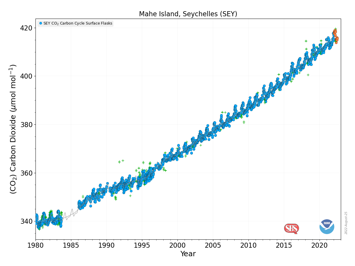
 Back to more serious data stuff today. Now, you may have been wondering where to get a visualization and the data for CO2 measurements collected on Mahe Island, Seychelles. All you have to do is start on NOAA’s Global Monitoring Laboratory where you will find a map with a bunch of dots around the world. Each dot represents a monitoring station. When you run the cursor over the data it tells you what data is collected at that location. Click the dot and then select what you’d like on the right sidebar. A new page will open for a few more choices. In the end you can get a graph, such as the one here, and a link to the data. Enjoy.
What is the math dance?
This is not my usual post but since most of you reading this are in some math area I just had to share this. I’ll be more serious on Thursday.
How hot was July 2022?
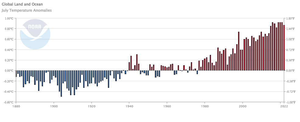 From NOAA’s July 2022 Global Climate Report:
The July 2022 global surface temperature departure was the sixth highest for July in the 143-year record at 0.87°C (1.57°F) above the 20th century average of 15.8°C (60.4°F). The five warmest Julys on record have all occurred since 2016. July 2022 also marked the 46th consecutive July and the 451st consecutive month with temperatures, at least nominally, above the 20th century average.
A few highlights:
Most of the contiguous U.S. had warmer-than-average temperatures in July, with several areas experiencing record-warm temperatures this month. July 2022 was the third-warmest July on record for the U.S.
Portugal had its warmest July on record, according to the Portuguese weather service. A station in Pinhão recorded a temperature of 47.0°C (116.6°F) on July 14, setting a new record for the warmest day in July for the country.
Spain had its warmest July on record, as well as its warmest month on record since at least 1961. 29 major weather stations had an average July temperature that was the highest of any month since the beginning of the record in 1961.
Time series data is available at a link near the top of the page.
How deep are the oceans?
It is often difficult to comprehend quantitative differences. MetaBallStudios‘ YouTube channel has a collection of comparison videos, such as the depth of oceans, to aid in understanding differences. There are a number of great videos that could be useful in a quantitative literacy based class. Take a look as they are really cool.
How much has Western US snowpack changed?
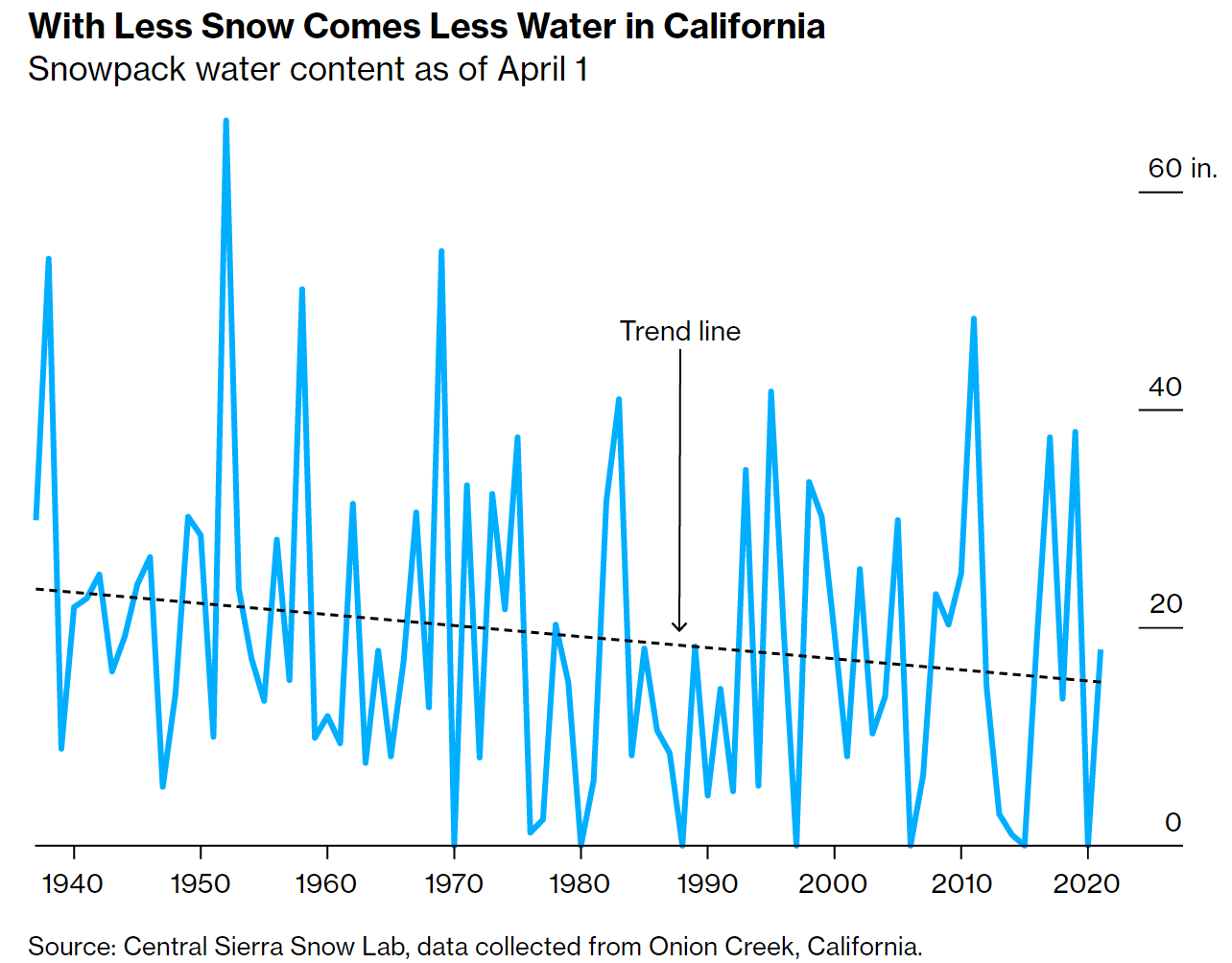 The Bloomberg article The End of Snow Threatens to Upend 76 Million American Lives by Baker et. el. (8/3/2022) has some excellent graphs, such as the one copied here, and overview of the water issues in the west.
The West’s mountain snowpacks have shrunk, on average, 23% between 1955 and 2022. By the end of the 21st century, California could lose as much as 79% of its peak snowpack by water volume.
This impacts all of the US:
The California Rice Commission says only about half of the 500,000 acres of rice typically planted in the state will be grown this year.
California alone accounts for a third of all vegetables grown in the US and two-thirds of the nation’s fruits and nuts.
The article includes a map of CA with charts of current reservoir levels as well as a couple of then and now photos. The data seems to come from the California Data Exchange Center.
Is the U.S. the number 1 carbon emitter per person?
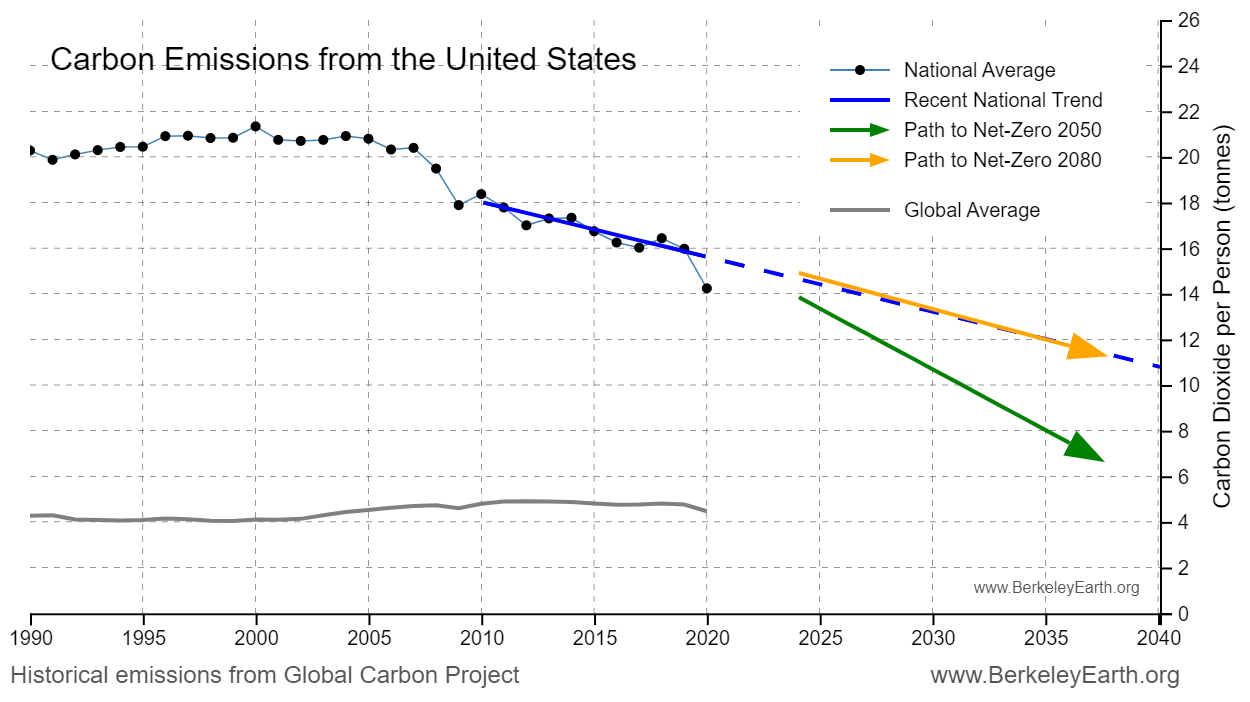
To answer the question Berkeley Earth has an interactive, What is your country’s carbon trend?, where you select a country and you get a table of information and a graph, such as the one copied here. The table of information provides such facts as the U.S. emits 14.2 tonnes per person per year, is the 14th highest, and is 3.2x the world average. On the other hand, the U.S. cumulative emissions (1850-2020) is 416,723 million tonnes and is the 1st highest. The nice part about the interactive is there is a link to the data on the graph.
The link is the same as the post from last Thursday, How much has your country warmed?, and this interactive is just a bit further down the page.
How much has your country warmed?
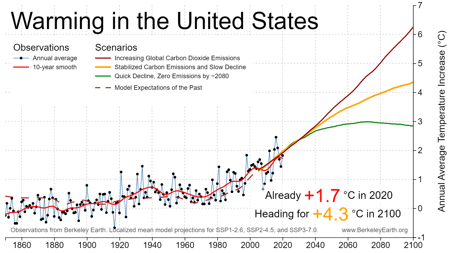
The Berkeley Earth page Actionable Climate Science for Policymakers has a Country-Level Warming Projections interactive graphic. Select a country and a graph, such as the one here for the U.S. appears. Click on the button below the graph, View More Details, and you will get extra text information and links to download the graph and the data.
As for the U.S. Berkeley Earth tells us the country has already warmed 1.7 deg C and headed for around 4.3 deg C by 2100,
What’s new from Tom?
 This post is a bit of shameless self promotion, but since many of you that read this are in higher ed I thought you’d appreciate my post, Campuses Need Collaborative Decision-making More than Shared Governance, on the AAUP Academe blog. Feel free to click the link, leave a comment, and share with friends. A highlight:
In “Exactly what is ‘Shared Governance’” Gary Olson offers, “The key to genuine shared governance is broad and unending communication. When various groups of people are kept in the loop and understand what developments are occurring within the university, and when they are invited to participate as true partners, the institution prospers.” I argue further that this is more than shared governance and that there are four key hierarchical leadership aspects that are needed to ensure this collaborative partnership: shared governance, transparency, openness, and collaboration.
Back to data and graphs on Thursday.
How hot was the UK?
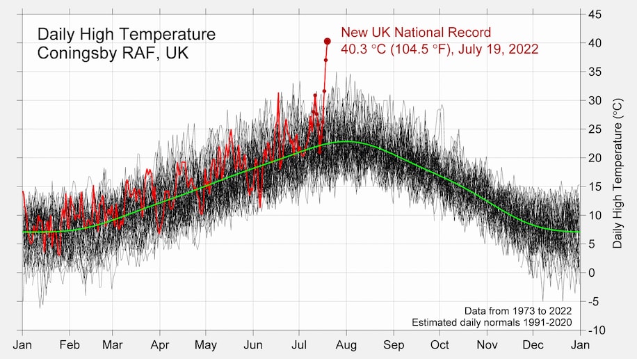
I’m sharing this Washington Post article, Britain’s freakish heat demolishes records. Here’s what happened, because they have inserted this excellent graphic from Robert Rhode of Berkeley Earth. The graph says it all, but if you prefer words:
The maximum temperature reached Tuesday in Coningsby, England — 130 miles north of London — was unlike anything the village had ever observed. It was an outlier in the truest sense: about 9 degrees Fahrenheit (5 degrees Celsius) above the previous highest temperature.
You’ll find a couple of similar images on the Berkeley Earth’s Temperature Updates page. They are just as startling. Consider what it would be like if where you live hit 9 degrees about the current record high.
Are there more animals than people in your county?
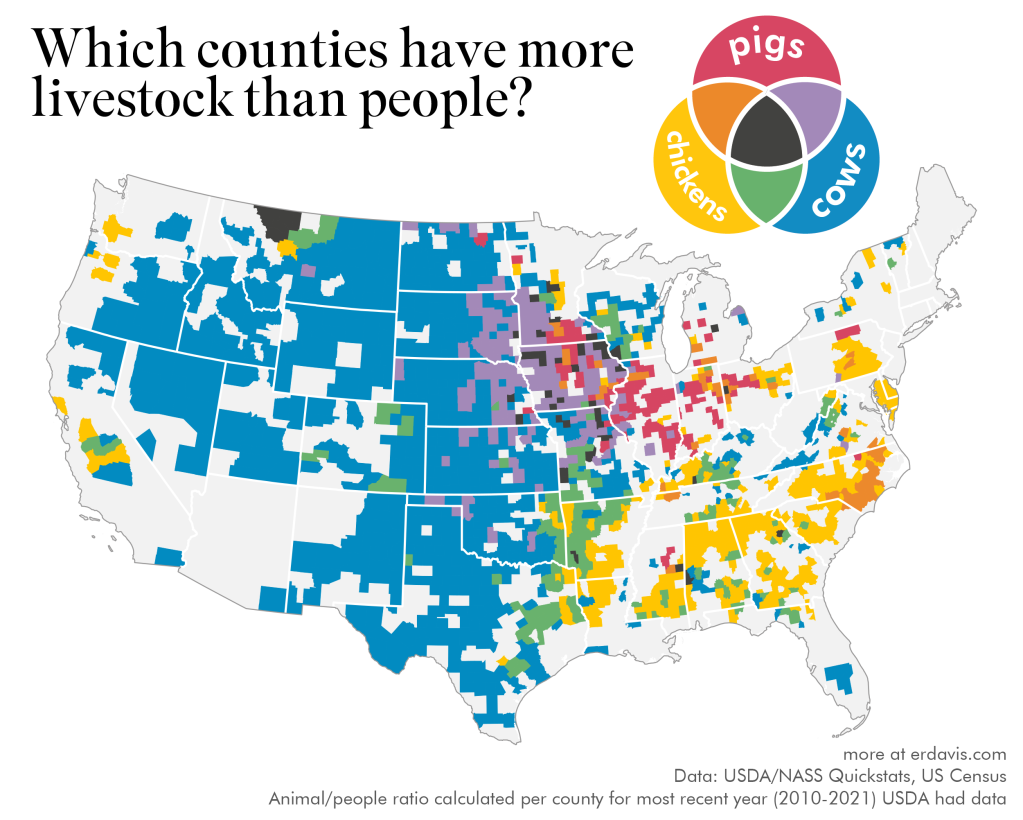 Here is one of a fun set of maps from the post Where is there more livestock than people? by the Data Stuff blog. The article links to the USDA site used to obtain the data. There are 7 other maps which are fun. One of them is a map of counties with more goats than people. Find out where.